

The Print-on-Demand Seller's Guide to Using Text Overlays on Mockups to Communicate Print Dimensions, Paper Type, and Framing Options

Buyers scrolling through Etsy or Shopify are making split-second decisions. They want to know what they are getting before they click through to your listing description, and they definitely want to know before they hit "Add to Cart." A beautiful mockup photo draws attention, but it rarely tells the full story. What size is that print? Is it framed or unframed? What kind of paper are you printing on?
Text overlays answer those questions right inside the image, where attention is highest. Done well, they reduce refund requests, cut down on "does this come in 16x20?" messages, and make your shop look professional rather than rushed. This guide covers how to think about overlay copy, what information matters most, and how to implement it efficiently across dozens of listings using Mockupanda.
Why Text Overlays Matter for Print-on-Demand Listings
Buyers Skim, They Don't Read
Most shoppers never scroll past the image gallery on a product listing. Etsy's own interface buries the description below the fold, and Shopify themes vary wildly. If critical product details live only in your description, a meaningful portion of your buyers will never see them. An overlay baked into the mockup image is unavoidable, and that is exactly the point.
Think about the three most common questions a print buyer has before purchasing. First: what size does this come in, and what size is shown here? Second: is there a frame, and if so, what color and material? Third: what is the paper or print quality? If any of those questions go unanswered in your images, you are asking the buyer to do extra work. Some will send a message. Many will just move on.
A short overlay like "18x24 in. Shown — Matte Fine Art Paper" sitting in the bottom corner of a mockup answers two of those three questions in under two seconds.
Text in Images Carries More Weight Than Text in Descriptions
There is a practical reason to put specs in your images beyond buyer attention spans. Platforms like Etsy index listing images, and when buyers save or share your listing, the image travels with it. A screenshot of your mockup shared to Pinterest or a group chat carries your sizing information right along with it. Your description does not.
This is also why consistency matters. If you use the same text overlay style and placement across your entire shop, returning buyers instantly recognize your brand, and new buyers can quickly compare products in their saved list because every image tells the same kind of story in the same visual language.
Takeaway: Treat each mockup image as a standalone product card. If someone saw only that image with no title or description, would they know what they are buying? Use overlays to make the answer yes.
What Information to Put in a Text Overlay
Print Dimensions and Size Variants
The most important piece of information you can overlay is the print size. This is especially true if you sell multiple sizes of the same design. Showing a 24x36 poster in a large room mockup with a small overlay that reads "24x36 in." removes all ambiguity. The buyer is not left guessing whether the print is big enough for their wall, or wondering if the scale of the room is distorting their expectations.
If you sell a design in several sizes, create a separate mockup for each size variant and label each one clearly. You might have the same design in a cozy desk scene for the 5x7 version and a full living room wall shot for the 24x36, each with its own overlay. This approach also helps your gallery tell a story: buyers see the design at different scales, in different settings, and the text confirms what they are seeing.
For multi-size shops, a clean format to follow is: [Width] x [Height] in. or [Width] x [Height] cm depending on your primary market. Keep it short. You do not need to explain that it is a print size; the context of the mockup makes that clear.
Paper Type and Print Finish
Paper type is where many sellers lose sales silently. A buyer choosing between your shop and a competitor may not even realize they are making a quality decision, but "Heavyweight Matte Fine Art Paper" versus nothing signals that you care about the product. It tells the buyer this is not a cheap inkjet print slapped in an envelope.
Common options to name in overlays include matte, satin, glossy, fine art, archival, and canvas. If your paper has a specific weight or a recognizable brand name that your target buyer would recognize, include it. If not, stick to the finish and weight category: "300 gsm Matte" communicates quality without jargon.
For canvas prints, "Gallery-Wrapped Canvas" is a phrase buyers search for and understand. For framed prints, you can combine paper and framing in one line: "Giclée Print, Black Wood Frame."
Framing Options and Included Hardware
Framed vs. unframed is one of the most frequent sources of buyer confusion in the wall art category. If your mockup shows a print in a beautiful light wood frame, make it explicit whether that frame is included or whether the mockup is purely illustrative. An overlay like "Frame Included" or "Print Only, Frame Not Included" takes three words and saves you hours of back-and-forth messages and negative reviews.
If you sell framed prints, use your overlays to communicate frame color options. A simple "Also available in Black and White frames" on one mockup tells buyers there are choices without requiring a wall of text in your description. You can then create separate mockups for each frame option and label each one, letting your image gallery do the heavy lifting.
Takeaway: Before you design any overlay, write down the three most common questions you get from buyers. If your overlays answer those three questions, you have done your job.
How to Add Text Overlays Using Mockupanda
Using the Text Tool in the Editor
Mockupanda's editor includes a built-in Text tool that lets you add custom text overlays directly to any mockup. According to the platform, you can change the font, size, color, alignment, and position of any text you add. The text is baked directly into your final downloaded image, which means it looks like part of the mockup rather than a sticker dropped on top afterward.
This is the key distinction from editing images after the fact in a separate design app. When text is baked in during the generation step, it integrates with the mockup scene. You position it, style it, and it comes out as one cohesive image. There is no risk of forgetting to add the text layer in Photoshop, no separate export step, and no chance that the text sits on a slightly different layer that gets lost when you resize for a different platform.
To use it, open the editor, upload your design, choose a template, and use the Text tool to add your overlay. You control where it sits, how large it appears, and what color it uses. For print listings, a common placement is the lower left or lower right corner in a semi-transparent or lightly colored block, keeping it visible but not competing with the design itself.
Choosing Fonts, Colors, and Placement That Feel Native
The goal of a text overlay is to inform, not to decorate. A few principles keep overlays clean and credible.
Use one font per shop, ideally something simple and readable at small sizes: a clean sans-serif works for most wall art shops. Avoid scripts or display fonts for spec text because they are harder to read quickly.
Color matters enormously. White text on a slightly darkened footer band works on most light room mockups. Dark text on a light footer works when the mockup background is bright. Avoid text that floats directly over your design or over a busy part of the room scene, because legibility drops fast.
Placement should be consistent across your entire shop. If you always put your overlay in the bottom left, buyers recognize the pattern and know where to look. If it moves from image to image, it feels accidental.
For size, keep it small enough to be unobtrusive but large enough to read at thumbnail size, because most buyers will see the thumbnail before they click. Test your mockup at the actual thumbnail size Etsy displays, and make sure the text is still legible.
Scaling Overlays Across Your Full Catalog
One text overlay on one mockup is straightforward. The challenge comes when you have twenty designs, each available in five sizes, each needing its own labeled mockup. That is one hundred images to produce, and doing them one by one defeats the purpose of running a scalable shop.
This is where Mockupanda's bulk generation changes the math. You can apply a single design across dozens of templates in one go, downloading all the results as a ZIP file ready for Etsy or Shopify. For sellers creating twenty or more listings per week, this approach eliminates the manual bottleneck that turns mockup creation into a part-time job.
For text overlays at scale, the practical approach is to plan your overlay copy before you generate. If you are creating a set of mockups for your 8x10 listings, decide on the overlay text for that size, add it in the editor, and generate all your 8x10 mockups in that session. Then switch to your 12x16 session with updated overlay text and repeat. Batching by size variant keeps the workflow logical and consistent.
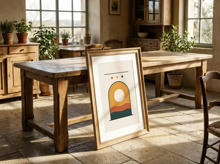
Takeaway: Use the Text tool to add overlays during mockup generation rather than after, and batch your work by size variant to keep the process fast and consistent across your catalog.
Designing Overlays for Different Product Types
Wall Art and Framed Prints
For wall art, the overlay hierarchy should go: size first, then finish or paper type, then framing status. Size is the decision gate: if the size is wrong, nothing else matters. Once the buyer is confident in the size, they want to know the quality, and then whether there is anything they need to buy separately.
A practical template to follow: line one is the size, line two is the paper or medium, line three is the framing status. Keep each line short. "12x16 in. / Matte Art Paper / Frame Not Included" fits cleanly in a small footer block and communicates everything a buyer needs.
For framed prints, if your mockup shows a specific frame style, name it. "Light Oak Frame Included" or "Black Metal Frame Included" is specific enough to reassure buyers who are coordinating with existing decor.
The perspective rendering in Mockupanda places your print naturally in the scene, with room light and shadows falling across it, so the mockup itself already communicates quality. Your text overlay does not need to sell the product; it just needs to answer the factual questions that the image cannot.
Apparel and Other Print-on-Demand Products
For apparel like t-shirts and hoodies, text overlays shift focus from dimensions to sizing guides and material. Rather than print dimensions, you might overlay "Available S to 2XL" or "100% Ring-Spun Cotton" on a lifestyle mockup of the shirt. For tote bags, "14x16 in. Bag / Cotton Canvas" is immediately useful.
For these product types, the overlay is less about print specs and more about purchase-decision specs. What does the buyer need to know to click buy? Material comfort for wearables, capacity or dimensions for bags, and wash-care indicators for anything that will be laundered.
The Text tool works the same way across product types, so the technique is identical even when the copy strategy shifts.
Multipanel and Specialty Prints
Diptych and triptych sets, which Mockupanda supports through its multi-frame template system, present an interesting overlay challenge. Buyers need to understand that they are buying a set of panels, not a single print. An overlay like "Set of 3 Panels / 8x10 in. Each" removes the ambiguity that leads to disappointed unboxings.
For canvas gallery wraps, noting the wrap depth is genuinely useful: "1.5 in. Deep Gallery Wrap" tells the buyer that the sides are printed rather than white, and that standard frames will not fit it. This kind of detail in an overlay prevents returns.
Takeaway: Match your overlay content to the specific purchase decision for each product type. Wall art buyers need size and framing info; apparel buyers need sizing and material info. Let the product type dictate the copy.
Building a System So Overlays Stay Consistent
Create a Style Guide for Your Shop
Before you start generating mockups with overlays, write down your font choice, text color, placement, and the exact copy format you will use for each product type. This does not need to be elaborate, a short document or even a notes file is enough. The point is that six months from now, when you are adding new designs at two in the morning, you do not have to make a decision. You just follow the guide.
Your style guide should cover: the font name and size you use, the color value for your text, the position in the frame (lower left, lower right, centered footer), and the copy format for each product category. Consistency is what makes a shop look like a brand rather than a collection of individual experiments.
Use Sets to Group Matching Templates
Mockupanda's Sets feature lets you save named, ordered groups of templates that you reuse across listings. If every wall art listing in your shop uses the same five room scene templates, save them as a set and apply that set every time you add a new design. This keeps your gallery consistent across your catalog without requiring you to remember which templates you used last time.
Combining Sets with a consistent text overlay approach means your workflow becomes genuinely systematic: upload design, apply set, add overlay text, download ZIP. That is a repeatable process that scales as your catalog grows.
Takeaway: Invest thirty minutes in a text overlay style guide before your next batch of mockups. It is a small upfront cost that compounds across every listing you ever produce.
Common Mistakes to Avoid
Overloading the Overlay with Too Much Text
The most common mistake is treating the overlay like a product description. You do not need to put your shop name, a tagline, a care instruction paragraph, and a sizing chart all in one corner of the image. Pick the two or three facts that matter most to the buying decision and stop there. Every line you add past that competes with your design and with the room scene that took Mockupanda a second or two to render beautifully.
If you feel compelled to add a lot of information, that is usually a signal that your listing structure has a problem. The overlay is a supplement to a well-organized listing, not a replacement for clear titles, accurate variation names, and a good description.
Using Text Colors That Disappear on Certain Templates
White text looks great on a dark moody room scene. It is nearly invisible on a bright white wall scene. Before you commit to a color, check how it looks across several of the templates in your usual set. If your shop uses templates with a variety of background tones, you may need two text color variants, one for light scenes and one for dark scenes, that you switch between depending on the template.
Forgetting to Update the Overlay When You List New Sizes
If you create a 12x16 mockup and then later decide to add an 8x10 variant of the same design, do not reuse the same mockup image. Generate new mockups with the updated overlay text. A buyer ordering an 8x10 who sees "12x16 in." in the image corner will either message you confused or, worse, assume the image is wrong and return the product when the 8x10 arrives.
Takeaway: Keep overlays short, check contrast across templates, and always update overlay text when you add size variants. These three habits prevent the most common overlay-related buyer confusion.
Text overlays are one of those small details that separate shops that look professional from shops that look like they were built in an afternoon. They take almost no time to add when you are already in the mockup editor, and they do measurable work for your conversion rate and your customer service inbox. Start with your most popular size, write a clean two-line overlay with the size and paper type, and generate your next batch of mockups with it. Then build from there. Mockupanda gives you the tools to do this at scale, so the effort you put into your first overlay becomes the system that runs across your entire catalog.
Keep reading

How to Upload a Custom PSD Smart Object Template and Expose It as an API-Renderable Resource in Your POD Workflow

How to Manage Multiple Mockupanda API Keys Across Dev, Staging, and Production Environments Without Leaking Credentials
