How to List a Diptych or Triptych Poster Set on Etsy Using a Single Gallery Wall Mockup That Shows the Full Set Together
You have spent real time designing a beautiful two or three panel poster set. The artwork flows across panels, the colors are coordinated, and when you picture all three frames hanging side by side on a white wall, it looks exactly the way you imagined. Then comes the Etsy listing, and suddenly nothing is working.
Do you upload each panel separately? Do you stitch them together in a collage? How do you show the buyer what the finished wall will actually look like without confusing them about what is included in the purchase? If you have been stuck on this question, you are not alone. It is one of the most common presentation problems digital print sellers face, and the solution is simpler than you might expect.
The answer is a single, well-composed gallery wall mockup that shows all the panels together, in context, at the right scale relative to each other. This one image does more selling than three separate flat previews ever could. Here is how to do it properly.
Why Multi-Panel Sets Confuse Buyers (And How Mockups Fix It)
Before getting into the how, it helps to understand the why. Etsy is a visual marketplace. Buyers scroll fast, and your thumbnail image has maybe two seconds to communicate what the product is, what it looks like in a home, and whether it is worth clicking on. A diptych or triptych listing adds a layer of complexity that most buyers are not prepared to decode on their own.
The Gap Between What You Know and What the Buyer Sees
As the designer, you know exactly what the set includes. You know panel one is the left side, panel two is the middle, and panel three is the right. You know they are designed to be hung together. But a buyer browsing Etsy at 10pm on their phone does not have that context. If your thumbnail shows a single panel, they may not even realize it is part of a set. If your thumbnail shows three separate flat images in a grid, it looks like three different products for sale.
This gap between your mental model and the buyer's first impression is where conversions die. A gallery wall mockup closes that gap instantly. When a buyer sees all three frames hanging side by side on a styled wall, there is zero ambiguity. They see the set as a finished, cohesive thing they can imagine in their own home.
Context Sells Better Than Clarity Alone
There is another reason a gallery wall mockup outperforms isolated panel previews, even when those previews are clear and well-designed. Context creates desire. Showing your poster panels hanging above a minimal console table, styled with a small plant and a warm lamp, makes the buyer feel something. They stop thinking about the product and start imagining their living room.
That emotional response is what drives impulse purchases on Etsy. Flat artwork previews, no matter how beautiful, do not trigger that response as reliably as a lifestyle mockup does. When you invest in a single mockup that shows the full gallery wall, you are not just explaining your product. You are selling a feeling.
Actionable takeaway: Before you create any listing image, write down in one sentence what a buyer should immediately understand from your thumbnail. For a triptych set, that sentence should be: three coordinated panels, designed to hang together, that would look beautiful on a real wall. Your mockup needs to communicate exactly that.
How to Choose the Right Gallery Wall Mockup Frame Layout
Not every gallery wall mockup is built for sets. Most generic mockup templates show a random collection of mismatched frames at different heights, which looks great for a lifestyle vibe but does a poor job of presenting a structured two or three panel set where the panels have a specific horizontal relationship to each other.
Matching the Mockup Structure to Your Set Structure
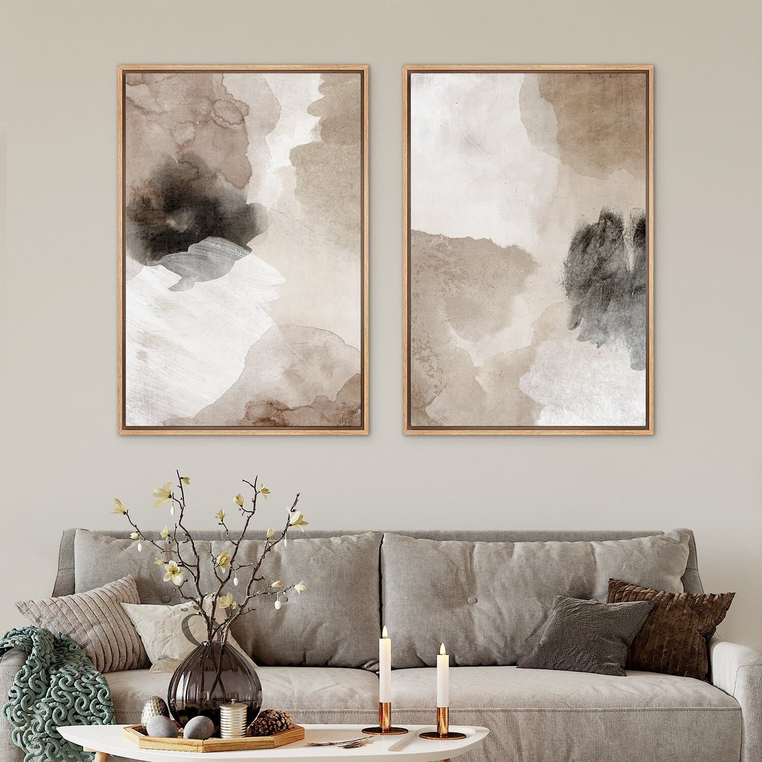
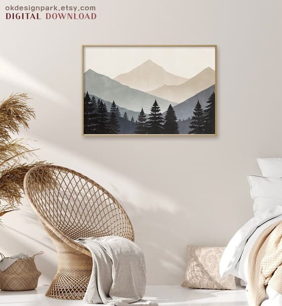
For a diptych, you need a mockup that shows two frames of the same size, hanging side by side at the same height, with consistent spacing between them. That consistent spacing is important because it signals to the buyer that these two panels belong together. If one frame looks higher than the other, or if the gap between them is uneven, the set loses its intentional, designed quality.
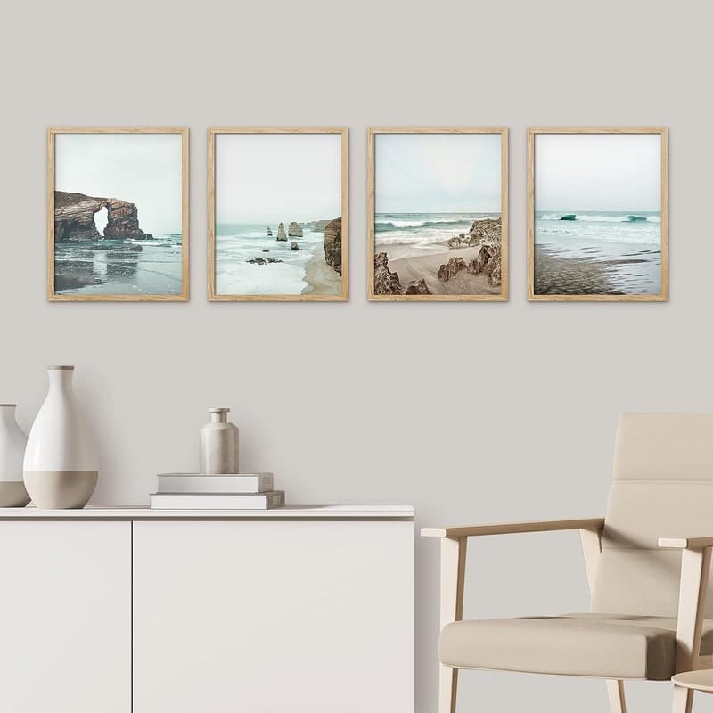
For a triptych, the same principle applies but now you have three frames, usually all in a horizontal row. The spacing between panels one and two should match the spacing between panels two and three. The frames should be the same size and style. Everything about the mockup should reinforce the idea that this is a coordinated set, not a coincidence of three separate prints that happen to end up on the same wall.
When you are looking for a suitable mockup template, search specifically for gallery wall mockups that include same-size frames in a row layout. Avoid templates where frames are staggered at different heights unless your design is specifically intended to be displayed that way.
Aspect Ratio and Panel Proportions
One of the most overlooked considerations when listing a set is making sure the frames in your mockup match the actual aspect ratio of your prints. If you are selling 8x10 panels and your mockup uses square frames, something will feel off even if the buyer cannot articulate exactly what it is. The panels will look compressed or stretched, and the mockup will feel dishonest.
Before you finalize any mockup, check that the frame proportions in the template match your actual product dimensions. For standard print sizes like 5x7, 8x10, 11x14, or 18x24, you should be able to find or create mockups with matching frame proportions without much trouble.
If you are creating your mockups with a tool like Mockupanda, this is straightforward because you can upload your artwork files and the tool places them accurately into the frame slots. The result looks proportionally correct because your actual artwork is in the frame, not a placeholder that may have different dimensions.
Actionable takeaway: Before searching for a mockup template, write down your print dimensions and the aspect ratio for each panel. Make it a non-negotiable filter. Only use templates where the frame proportions match your actual product. This one rule will save you from publishing listing images that subtly mislead buyers about what they are getting.
Creating the Mockup: A Step-by-Step Approach
Once you have chosen the right template structure, creating the actual mockup is a process you can systemize so it takes minutes rather than hours. The goal is to produce one hero image that shows all panels together, plus a few supporting images that give additional context.
Setting Up Your Artwork Files Before You Start
The single most time-saving thing you can do before opening any mockup tool is to prepare your artwork files properly. For a triptych, you will have three separate files, one for each panel. Make sure they are all exported at the same resolution, in the same file format, and with consistent naming so you can easily identify which is which when you are uploading them.
If your panels are designed to bleed into each other visually, meaning the artwork flows continuously across all three panels, double-check that the edges of each panel align correctly when placed side by side. A pixel gap or misalignment between panels two and three that looked invisible at design stage can become obvious at mockup stage when all three frames are hanging in a row.
It also helps to export a composite preview of all three panels placed edge to edge, just so you can visually confirm the full set looks right before committing to mockup creation. This is a ten-second sanity check that can save you from publishing a listing with a subtle error.
Uploading and Placing Your Panels in the Mockup Tool
With Mockupanda, you can upload your individual panel files and assign them to the corresponding frame slots in a multi-frame gallery wall template. The tool handles the placement, scaling, and perspective matching so each frame looks like it is actually hanging on the wall rather than being digitally pasted onto a flat photo.
The key thing to watch for during this step is the order of panels. Left to right should always be panel one, panel two, panel three. Double-check this before exporting, especially if you are doing bulk mockup generation for multiple sets at once. Swapping panels two and three is an easy mistake to make when you are moving fast, and it results in a listing image that shows your artwork in the wrong sequence.
Once the panels are placed, take a close look at the overall composition. Does the set read clearly as a single cohesive thing? Is there enough wall space around the frames so the composition breathes? Is the room styling neutral enough that it will appeal broadly, without being so generic that it looks boring? These are the visual judgment calls that separate a good mockup from a great one.
Actionable takeaway: Create a simple pre-mockup checklist for every set you list. Include: files exported at correct resolution, panels named clearly, alignment at panel edges confirmed, aspect ratio matches template frames, panel order verified left to right. Running through this list takes two minutes and eliminates the most common errors before they make it into your published listing.
Writing Your Listing to Complement the Mockup
The mockup does the visual heavy lifting, but your listing title, description, and photos still need to work together to answer every remaining question a buyer might have. A buyer who loves the mockup but cannot figure out exactly what is included in the purchase will not complete the transaction.
Titles That Make the Set Structure Immediately Clear
Your Etsy listing title has limited space, and most of it should go toward searchable keywords. But within that constraint, your title needs to make the set structure explicit. Use language like Set of 3 Prints, Triptych Wall Art, or Diptych Poster Set early in the title, before you get into descriptive keywords.
Buyers who are specifically searching for sets will use those terms. And for buyers who find your listing through a more general keyword search, seeing Set of 3 in the title immediately contextualizes the mockup they are looking at. They now know the three frames they see in the image are all included in this one purchase.
Avoid vague titles like Abstract Wall Art Collection or Botanical Print Series that do not make the set structure clear. A buyer should not have to read your description to figure out whether they are buying one print or three.
Description Structure That Answers Every Question
Even with a perfect mockup and a clear title, your description needs to do some work. Organize it to answer the questions buyers ask most often about print sets, in the order they are most likely to ask them.
Start with what is included: exactly how many panels, at what sizes, in what file formats. Then explain how the files are delivered, since this is a digital product. Then address the question of how the panels are meant to be displayed, including the recommended spacing between frames if you have a preference. If your design was created to flow continuously across panels, say so explicitly and mention that the panels should be hung in left-to-right order.
Finish with a brief note about print recommendations if you have them. Many of your buyers will be printing at home or sending to a local print shop, and a simple sentence like These files are sized for standard 8x10 printing at any home printer or print shop goes a long way toward reducing post-purchase questions and negative reviews.
Actionable takeaway: After writing your description, read it from the perspective of a buyer who has never heard of you and is not sure whether digital prints are for them. Count how many questions they might still have after reading. If the number is more than one or two, revise until it is zero.
Building a Full Image Set for Your Listing, Not Just the Hero
Etsy allows up to ten listing images, and for a multi-panel set, you should be using at least five or six of them strategically. The gallery wall mockup is your hero image and the most important one, but the supporting images each serve a specific job in moving a buyer from interest to purchase.
The Supporting Images Your Set Listing Needs
After the hero gallery wall mockup, the next most important image is a close-up of one panel so the buyer can see the artwork detail and print quality clearly. If your set has a focal panel, use that one. If all three panels are equally detailed, pick the one with the most visual complexity so buyers can see how well the artwork holds up at close range.
Next, add a size reference image. This is a mockup or simple graphic that shows the frames in context with something recognizable, like a standard door height or a piece of furniture, so buyers can intuitively understand the scale. Buyers consistently struggle to visualize print sizes from dimensions alone. A visual size reference reduces hesitation significantly.
If your set comes in multiple size options, create a separate image that shows the available size variants side by side. This prevents the common buyer confusion of ordering the wrong size and then leaving a frustrated review.
Using Alternate Room Mockups to Broaden Appeal
One gallery wall mockup shot works well, but two or three styled room mockups showing the same set in different settings can dramatically expand your listing's appeal. A triptych that looks beautiful in a light-filled Scandinavian living room might appeal to one buyer, while the same set in a darker, moodier bedroom setting appeals to a completely different buyer.
With a tool like Mockupanda, you can generate multiple room mockups from the same artwork files quickly, without having to manually recreate the setup each time. This is one of the biggest practical advantages of using a purpose-built mockup tool over trying to do everything in Photoshop or Canva. You do the creative work once, and then you can generate variations without starting from scratch.
For a triptych set, a realistic image set might include: a bright living room gallery wall mockup as the hero, a bedroom wall mockup as the second lifestyle image, a close-up detail shot of the most detailed panel, a size reference graphic, and a flat-lay or white background image showing all three panels together for buyers who want to see the artwork without the room styling context.
Actionable takeaway: Map out all five or six of your listing images before you start creating any of them. Assign each image a specific job: hero, lifestyle variant, detail shot, size reference, and so on. Creating images without a plan leads to redundant photos that do not add new information for the buyer and wasted slots that could be doing more selling work.
Common Mistakes to Avoid When Listing Multi-Panel Sets
Even sellers who understand the theory sometimes make avoidable mistakes when they go to actually create and publish their set listings. Here are the ones that show up most often and how to sidestep them.
Inconsistent Frame Styles Between Your Mockup and Your Product Page
If your gallery wall mockup shows black frames and your listing description mentions that the buyer will receive digital files to print and frame themselves, that is completely fine. But if your other listing images show white frames or wood frames, the visual inconsistency creates a subtle sense of confusion. The buyer is not sure which frame style is representative of what the product will look like.
Pick one frame style for your primary mockup and use it consistently across all the lifestyle images in that listing. Save other frame styles for separate listings or as secondary images that are clearly labeled as alternate display options.
Forgetting to Specify Download and File Details for Each Panel
For digital print sets, buyers need to know that they will receive three separate files, one for each panel. This sounds obvious to you, but a buyer who has not purchased a digital print set before might assume they receive a single file that they print three times. If your set is designed to have different artwork on each panel, that misunderstanding will lead to unhappy buyers.
Be explicit in your description: You will receive 3 separate high-resolution files, one for each panel. File names will clearly indicate which is the left, center, and right panel. This level of specificity prevents confusion and reduces the support messages you have to answer after purchase.
Pricing the Set Without Signaling the Value of the Bundle
One of the reasons to list a diptych or triptych as a set rather than three individual prints is that it allows you to price at a slight premium while still offering the buyer perceived savings compared to buying the panels separately. But this only works if you communicate the bundled value clearly.
If you also sell the individual panels separately, mention in your set listing description that the set is priced as a bundle. Even if the difference is small, the perception of getting a deal encourages buyers to choose the set over a single panel, which increases your average order value.
Actionable takeaway: Before publishing your set listing, pull up a fresh browser window and look at the listing the way a first-time buyer would. Check for visual consistency across all images, verify that the description makes the file delivery absolutely clear, and confirm that the pricing structure makes sense. Fresh eyes catch the mistakes that familiarity hides.
Putting It All Together: A Repeatable Process for Every Set You Sell
The real payoff of getting this right once is that you can repeat the process for every set you add to your shop. Print-on-demand sellers who scale successfully are not doing everything from scratch each time. They build repeatable systems that maintain quality while reducing the time cost of each new listing.
Here is a simple process you can run for every new diptych or triptych you add to your catalog.
First, export your panel files, name them clearly, and check alignment at the edges. Second, open your mockup tool, select your gallery wall template, and place the panels in the correct order. Third, generate your hero mockup and one or two lifestyle variants. Fourth, create a size reference graphic using your standard template. Fifth, write your listing using a description template that you adapt rather than rewrite from scratch. Sixth, upload all images in order, with the gallery wall hero first.
This process, once you have done it two or three times, takes less than thirty minutes per listing. The first time through will take longer because you are making decisions. After that, you are executing a system.
Mockupanda is built to fit naturally into this kind of workflow. Because it is designed specifically for print-on-demand sellers rather than being a generic design tool, the features that matter most for this use case, such as multi-frame gallery wall templates, bulk processing, and consistent output quality, are front and center rather than buried in menus.
If you are listing sets regularly, the time you save on mockup creation adds up quickly. And because the output looks consistently professional, your gallery wall mockups will hold up to comparison with the competition in Etsy search results, which is where the battle for clicks is won or lost.
The goal is not just one great listing. It is a shop full of listings where every set, every collection, and every new design gets the same professional visual treatment without requiring you to spend hours on it. That consistency is what builds a brand that buyers trust and return to.
Keep reading
How to Create a Cohesive Etsy Shop Front Using Mockups With a Consistent Color Palette Across All Listings
Why Etsy Buyers Judge Your Entire Shop Quality From the First Mockup They See