How to Create Mockups That Show Print Scale Accurately So Buyers Stop Leaving Negative Reviews About Size
Nothing stings quite like a negative review that says something like "way smaller than I expected" or "the print looked huge in the photos but it's tiny in real life." You did everything right. You listed the dimensions. You uploaded a beautiful mockup. And somehow the buyer still felt misled.
This is one of the most common complaints digital print and wall art sellers face on Etsy. And the frustrating truth is that it almost never comes down to dishonesty on your part. It comes down to a gap between what the buyer imagined and what the mockup actually communicated.
The good news is that this is a solvable problem. With the right approach to mockup creation and listing structure, you can close that gap entirely. This guide is going to walk you through exactly how to do that.
Why Buyers Get Confused About Print Size in the First Place
Before you can fix the problem, it helps to understand why it keeps happening. Most sellers assume that if they write the dimensions in the title or description, buyers will read them and understand. But that is not how people shop online, especially on Etsy.
Buyers Shop Visually First, Textually Second
On Etsy, buyers are scanning thumbnails and reacting emotionally to images. They are not opening your listing and immediately reading your description. They fall in love with a print first, and then maybe they check the details. And even when they do read the dimensions, a number like "18x24 inches" is genuinely hard to visualize for most people.
Think about the last time you tried to picture something in your head based on measurements alone. Unless you are a designer or work in a trade where you handle physical materials constantly, numbers like that are abstract. You might know roughly that 18x24 is larger than a piece of paper, but your brain does not naturally map that onto a wall in your home.
Your mockups need to do that work for your buyers. The image should answer the question "how big is this going to look on my wall" before the buyer even thinks to ask it.
Misleading Angles and Empty Walls Distort Perception
A lot of scale confusion comes directly from common mockup mistakes that are easy to make without realizing it. When you place a print on a wall with no surrounding furniture or objects, the brain has no reference point. The print could be eight inches wide or eight feet wide. There is no way to tell.
The same problem happens with extreme close-up mockups. They look gorgeous in a thumbnail, but they strip away all context. A beautifully styled close-up of a frame and print tells the buyer nothing about how that print will actually fit in their space.
Angles can also distort size perception significantly. A print photographed or mockuped at an angle can appear much larger or smaller than it actually is depending on the perspective and the lens focal length baked into the template.
Takeaway: Use mockup templates that include room context with clearly visible furniture and architectural elements. Avoid bare-wall or close-up-only mockup sets, especially as your first listing image.
The Elements of a Scale-Accurate Mockup
So what actually makes a mockup communicate scale correctly? There are a few specific components that do most of the heavy lifting.
Human or Furniture References Are Non-Negotiable
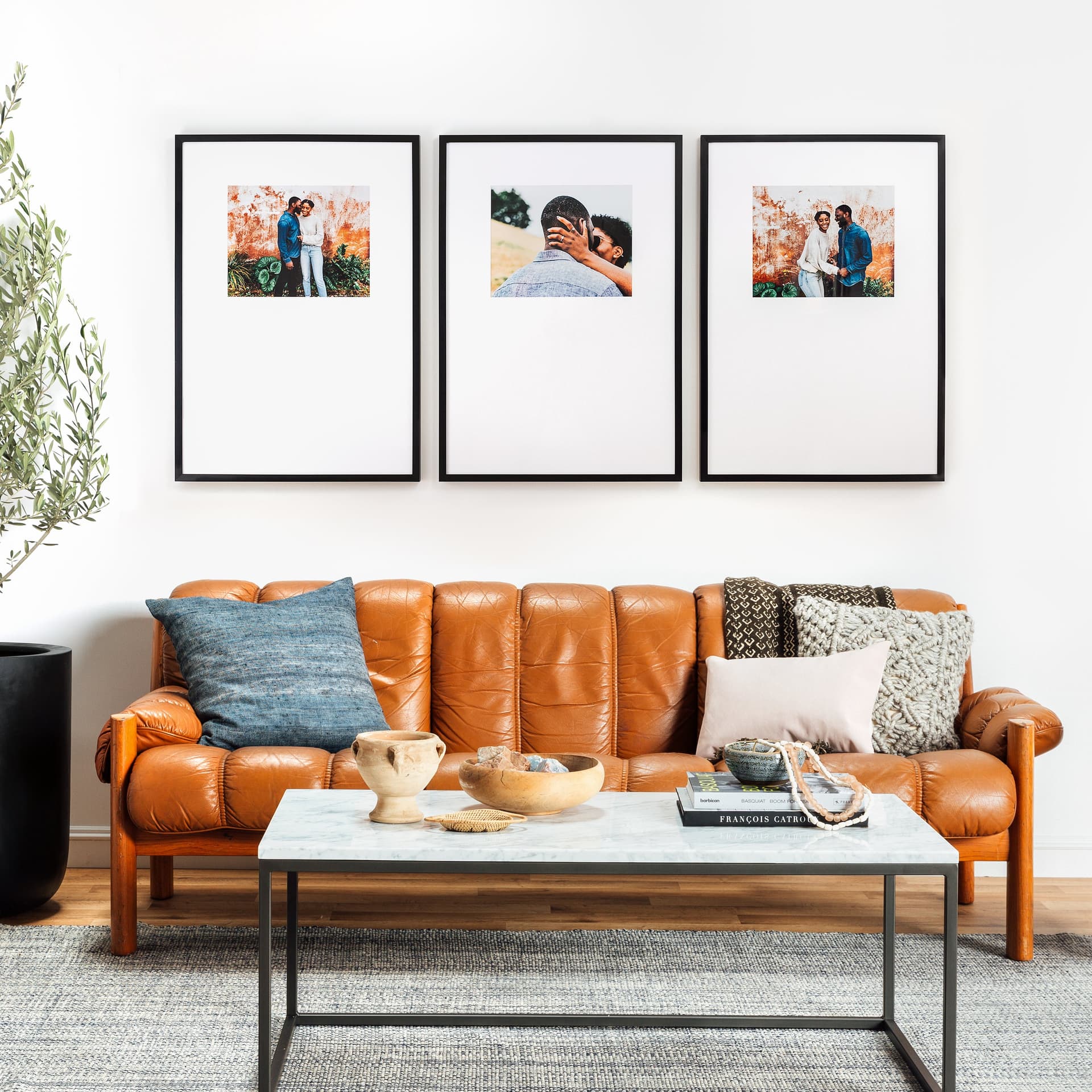
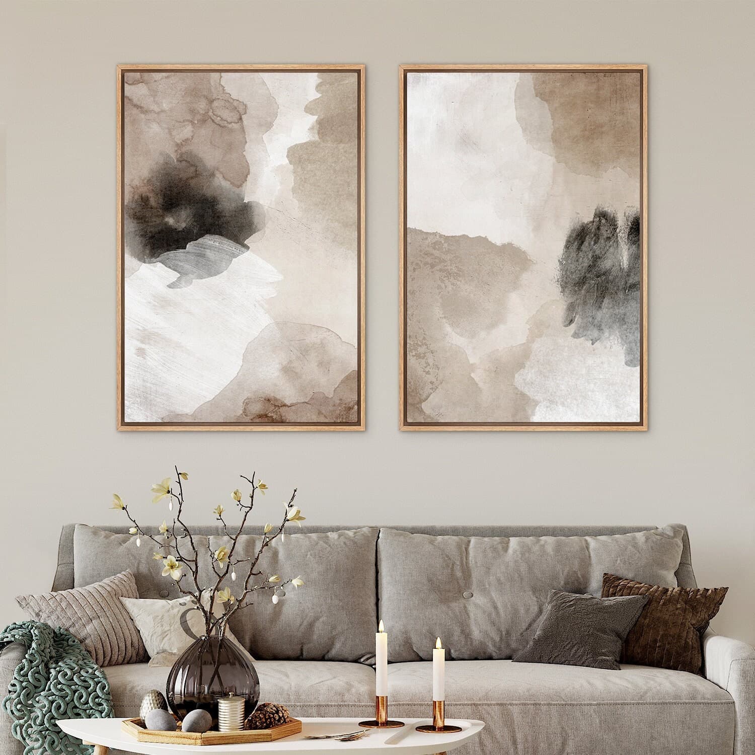
The most powerful scale reference you can include in a mockup is a human being. When a buyer sees a person standing next to a framed print on a wall, their brain instantly calculates the relative size. It is an involuntary process and it works every time.
Not every mockup needs a person in it, but at least one image in your listing gallery should include a clear human scale reference. This could be someone hanging the print, a lifestyle shot where a person is casually in frame, or even just a hand holding the print near a wall.
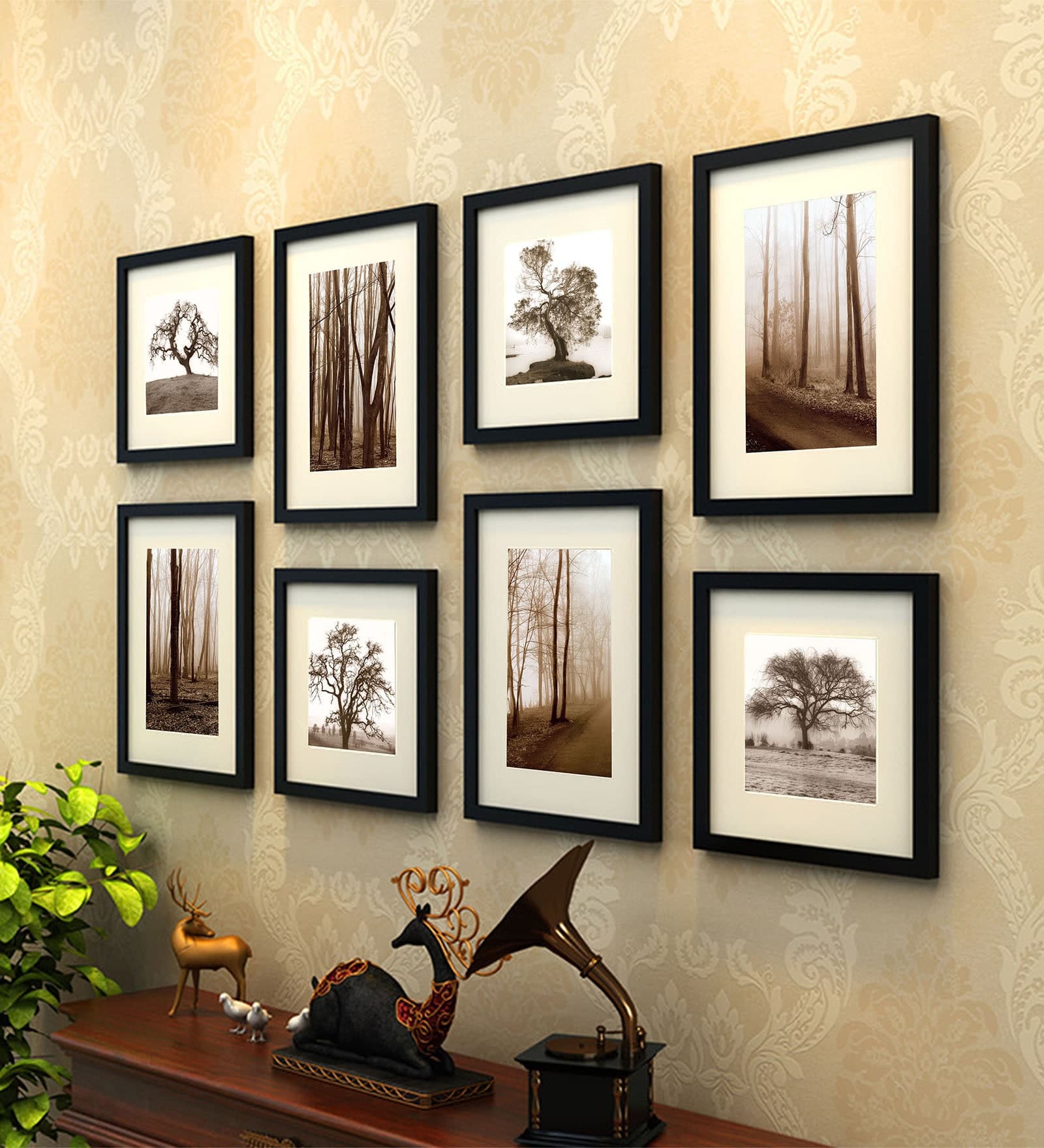
Furniture works almost as well. A sofa, a bed, a dining table, a dresser, these are objects whose approximate size most people carry in their mental models. When your print appears above a couch and it takes up roughly a third of the wall space above that couch, buyers understand the scale immediately.
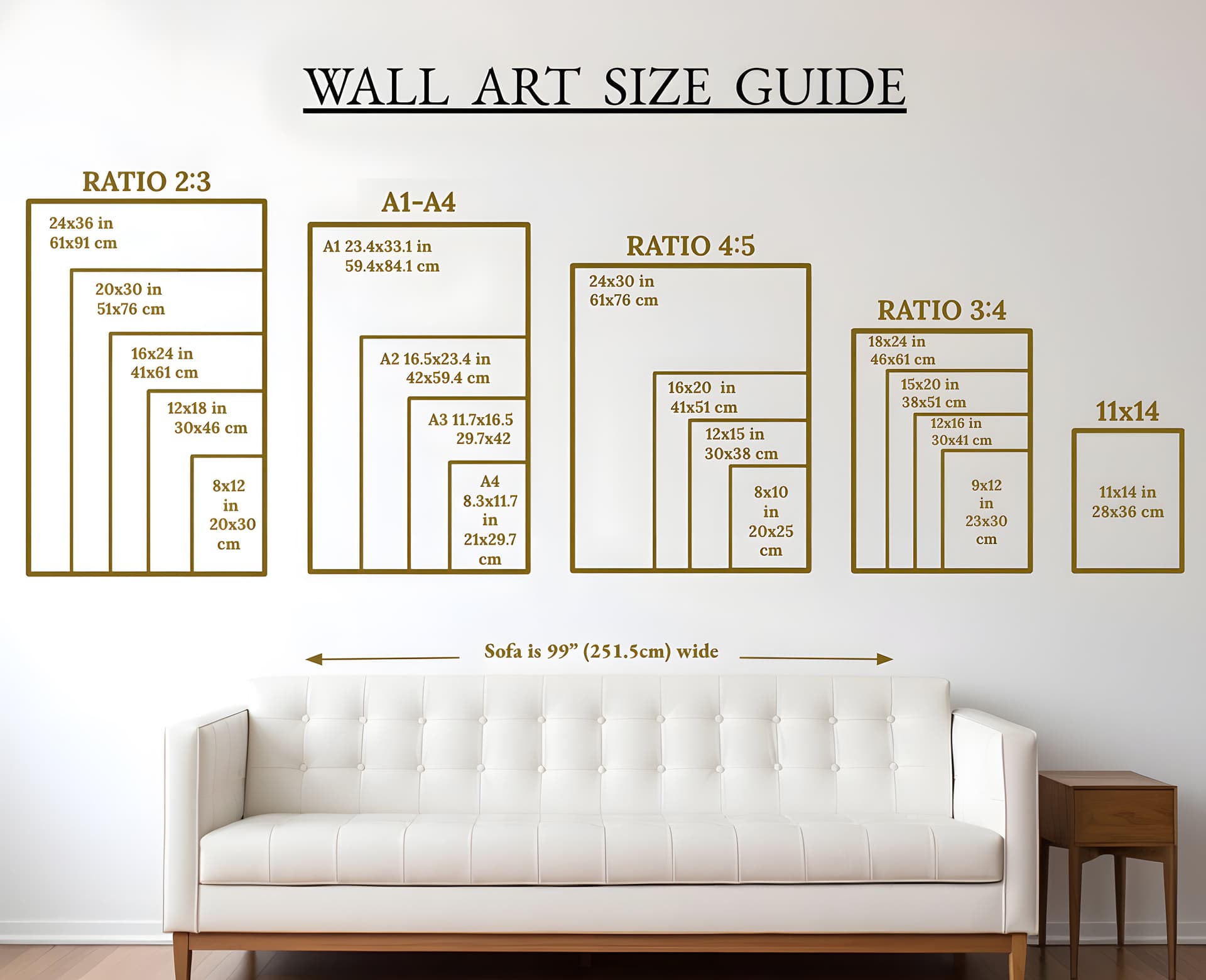
Dimension Labels on the Mockup Itself
This is one of the most underused tools in a print seller's arsenal. Adding a clean, readable dimension label directly onto your mockup image removes all ambiguity. Instead of asking buyers to cross-reference a number in your description, you are putting the information exactly where they are already looking.
This does not have to look clunky or overly technical. A simple line like "18 x 24 in" in a small, clean font placed at the bottom of the frame or in the corner of the image is enough. Keep it tasteful so it does not distract from the art itself, but make sure it is legible at thumbnail size.
You can take this even further by creating a scale comparison graphic. This is an image that shows your print in multiple sizes side by side in the same room context, so a buyer shopping for an 8x10 can immediately see how it compares to the 16x20 option.
Use Real-World Room Dimensions When Possible
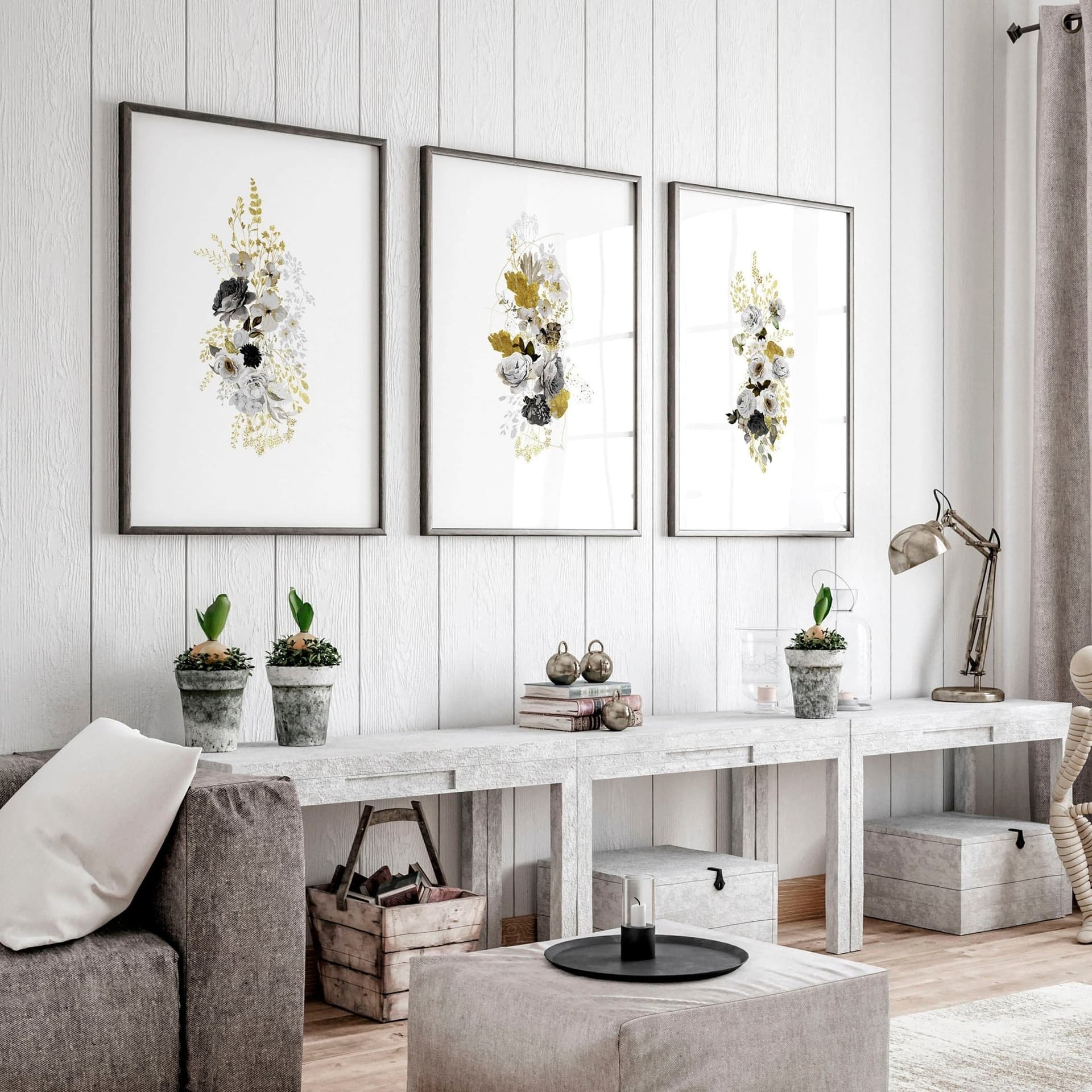
Some mockup styles place your print against a wall with no context at all. Others use stylized rooms where the proportions are artistic rather than realistic. Both of these can distort scale.
When you are selecting mockup templates, look for ones that use realistic room proportions. Standard ceiling heights, normal sofa dimensions, average doorframe widths. If a room looks like it came out of a design magazine where the ceilings are twelve feet high and the furniture is custom scaled, the size communication is going to be off.
When you are using a tool like Mockupanda to generate your mockups, choose templates that show real living spaces with believable proportions. The more grounded the environment looks, the more accurately your buyer's brain will interpret the scale of the print in it.
Takeaway: Every listing should include at least one mockup with a clear human reference or realistic furniture context, plus a dimension label directly on the image. These two elements alone will dramatically reduce size-related confusion.
How to Structure Your Listing Image Gallery for Size Clarity
Even if you have great scale-accurate mockups, they only work if buyers actually see them. How you order and structure your image gallery matters a lot.
Lead With Context, Not Just Beauty
The first image in your gallery is your thumbnail. It is what appears in search results and category pages. Most sellers choose their most beautiful mockup for this slot, which makes sense from a click-through perspective. But beautiful does not always mean informative.
Your first image should ideally be both beautiful and contextual. A well-styled room shot with the print in place, furniture visible, and real proportions intact can do both jobs at once. It should make the buyer want to click, but it should also immediately communicate that this is a real-world sized print in a real-world space.
If you have to choose between a gorgeous abstract close-up and a slightly less polished but context-rich room shot, go with the room shot as your first image. The close-up can be second or third.
Use the Second and Third Images for Size Education
Once a buyer has clicked into your listing and they are scrolling through your gallery, images two and three are doing the job of building confidence. This is where you put your most educational scale content.
Image two is a great place for your dimension comparison graphic, showing the print in multiple available sizes in the same room. Image three works well for a mockup that includes a clear human reference, or a styled flat-lay that shows the print next to common objects like a book, a plant, or a coffee mug to give tactile scale.
Think of your gallery as a conversation. The first image says "look how beautiful this is." The second and third say "and here is exactly what you are going to receive."
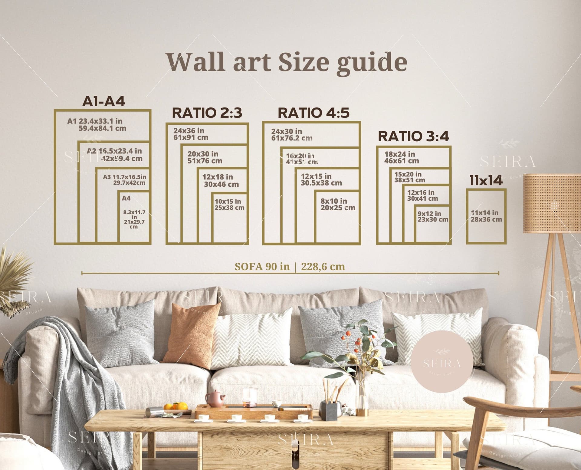
Include a Dedicated Size Guide Graphic
Beyond your styled mockups, consider adding a clean, simple size guide graphic as one of your listing images. This does not need to be fancy. A white background with your available sizes shown as rectangles with their dimensions labeled, potentially with a human silhouette for comparison, is incredibly effective.
Many buyers specifically look for this kind of image when they are trying to decide between sizes. Having it in your gallery saves them the effort of trying to visualize the numbers themselves, and it positions you as a seller who takes buyer clarity seriously.
You can create this kind of graphic as a text overlay directly in Mockupanda, keeping the style consistent with your other branding rather than creating a one-off graphic in a separate tool.
Takeaway: Structure your gallery so the first image is contextual and beautiful, images two and three handle scale education, and consider adding a dedicated size guide graphic as a standalone image in the set.
Common Mockup Mistakes That Cause Size Complaints
Let's talk specifically about the mistakes that lead to those frustrating negative reviews, so you can audit your existing listings and fix them.
Oversized Frames in Lifestyle Mockups
This is a surprisingly common issue with generic mockup templates. The template designer created a beautiful room mockup, but the frame in the template is proportionally much larger than it would be in real life. The room looks stylized, the proportions feel slightly off, and buyers end up thinking they are buying a large statement piece when they are actually ordering an 8x10.
When you review your mockup templates, ask yourself whether the frame looks realistically sized relative to the furniture. If a sofa is in frame and the print above it takes up more than about half the wall width, you are either looking at an oversized frame template or a very large print. Make sure your template matches your actual product.
Using Only Square or Close-Cropped Mockups for Rectangular Prints
Etsy thumbnails are square. This creates a real problem when your print is a vertical or horizontal rectangle, because the thumbnail often crops the mockup in a way that distorts what the buyer sees. A tall vertical print shown in a square thumbnail with heavy cropping can look almost square, which leads to size and shape surprises on delivery.
Use room-context mockups that show the full print without heavy cropping, even if the resulting image has more white space on one side. The accurate representation of your print's shape and proportions is more important than filling the frame.
No Size Options Shown Together
If you sell the same design in multiple sizes, showing only one size in your mockup gallery is leaving buyers without a critical piece of information. They have no way to compare how the 11x14 looks versus the 24x36 in an actual space.
Bulk mockup generation tools like Mockupanda make it practical to create a full set of size-specific mockups without spending hours in design software. You can generate mockups for every size variant and include a comparison graphic, all in a fraction of the time it would take manually. This used to be the kind of thing only high-volume sellers with design teams could do consistently. Now it is genuinely accessible.
Takeaway: Audit your existing listings for oversized template frames, cropped rectangular prints, and missing size comparisons. These three issues account for the majority of preventable size-related complaints.
What to Write in Your Listing to Reinforce Scale Communication
Mockups do most of the heavy lifting, but your listing copy should back them up. The goal is not to repeat yourself endlessly, it is to make the size information impossible to miss.
Put Dimensions in Your Title, Not Just Your Description
Etsy allows you to include dimensions in your listing title, and you should use that space. Something like "Botanical Print, Digital Download, 8x10 16x20 24x36" in the title means that buyers see the size options before they even open the listing. This pre-filters buyers who are looking for a specific size and reduces the chance that someone buys the wrong size by mistake.
Do not bury dimensions only in the description. Most buyers do not read descriptions until after they have already decided they want the product. By then, the mental image of what they expect has already formed based on your mockups.
Write a Clear, Specific Size Section in Your Description
In your listing description, include a dedicated section that lists every available size, what that size looks like on a wall, and any specific guidance that is relevant to your product. For example, if your print is designed to be displayed at 8x10, you might note that it is a popular size for gallery walls or a nightstand display. If the 24x36 is your statement piece option, say that and describe the kind of space it works best in.
This kind of contextual language helps buyers self-select the right size and sets accurate expectations in a way that pure numbers cannot.
Address Size FAQs Proactively
If you consistently get questions about whether a certain size will fit above a standard sofa, or how a print looks in a small apartment, answer those questions directly in your description or in a dedicated FAQ section. Proactive answers to the questions buyers actually ask are one of the most effective ways to reduce both confused messages and disappointed reviews.
Takeaway: Dimensions belong in your title, your description, and ideally on your mockup images. Triple-coverage of this information is not overkill. It is what it takes to reach every type of buyer.
Building a Consistent, Scale-Accurate Mockup Workflow
Once you understand what accurate scale mockups look like, the next challenge is creating them consistently across your entire shop without spending all your time on image production.
Batch Your Mockup Creation by Product Category
The most efficient way to maintain scale-accurate mockups across a large shop is to create them in batches by product type. All your 8x10 prints get processed together, all your 16x20 prints together, and so on. This way you are working with the same template set and the same settings each time, which means consistent scale representation across similar products.
Bulk mockup generators are built for exactly this kind of workflow. You upload a batch of print files in the same size, select your scale-appropriate templates, and generate a full set of mockups in minutes rather than hours.
Create a Template Library Organized by Print Size
Over time, build a personal library of mockup templates that you know represent each size accurately. Tag or organize them by print size so that when you are uploading a new 11x14 print, you already know exactly which templates to reach for. This removes the guesswork from template selection and ensures that your scale communication is consistent across every new listing.
Mockupanda supports this kind of organized, repeatable workflow. Because it is built specifically for print-on-demand and digital print sellers rather than generic design use cases, the template selection and bulk generation process is structured around the way you actually work, not the way a general-purpose design tool assumes you work.
Review New Mockups With Fresh Eyes Before Publishing
Before you publish any new listing, look at your first mockup image as if you were a buyer who had never seen your shop before. Ask yourself honestly: if I had no idea what size this print was, could I tell from this image? If the answer is no, add scale context before you publish.
This ten-second review step is one of the simplest habits you can build to protect your review score. Most size-related complaints are completely preventable at this stage.
Takeaway: Build a repeatable mockup workflow organized by print size, maintain a template library you trust for scale accuracy, and review every first image from a buyer's perspective before you publish.
The Payoff Beyond Fewer Negative Reviews
Fixing your scale communication is not just about avoiding complaints. It has a direct positive effect on your conversion rates and your shop's reputation.
When buyers feel confident about what they are getting, they buy more readily and they come back. When your mockups are honest and clear, the customers who purchase are the right customers, people who wanted exactly what you delivered. That alignment between expectation and reality is what generates five-star reviews, repeat purchases, and word-of-mouth recommendations.
There is also a pricing dimension here. Sellers with professional, clear, scale-accurate mockups are able to justify higher price points because their listings look polished and trustworthy. A blurry close-up mockup with no scale context communicates uncertainty. A well-styled room mockup with dimension labels and a size comparison graphic communicates professionalism. Buyers pay more for the second seller.
Creating these mockups used to require hiring a designer or spending hours in Photoshop. With the right tools and a clear workflow, it is genuinely something you can build into your regular listing process without it becoming a burden. Start with your best-selling listings, fix the scale communication there first, and work outward from that foundation.
Your buyers want to love what they receive. Give them every possible opportunity to know exactly what that is going to look like on their wall before they ever check out.
Keep reading
How to Showcase Poster Sets on Etsy Using Gallery Wall Mockup Templates
How to Use Lifestyle Mockups to Sell Abstract Art to Buyers Who 'Don't Get It' Yet