How Many Mockup Images Should Each Etsy Listing Have for Digital Prints?
If you sell digital prints on Etsy, you already know that your listing images are doing most of the heavy lifting. Shoppers can't touch your product, try it on, or hold it up against their wall. All they have is what they see on screen. So when it comes to how many mockup images you should include in each listing, the stakes are genuinely high.
Etsy allows up to ten images per listing. Most sellers either cram in ten images because they can, or upload two or three because they ran out of time. Neither approach is intentional, and neither one is optimized for conversions.
The honest answer to how many images you need is: it depends on what those images are actually showing. But there is a practical sweet spot, and there is a clear framework for building your image set so every single slot earns its place.
Let's break it all down.
Why Your Image Count Matters More Than You Think
First Impressions Happen in Under a Second
When someone lands on your Etsy listing, they are not reading your description. They are looking at your first image. That thumbnail is competing with dozens of other listings in search results, and buyers make a split-second decision about whether your product looks worth clicking on.
Once they are inside your listing, the rest of your images form a kind of silent sales conversation. Each one should answer a question the buyer is silently asking: What does this look like in a real room? What size is it? Does it come in other colors? Is it worth the price?
If your images don't answer those questions, buyers leave. Not because they disliked your product, but because they didn't feel confident enough to buy it.
More Images Signals Professionalism
There is also a trust signal at play. A listing with one blurry image reads as unfinished or low-effort. A listing with seven or eight well-composed mockups that show the product in context reads as a real business. That perception directly affects whether someone is willing to pay a premium price for what you're selling.
This is especially important for digital prints because the price point can feel hard to justify. Buyers know they're getting a file, not a physical object. Strong, professional mockup images are the main tool you have for communicating the value of your work and making that price feel completely reasonable.
Takeaway: Treat your image slots as a sales conversation, not a photo dump. Every image should answer a specific buyer question or reinforce the value of your product.
The Ideal Number of Mockup Images for a Digital Print Listing
The Sweet Spot Is Seven to Ten Images
For most digital print listings, seven to ten images is the right target. Etsy gives you ten slots. Using fewer than seven leaves conversion opportunity on the table. Using all ten is smart if you can fill them with genuinely useful content, but there is no award for reaching ten if your last three images are filler.
Seven images is a realistic, achievable goal for most sellers. It gives you enough room to cover all the key buyer questions without feeling like you are forcing content for the sake of it. Ten images makes sense for bestsellers, higher-priced prints, or any listing where you want to maximize conversion rate.
If you are just starting out and trying to get listings live quickly, aim for a minimum of five. Below five, your listing starts to feel incomplete compared to the competition.
What the Research and Etsy's Own Data Suggests
Etsy has publicly noted that listings with more high-quality images tend to perform better in search and convert at higher rates. Sellers who regularly test their image sets report that adding contextual lifestyle mockups, specifically images showing the print inside a real-looking room, consistently improves add-to-cart rates.
This lines up with what we know about how people make purchase decisions online. The more vividly a buyer can picture your product in their own home, the more emotionally connected they become to it, and the more likely they are to buy. Mockups do that work.
Takeaway: Aim for seven to ten images per listing. Set a floor of five if you are in a rush, but prioritize getting to seven before you move on to creating new listings.
What Each Image in Your Listing Should Show
Image One: The Hero Mockup
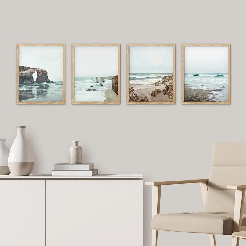
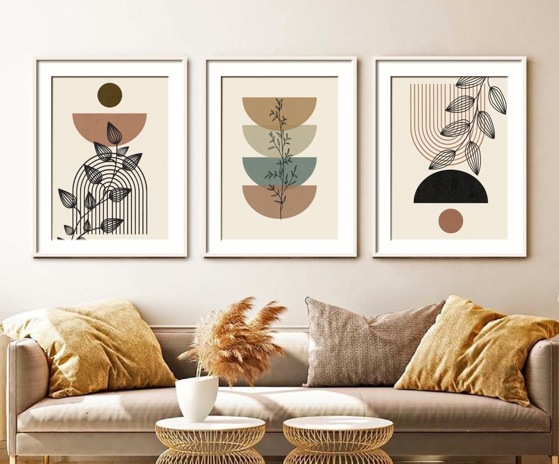
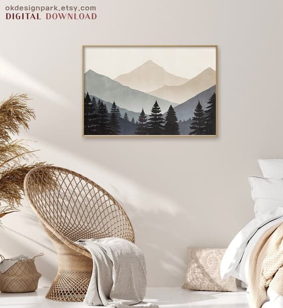
Your first image is your thumbnail. It needs to stop the scroll. For digital prints, this almost always means a high-quality lifestyle mockup showing the print displayed in a beautiful, relevant room setting. A minimal Scandinavian living room, a bright nursery, a cozy reading nook, whatever matches the vibe of your print.
This is not the place to show the raw digital file or add a lot of text. Clean, well-lit, aspirational. The buyer should look at it and think, I want my home to look like that.
Images Two Through Four: Different Contexts and Angles
Once the buyer clicks through, they want to see more. Images two through four should show the print in different settings or from different perspectives. A bedroom if your first image was a living room. A closer crop showing the detail and quality of the design. A version with a different frame style if relevant.
For digital prints, this is also where you can show multiple size options. A small 5x7 on a gallery wall alongside larger statement pieces gives buyers a sense of scale and shows them the product's versatility. This directly reduces a common hesitation: buyers often aren't sure what size to order, and seeing it visualized helps them commit.
Images Five Through Seven: Practical and Trust-Building Content
This section is where many sellers skip out, and it's a mistake. Images five through seven are where you build buyer confidence and handle objections before they arise.
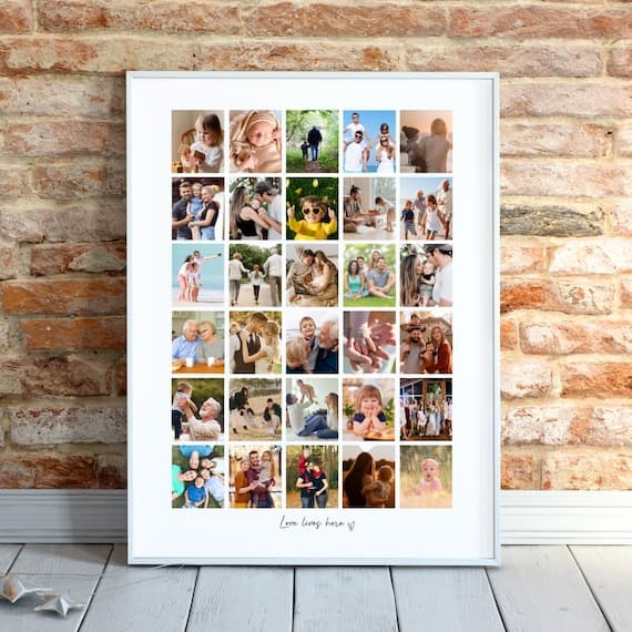
A size comparison image is extremely valuable here. Show your print sizes next to something recognizable, or lay them out in a simple graphic that shows the relative dimensions. Buyers who understand sizing are far more likely to purchase the right size the first time, which also reduces your support messages.
An image showing the file types included (JPEG, PDF, etc.) and download instructions gives buyers clarity on what they're actually getting. For digital products, this kind of transparency reduces refund requests and purchase anxiety.
A close-up of the artwork itself showing texture, color accuracy, or fine detail rounds out this section and reinforces the quality of your work.
Images Eight Through Ten: Bonus Value and Brand Reinforcement
If you are going for all ten slots, use the final images strategically. Show the print styled in a different aesthetic context to broaden its appeal. Include a color variation if your design comes in multiple palettes. Add a simple graphic explaining your instant download process if buyers in your niche frequently ask how digital downloads work.
You can also use this space for a soft brand moment, a clean image with your shop name or a tagline, something that makes the listing feel cohesive and professional without being salesy.
Takeaway: Build your image set like a one-way sales conversation. Start with aspiration, move to context and versatility, then handle objections and add trust signals before closing with bonus value.
The Biggest Mistakes Sellers Make With Listing Images
Uploading the Raw File as the First Image
This is the single biggest mistake digital print sellers make. The raw design file, even if it's beautiful, does not communicate value the same way a lifestyle mockup does. A flat white square with artwork on it tells the buyer what your file looks like. A mockup of that file framed and hanging above a mid-century modern sofa tells the buyer what their home could look like.
Even if your design is stunning, lead with a mockup. Always.
Using Low-Resolution or Poorly Matched Mockups
Not all mockups are created equal. A pixelated image, a mockup where your print is obviously pasted on at the wrong angle, or a room setting that clashes with your design's aesthetic all undermine the professionalism you are trying to project.
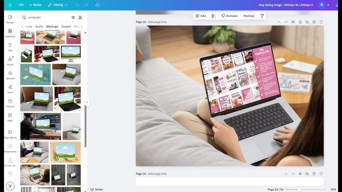
This is where having a reliable tool for creating clean, well-matched mockups pays off. Mockupanda was built specifically for this kind of workflow, letting you drop your design into high-quality mockup templates and generate professional images quickly, without needing Photoshop or design experience. When you can produce polished mockups efficiently, you are more likely to actually fill all ten image slots instead of stopping at three because it got too tedious.
Ignoring Mobile Viewers
Over 70% of Etsy traffic comes from mobile devices. Your images need to look good on a small screen. That means your hero image should be readable as a thumbnail, your text-based images should use large, legible fonts, and close-up mockups should show detail clearly at small sizes.
Before you publish a listing, scroll through your images on your phone. If anything looks cluttered, too small, or hard to read, fix it before it goes live.
Takeaway: Avoid the raw file as your hero image, invest in quality mockups that match your design's aesthetic, and always check your images on mobile before publishing.
How to Build Your Image Set Efficiently
Create a Template System
If you have a consistent shop aesthetic, you do not need to reinvent your image set from scratch for every listing. Build a template system where the structure stays the same and only the artwork swaps out.
For example, your size comparison graphic might always use the same layout with your branding. Your file information image might always be the same design. You only need to create those template images once, then update the artwork for each new listing. This dramatically reduces the time it takes to launch new products.
Use Bulk Mockup Generation for Volume
If you have a large catalogue or you are launching multiple listings at once, creating mockups one by one is a serious time drain. Tools that support bulk mockup generation let you apply your designs to multiple mockup templates in one go, which is exactly how Mockupanda approaches this problem.
Instead of spending an hour creating images for a single listing, you can generate a full set of mockups for several listings in the same amount of time. That time compounds quickly if you are regularly adding new products to your shop.
Match Your Mockups to Your Target Buyer
The room settings and styling in your mockups should reflect the taste and lifestyle of the person most likely to buy your prints. If you sell botanical prints, use bright, airy spaces with plant-filled shelving. If you sell minimalist typography art, use clean, modern interiors with neutral palettes.
This is not just aesthetic, it is targeting. The right buyer should look at your mockup and feel like it was made for them. The wrong buyer will scroll past either way, so your job is to connect as strongly as possible with the right one.
Takeaway: Build a reusable template system for your non-mockup images, use bulk generation tools to speed up mockup creation, and always style your mockups to match your target buyer's aesthetic preferences.
Updating Your Existing Listings
Audit Your Lowest-Converting Listings First
If you already have an established shop, you don't need to redo every listing at once. Start by identifying your listings with the lowest conversion rates. In your Etsy shop stats, you can see how many views each listing gets versus how many orders it generates. Listings with high views but low conversions are often image problems in disguise.
Pick your five to ten lowest-converting listings and rebuild their image sets using the framework above. Add more mockups, improve the quality of what you have, and make sure you are hitting the practical trust-building images in slots five through seven. Then monitor your stats over the next few weeks to see the impact.
Refresh Seasonal and Trending Products
Listings that are tied to seasons, holidays, or design trends can benefit from image refreshes that reflect the current context. A Halloween print that performed well last year might get a boost from updated mockups that show it styled in a more current interior aesthetic.
You don't need to change your designs to stay relevant. Updating your mockup images is often enough to make a listing feel fresh and current, which can give it a second life in Etsy's search algorithm.
A/B Test Your Hero Images
Etsy does not offer a built-in A/B testing tool, but you can do informal tests by swapping your hero image and tracking your click-through rate over a set period. If you notice a meaningful change in traffic or sales after updating your first image, you've found a winner. Keep that version and move on to optimizing the next listing.
This kind of iterative improvement is how successful Etsy shops are built. Small, consistent upgrades to your listings compound over time into significantly better overall performance.
Takeaway: Start your image audit with your lowest-converting listings, refresh seasonal products with updated mockups, and run simple before-and-after tests on your hero images to find what drives the best click-through rates.
Putting It All Together
The short answer to how many mockup images your Etsy digital print listing should have is: as many as you need to confidently answer every question a potential buyer might have, up to ten.
In practice, that means aiming for seven to ten images structured as a deliberate sales conversation. Lead with a beautiful lifestyle mockup that stops the scroll. Follow up with context, versatility, and detail. Then handle objections and build trust with practical information. Use any remaining slots to reinforce your brand and broaden your product's appeal.
The sellers who do this consistently are the ones who build shops that convert well even without constantly chasing new customers. Your images are working for you around the clock. Making them as good as possible is one of the highest-leverage investments you can make in your Etsy business.
And if the bottleneck is time rather than strategy, that's exactly the problem Mockupanda was designed to solve. Fast, affordable, and built specifically for print-on-demand sellers who need professional results without a design degree or a bloated software subscription.
Keep reading
How to Use Mockup Images in Your Etsy Shop Announcement and Banner to Build Trust Before a Buyer Clicks a Single Listing
How to Create a Cohesive Etsy Shop Front Using Mockups With a Consistent Color Palette Across All Listings