How to Use Mockup Images in Your Etsy Shop Announcement and Banner to Build Trust Before a Buyer Clicks a Single Listing
There is a moment that happens every time someone discovers your Etsy shop. Maybe they found you through a search, a Pinterest pin, or a friend's recommendation. They land on your shop homepage, and in about three seconds they decide whether you look legit or not.
Most sellers are completely blind to this moment. They pour time into individual listing photos, keyword research, and pricing strategy, but their shop banner is a blurry stock image they threw up two years ago, and their announcement section is either empty or says something like "Welcome to my shop! I love making things!"
That three-second window is a trust signal. And right now, most Etsy shops are failing it.
The good news is that fixing this is not complicated. If you sell digital prints, wall art, or any kind of print-on-demand product, you already have everything you need. You just need to use your mockup images in the right places, with the right intention.
This post is going to show you exactly how to do that.
Why Your Shop Homepage Matters More Than You Think
Etsy has trained sellers to think at the listing level. The platform's own seller resources talk about listing SEO, listing photos, listing descriptions. And yes, all of that matters. But your shop homepage is functioning like a storefront window, and a lot of buyers will glance at it before they ever click a listing.
When someone lands on your shop, they are not just evaluating a product. They are evaluating you as a seller. They are asking themselves, consciously or not, questions like: Does this shop look professional? Does the style match what I am looking for? Would I feel comfortable buying from this person?
Your banner and announcement are the two places where you can answer those questions before a buyer has to do any work.
The Psychology of First Impressions in Online Shopping
Research on consumer behavior consistently shows that visual credibility signals matter enormously in online shopping, especially on marketplace platforms where multiple sellers compete for the same buyer. When a buyer cannot touch the product, cannot walk into a physical store, and cannot easily vet the seller, they rely on visual cues to gauge trustworthiness.
A polished, cohesive shop homepage visually communicates that you take your business seriously. A mockup image showing a beautifully framed print hanging on a clean white wall tells the buyer far more than a product description ever could. It shows them the lifestyle context of the product. It shows them what quality looks like. It does the work of imagination for them.
The opposite is also true. A banner with a low-resolution image, mismatched colors, or no clear product focus sends an unconscious signal that the seller might not be attentive to quality. Buyers may not even be able to articulate why they clicked away. They just did not feel confident.
What Buyers Are Actually Looking For in Those First Seconds
Before clicking into any listing, a buyer scanning your homepage is trying to answer a few quick questions. First, what does this shop sell? Second, does the aesthetic match my taste? Third, does this look like a real business or a hobby project?
Your banner and announcement can answer all three of those questions directly. The banner is primarily visual, so it should show your products in a way that communicates both what you sell and how it will look in someone's home or space. The announcement is your chance to add a few words of context that reinforce the visual impression the banner just made.
When these two elements work together with intention, the buyer arrives at your listings already primed to trust you. That is a completely different buying mindset than arriving with skepticism and looking for reasons to leave.
Actionable takeaway: Go look at your shop homepage right now as if you are a first-time visitor. Ask yourself those three questions. If you cannot answer them within three seconds from the banner alone, that is the problem you need to solve first.
How to Use Your Banner to Create an Instant Visual Identity
Your Etsy shop banner is prime real estate. It spans the full width of your shop, it is the first large visual element on the page, and it is completely under your control. Most sellers waste it.
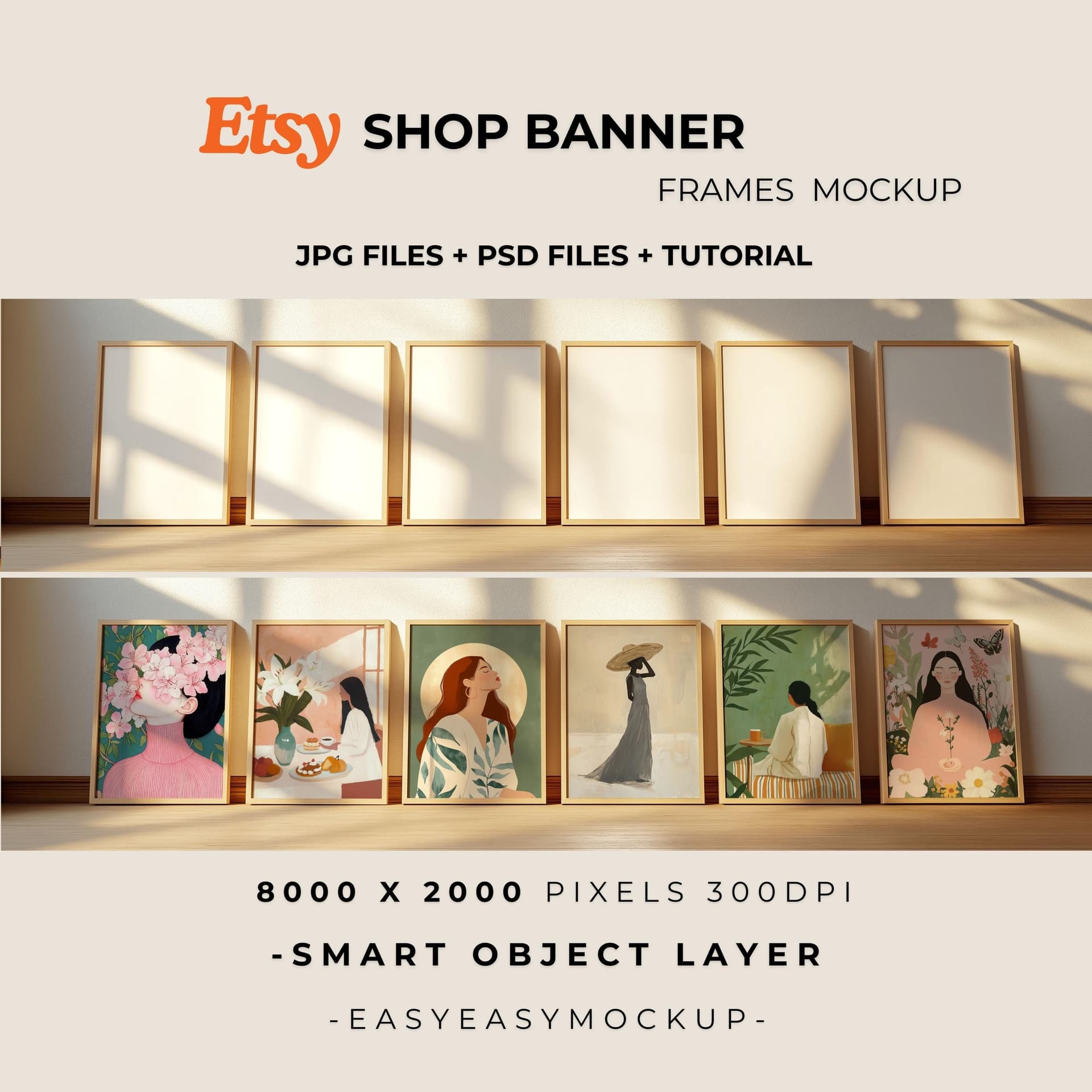
The goal of your banner is not to be decorative. The goal is to communicate your brand's visual world in a single image or image collage. And the most effective way to do that, especially for print-on-demand and digital print sellers, is to use high-quality mockup images that show your products in context.
Choosing the Right Mockup Images for Your Banner
Not all mockup images work equally well as banner material. A mockup that looks great as a listing thumbnail might fall apart at banner dimensions because it was composed for a square crop, not a wide horizontal one.
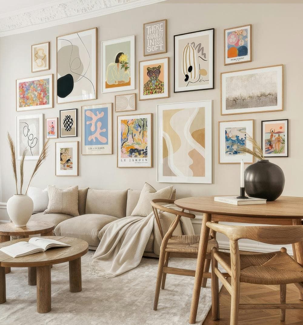
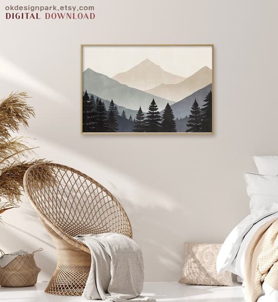
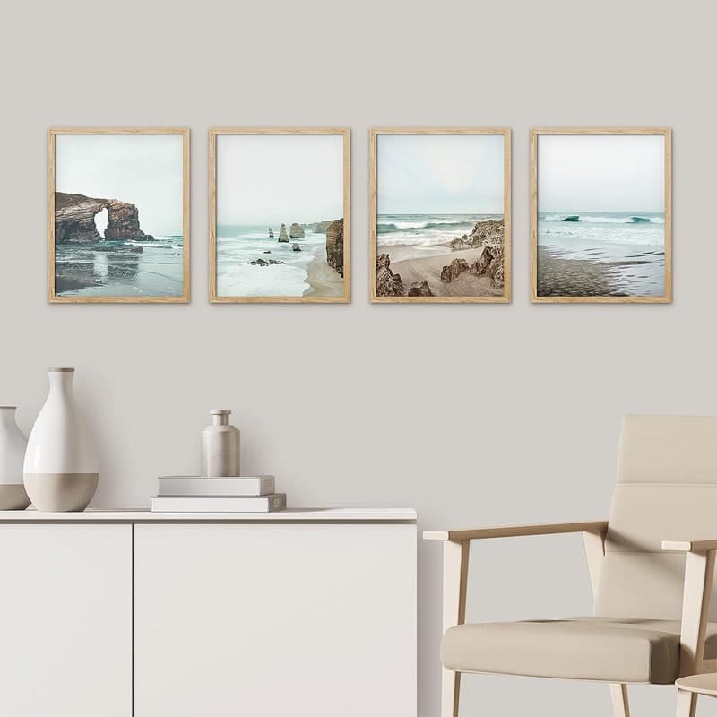
When selecting mockup images for your banner, look for ones that have strong horizontal composition. Lifestyle mockups, where the product is shown in a room setting rather than on a plain background, tend to work best because they give the eye something to move across. A gallery wall mockup, a styled desk scene, or a wide interior shot with framed prints can all fill a banner beautifully.
You also want your mockup images to share a consistent color palette and mood. If you sell minimalist black-and-white art prints, your banner mockups should reflect that. Warm wood tones, clean white walls, soft natural light. If you sell bold, colorful illustrations, pick mockups with energy and vibrancy. The mockup style should be an extension of your brand, not just a neutral container for your product.
This is where a tool like Mockupanda makes a real difference. Because you can generate multiple mockups from a consistent set of templates, you end up with images that naturally feel cohesive. You are not stitching together mockups from five different free tools that all have slightly different lighting styles and color grading. Everything comes from the same visual language.
Sizing, Composition, and What to Actually Put in the Frame
Etsy's banner dimensions have changed over the years, and the platform now offers a few different banner styles. The large banner displays at 3360 x 840 pixels. The mini banner is 1200 x 160 pixels. If you are using the large banner format, you have a lot of room to work with.
For a digital print or wall art shop, a strong banner approach is to show three to four of your bestselling or most representative products in styled mockups, arranged in a loose gallery-wall composition or a clean row. This immediately answers the question of what you sell while also showing buyers the range of your style.
Another effective approach is a single large lifestyle mockup that features one standout product in a beautiful room setting. This works especially well if your brand has a very specific aesthetic and you want buyers to feel immediately transported into your design world.
What you want to avoid is putting text-heavy content in your banner. Small text becomes unreadable on mobile, which is where most Etsy traffic comes from. Let the images do the visual work. Any messaging can live in the announcement section.
Actionable takeaway: Create at least two or three wide-format mockup variations of your bestselling products specifically for banner use. Make sure they share a consistent color palette and mood. Then test which one performs better by checking your shop stats after swapping banners.
Writing an Announcement That Works Alongside Your Visuals
The shop announcement sits just below your banner and profile information. It is a text field, which means a lot of sellers either ignore it or use it as a dumping ground for legal disclaimers and policies they feel obligated to paste somewhere.
That is a missed opportunity. Your announcement is the place where your visuals get a voice.
What Your Announcement Should Actually Communicate
Think of your announcement as a very short welcome email to someone who just walked through the door of your shop. You have their attention for maybe ten seconds. What do you want them to know?
The most effective shop announcements do three things. First, they confirm what the shop sells in one clear sentence. Second, they give the buyer a reason to feel confident buying from you, whether that is your experience, the quality of your files, your customer service approach, or the fact that your products are instant download. Third, they create a moment of connection, something that makes the shop feel human.
For a print-on-demand or digital print seller, an announcement might look something like this: "Every print in this shop is designed for easy printing and comes as a high-resolution instant download. All files are sized for standard frames you can find at any home store. If you have questions about sizing or printing, send me a message and I will help you out."
That is not flashy. But it directly addresses three of the most common hesitations digital print buyers have: will it actually print well, will I be able to frame it, and what do I do if something goes wrong. Those answers, delivered in plain language, build trust.
Weaving in a Reference to Your Visual Style
Because your announcement appears right below your banner mockup images, you can create a nice connection between the two. If your banner shows warm, neutral-toned interior mockups, your announcement can mention that your prints are designed to complement minimalist and Scandinavian-inspired spaces. This reinforces the visual message the buyer just received and helps them quickly confirm that your shop is for them.
You can also use your announcement to point buyers toward your most popular collections or tell them something specific about your product range. Something like: "Browse the botanical collection for ready-to-hang sets, or explore the quote prints section for custom personalization options." This kind of gentle guidance keeps buyers moving through your shop instead of bouncing after scanning the homepage.
Actionable takeaway: Rewrite your announcement to answer these three questions in three or four sentences: What do you sell? Why should the buyer trust you? What should they do next? Keep it warm, specific, and jargon-free.
Using Consistent Mockup Styles to Create a Cohesive Shop Identity
One of the things that separates shops that feel like established brands from shops that feel thrown together is visual consistency. When every mockup in your shop, from your banner to your listing thumbnails, shares the same light quality, color palette, and staging style, the whole shop feels intentional. That intentionality communicates professionalism without you having to say a word about it.
Building a Mockup Template System for Your Shop
The most efficient way to achieve this consistency is to commit to a small set of mockup templates and use them across all your products. Rather than hunting for a new mockup every time you create a new listing, you have two or three go-to templates that become your shop's visual signature.
For example, you might always use a clean white wall frame mockup for your main listing photo, a warm living room lifestyle mockup for your second photo, and a flat lay desk scene for your third. Every new product gets the same treatment. Buyers who browse your shop see a unified gallery instead of a patchwork of different visual styles.
This is one of the core reasons Mockupanda was built the way it was. The bulk generation feature means you can take an entire collection of new prints and run them all through the same mockup templates in minutes, not hours. The consistency is built into the process rather than something you have to manually recreate every single time.
How Mockup Consistency Supports Your Banner Strategy
When your banner mockups and your listing mockups share the same visual language, something interesting happens. Buyers who click from your banner into a listing feel a sense of continuity. The shop feels coherent. There is no visual whiplash between the beautiful lifestyle image they saw in the banner and the listing photos inside.
This coherence is a trust signal in itself. It tells the buyer that you pay attention to details, that your shop has been put together thoughtfully, and that the same care probably extends to the products themselves.
Conversely, when there is a mismatch between the polished banner and scrappy listing photos, it creates cognitive dissonance. The buyer senses something is off, even if they cannot name it. That feeling of misalignment often translates into hesitation at checkout.
Actionable takeaway: Pick two or three mockup templates and commit to using them consistently across every new listing you create. Then make sure your banner pulls from that same visual family. Consistency is more powerful than variety when it comes to building brand trust.
Common Mistakes That Undermine Your Shop's First Impression
Now that you know what to do, it is worth spending a moment on what not to do, because some of the most common Etsy shop mistakes happen right in the banner and announcement area.
Using Mockups That Do Not Match Your Product Quality
One subtle but damaging mistake is using very polished, high-end lifestyle mockups for products that are, frankly, not yet at that quality level. If your designs are simple and your target buyer is looking for affordable everyday prints, staging them in ultra-luxury penthouse interior mockups can actually create a mismatch that confuses buyers or sets expectations you cannot meet.
Your mockup environment should match your product positioning. Mid-range, stylish, and accessible prints work beautifully in clean, bright, modern home settings. Premium art prints can justify the luxury interior staging. Budget-friendly kids' room prints might look most natural in colorful, playful room settings. Let the staging tell the right story for the right buyer.
Forgetting Mobile Buyers Entirely
The majority of Etsy traffic is mobile. Your banner will display differently on a phone than it does on a desktop. On mobile, Etsy often crops or reduces the banner, which means anything you designed for the edges of the frame may disappear entirely.
Always preview your banner on a mobile device before publishing it. Make sure your most important visual elements, the product and the general mood, are visible in the center of the frame even if the edges get cut. Mockup images with centered compositions tend to survive mobile cropping much better than wide-format compositions where the product is off to one side.
Actionable takeaway: Before finalizing any banner update, open your shop on your phone and check how it actually looks. Adjust your composition if anything important is getting cut. Designing for mobile first is not optional anymore.
Putting It All Together: A Simple Action Plan
If you have read this far, you are already thinking about your shop differently. Let me give you a concrete sequence to implement everything covered in this post without getting overwhelmed.
Start with your mockup library. If you do not already have a consistent set of mockup templates for your products, that is the foundation. Use Mockupanda to generate a batch of mockups for your top five to ten bestselling products, all using the same two or three templates you want to become your shop's visual standard.
Next, build your banner. Take the best two or three of those new mockups and compose a banner image that shows your products in context. Focus on horizontal compositions, a consistent color palette, and leaving room for mobile cropping in the center.
Then rewrite your announcement. Keep it short, direct, and buyer-focused. Answer what you sell, why they should trust you, and what to do next. No filler, no walls of text.
Finally, do a visual audit of your existing listings. As you update listings over the coming weeks, replace inconsistent mockup photos with images from your new consistent template set. You do not have to do this all at once. Prioritize your bestsellers first.
Measuring Whether It Is Working
After making these changes, give it four to six weeks and then look at your shop stats. Pay attention to your shop visit-to-listing-click rate, the percentage of shop visitors who actually click into a listing. If your homepage is doing its job better, this number should improve. You can also look at your conversion rate on your top listings, since buyers who arrive more primed to trust you should convert at a higher rate.
If you are running Etsy ads, this matters even more, because you are paying for shop traffic. Every improvement in how well your homepage converts visitors into listing browsers directly affects your return on ad spend.
The Compounding Effect of Small Trust Signals
None of the individual changes described in this post is a dramatic transformation on its own. A better banner, a clearer announcement, more consistent mockup images. Each one is a small thing. But trust is built from small things. It is the accumulation of signals that all say the same thing: this seller takes their business seriously, and you can feel confident buying from them.
When your banner, your announcement, and your listing photos all speak the same visual language, you are creating a buying experience that feels coherent and professional from the very first second. That experience is what turns a casual browser into a buyer, and a first-time buyer into someone who bookmarks your shop and comes back.
Actionable takeaway: Block out two hours this week to implement the four steps above. Start with generating your consistent mockup set, because everything else builds on that foundation. Small, deliberate improvements to your shop's first impression compound over time into meaningfully better conversion rates and a stronger brand.
Keep reading
How to Create a Cohesive Etsy Shop Front Using Mockups With a Consistent Color Palette Across All Listings
Why Etsy Buyers Judge Your Entire Shop Quality From the First Mockup They See