Why Your Print-on-Demand Shop Needs a Signature Mockup Style (And How to Define Yours in an Afternoon)
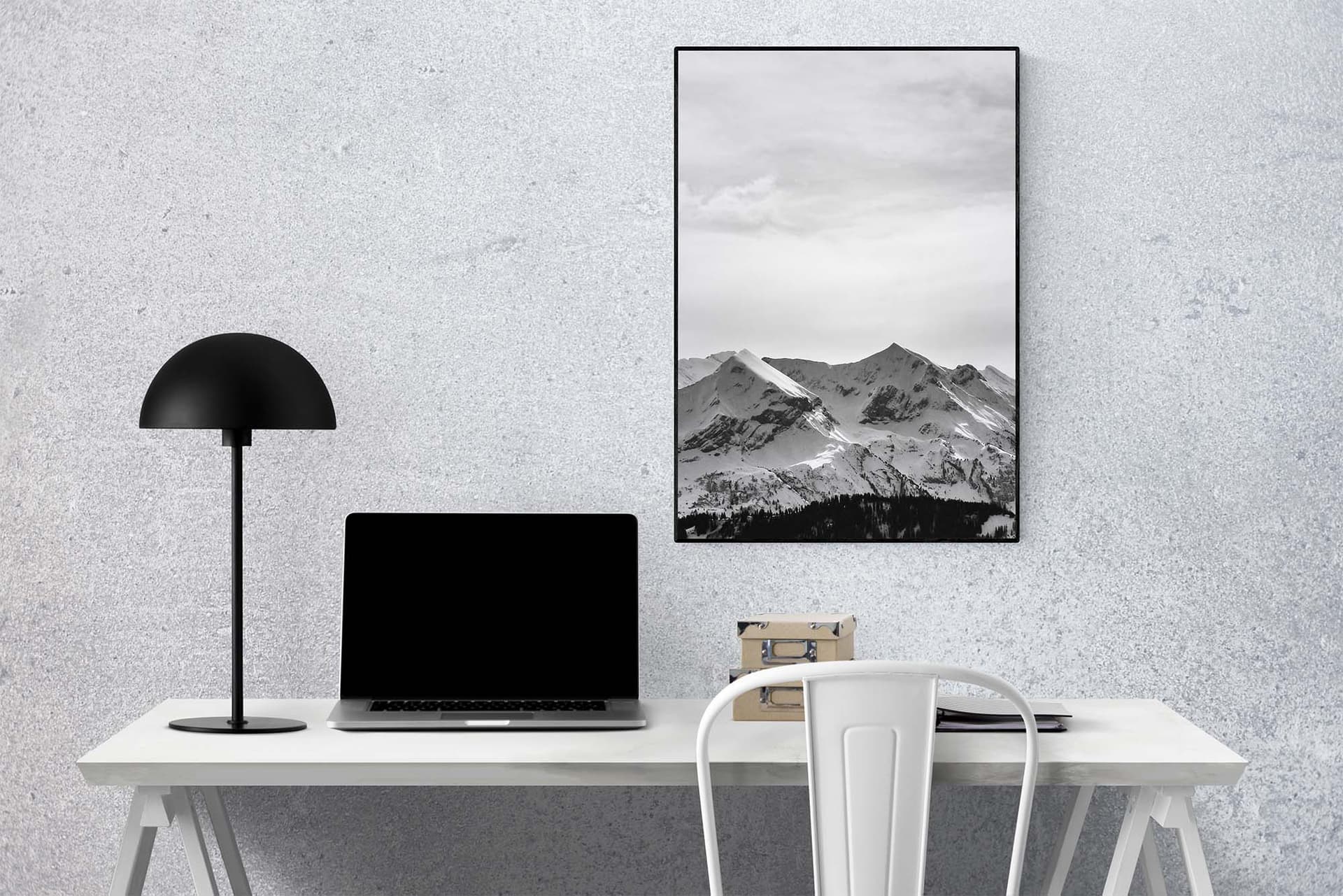
Walk through any thriving Etsy shop selling wall art or digital prints and you'll notice something almost immediately. The listings look like they belong together. The frames are consistent, the room settings feel cohesive, the light has a particular mood. Nothing feels random. Now compare that to a struggling shop where every listing looks like it was pulled from a different website. One mockup has a warm, minimalist Scandinavian vibe. The next has a dark, moody studio background. The third is a stark white frame on a stark white wall.
Buyers feel that inconsistency, even if they can't name it. It reads as unprofessional, and unprofessional shops don't command premium prices.
The good news? Defining a signature mockup style is not a month-long branding project. You can absolutely map it out in an afternoon and start applying it the same day. This guide will walk you through exactly how to do that, and how tools like Mockupanda's bulk mockup generator make it genuinely fast to maintain that style across dozens of listings.
Why a Signature Mockup Style Is a Business Decision, Not Just an Aesthetic One
It Builds Instant Recognition and Trust
When a shopper favorites one of your listings and comes back to Etsy three days later, your shop needs to feel immediately familiar. Consistent mockup styling is what makes that happen. It's the visual equivalent of a brand color palette, it tells your customer's brain, "you've been here before, you liked it here."
Trust is the currency of Etsy. Buyers are handing money to a stranger on the internet for a digital file they can't physically touch before purchasing. Every single visual signal either builds or erodes that trust. A shop where every listing feels intentional and cohesive signals that the seller is professional and that the product is worth the price.
Actionable takeaway: Look at your current shop with fresh eyes. If a new visitor couldn't tell your listings were all from the same shop, your mockup style needs work.
It Justifies Higher Prices
Here is something most Etsy sellers underestimate. Your mockup is doing most of the heavy lifting when it comes to perceived value. A beautiful art print displayed in a thoughtfully styled room setting with great light feels worth $15. The exact same print slapped into a generic white frame mockup feels worth $3.
This is not a small difference. Perceived value is the gap between your cost and what a customer is willing to pay, and your mockup style is one of the largest drivers of that gap. Shops with a strong, consistent visual identity can charge two to three times more than shops selling technically identical products with generic presentation.
If you've ever wondered why your conversion rate is lower than you'd like, or why shoppers visit but don't buy, scroll through your listings from the buyer's perspective. Then look at the top shops in your niche and notice how much more deliberate their visual presentation feels.
Actionable takeaway: Pick one of your current listings and spend ten minutes finding a higher-quality mockup version. Notice how differently the product feels. That difference in feeling is money on the table.
It Saves You Time in the Long Run
This one is counterintuitive. Sellers avoid defining a mockup style because it feels like more work upfront. But the absence of a style actually costs you hours every single week. When every new product requires you to start from scratch, searching for the right mockup, experimenting with different settings, second-guessing whether this one matches your other listings, you're spending creative energy on decisions that should already be made.
A defined style means those decisions are done. You open your mockup tool, apply your established settings, and you're finished. If you're using Mockupanda for bulk mockup generation, you can process an entire product collection in minutes because the variables are already locked in.
Actionable takeaway: Track how long your current mockup process takes per product. That number will motivate you to invest in defining your style.
How to Study What's Already Working in Your Niche
Audit the Top Sellers, Not Just the Pretty Ones
Before you define your own style, spend 20 to 30 minutes doing competitive research. Open Etsy and search your primary product category. Sort by bestseller. Open the top 10 shops and look at them purely from a visual presentation standpoint. You're not looking for inspiration to copy. You're looking for patterns.
Ask yourself: What frame styles show up most often? Are room settings warm or cool-toned? Is there a lot of negative space or are the compositions busier? What props, if any, appear in lifestyle shots? Do sellers mix frame mockups with flat lays, or do they stick to one type?
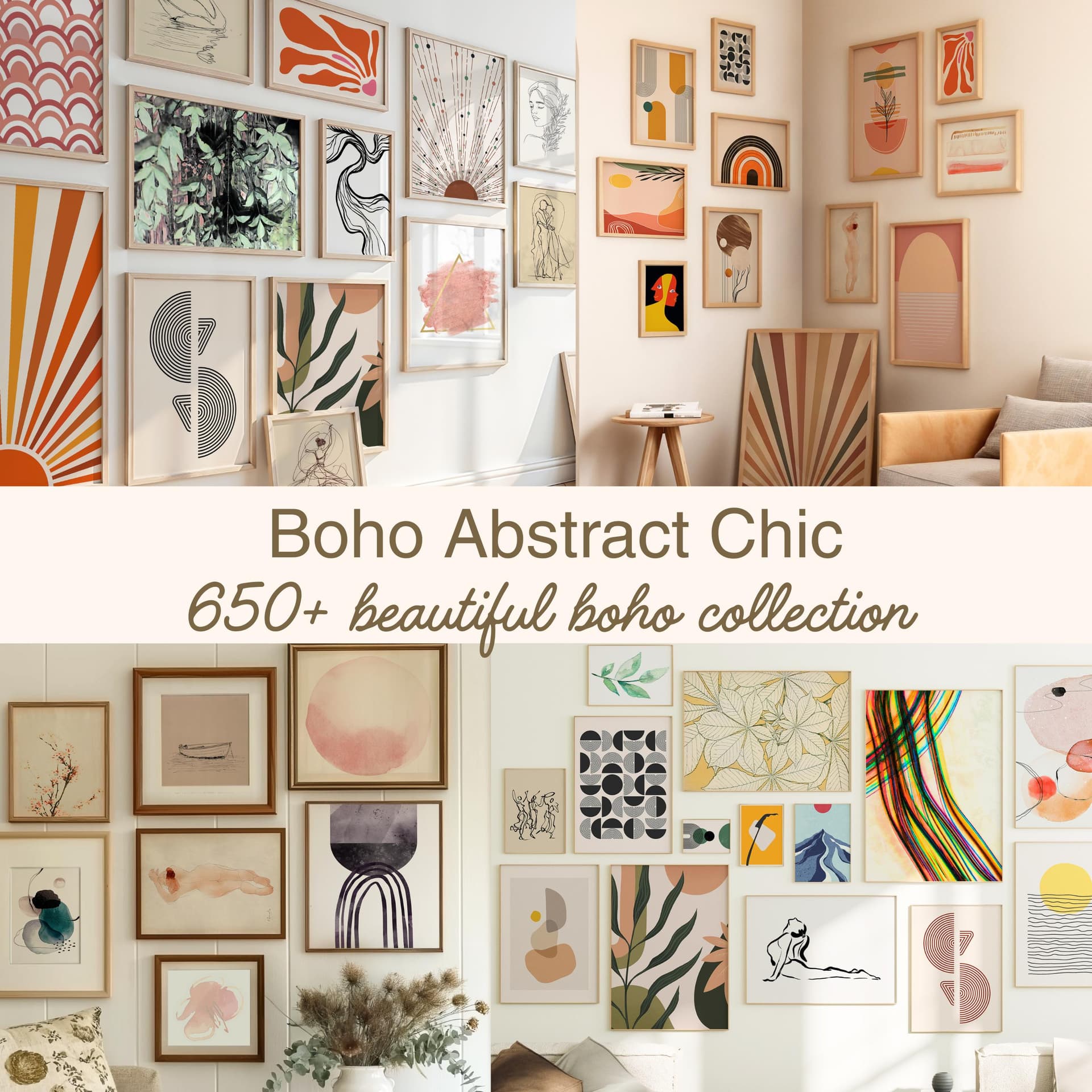
You'll start to notice that top sellers in a given niche have converged on a visual language that resonates with their buyer. A boho art shop looks very different from a minimalist architecture print shop, and that's not an accident.
Actionable takeaway: Make a simple list of 5 visual elements that the top shops in your niche consistently use. This is your baseline research.
Identify Your Own Aesthetic Position
Now that you know what the market looks like, figure out where you fit. Your goal is not to mimic the bestsellers exactly. Your goal is to be clearly positioned within a recognizable aesthetic that appeals to your ideal buyer.
Start with your product itself. What emotion does it evoke? Who is buying it and where are they hanging it? A children's nursery art seller should look completely different from a seller of moody, cinematic landscape prints. The mockup style should match the emotional tone of the art.
Then think about your buyer's life. Are they decorating a warm, family-oriented home? A sleek modern apartment? A maximalist eclectic space? Your room settings should reflect the home they aspire to have, not just any beautiful room.
Write down three adjectives that describe the visual feeling you want your shop to have. These become your filter for every mockup decision going forward.
Actionable takeaway: Write your three style adjectives now. Tape them to your monitor. Every mockup you create should pass the filter: does this match all three?
Look Outside Etsy for Inspiration
Some of the best mockup style inspiration doesn't come from Etsy at all. Look at home decor magazines like Apartment Therapy or Architectural Digest. Look at interior design accounts on Instagram and Pinterest. Look at how high-end art print brands like Minted or Society6 present their products.
Pay attention to lighting (warm vs. cool), the complexity of the scene (minimal props vs. styled vignettes), the color palette of the surrounding room, and the framing choices. Save 15 to 20 images that feel right for your brand. You're building a mood board, and mood boards are the fastest way to get from vague intuition to concrete decisions.
Actionable takeaway: Create a Pinterest board or a simple folder of saved images that represents the visual world your brand lives in. This is your reference point for every future mockup.
Defining the Four Pillars of Your Mockup Style
Pillar One: Frame and Display Style
The first and most important decision is how your products are displayed. For wall art and digital print sellers, the main options are: framed mockups (thin black, thin white, natural wood, ornate gold), frameless or floating, flat lay product shots, or lifestyle room scenes.
You don't have to pick just one, but you should establish a hierarchy. Many successful shops use framed room mockups as the primary listing image and add one or two flat lay or detail shots as secondary images. What you want to avoid is randomness. Don't use a thin black metal frame for one product and an ornate baroque gold frame for the next unless your brand aesthetic specifically calls for eclectic mixing.
For most sellers, picking one to two frame styles and using them consistently is the fastest path to a cohesive look. When you batch-create your listings using a tool like Mockupanda, you can apply the same frame and setting across your entire catalog quickly, which makes consistency effortless rather than a chore.
Actionable takeaway: Decide on your primary frame style today. It's one choice, but it will instantly make your shop look more intentional.
Pillar Two: Color Palette and Lighting Mood
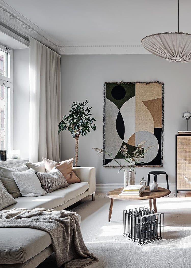
The room settings and backgrounds in your mockups have a color temperature and an overall mood. Warm rooms feel cozy and inviting. Cool rooms feel modern and minimal. Bright, airy rooms feel cheerful. Darker, moodier rooms feel sophisticated or dramatic.
Your mockup color palette should complement your products and appeal to your target buyer. If you sell botanical prints with soft greens and warm creams, a mockup with warm wood tones and soft natural light will make your products sing. If you sell bold geometric prints, a crisp white-walled, high-contrast room setting might serve you better.
Once you've decided on your lighting mood, stick to it across your listings. The overall color temperature of your shop's gallery view (the grid of listings a buyer sees when they visit your shop) should feel harmonious. When one listing is very warm and the next is very cool, the grid looks chaotic.
Actionable takeaway: Pull up your shop's main gallery page and squint your eyes slightly. Do the listings blend together harmoniously, or do they clash? That tells you a lot about your current color consistency.
Pillar Three: Complexity Level
Some shops use very minimal mockups: a single frame on a clean wall, nothing else. Other shops use fully styled room vignettes with plants, books, candles, and coordinating furniture. Neither is wrong, but you need to pick a lane.
Highly styled mockups can look stunning but they carry risk. If the styling overwhelms the product, buyers may be drawn to the decor in the photo rather than the print itself. Minimal mockups let the art speak for itself but require the art to be strong enough to carry the image.
Consider your product complexity. Detailed, busy prints often benefit from simple backgrounds. Simple, typographic prints can handle more visual styling around them without getting lost.
Actionable takeaway: Pick a complexity level (minimal, moderate, or fully styled) and apply it consistently. Your buyer should always know immediately what the product is in your listing images.
Pillar Four: Secondary Image Strategy
Your first listing image is your mockup. But Etsy allows up to 10 images per listing, and how you use those additional slots is part of your signature style too. Do you include a close-up detail shot? A size reference mockup showing scale on a wall? A multi-frame gallery wall arrangement? A flat lay with the print and a few complementary objects?
Decide which secondary image types you'll use and keep them consistent. When every listing has the same structure (hero mockup, detail shot, scale reference, gallery wall arrangement), your shop feels systematic and professional. Buyers don't have to re-learn how to read your listings every time.
Actionable takeaway: Define your secondary image template. For example: image one is room mockup, image two is close-up detail, image three is scale reference. Use this template for every listing.
How to Build Your Style Template in an Afternoon
Gather Your Assets in One Place
Now that you know your four pillars, it's time to build. Start by gathering everything you need. This means selecting 3 to 5 mockup scenes that fit your color palette and complexity level, identifying your preferred frame styles, and making note of any text overlay styles you want to use for promotional images or collection banners.
If you're building your mockup workflow around a tool designed for print-on-demand sellers, this process becomes much faster. Mockupanda's platform is built specifically for this workflow, so you're not adapting a generic design tool to a POD use case. You can bulk-generate consistent mockups across a product collection, apply the same settings repeatedly, and add text overlays for ads or collection headers, all without needing Photoshop or design expertise.
Actionable takeaway: By the end of your afternoon session, you should have your 3 to 5 core mockup scenes selected and your settings documented somewhere you can reference quickly next time.
Create a One-Page Style Guide
This sounds more formal than it is. A style guide for your mockup work can be as simple as a Google Doc or a notes file with the following information: your three brand adjectives, your primary and secondary frame styles, your preferred room settings and their color temperature, your secondary image template, and any text overlay fonts or styles you use.
Having this written down matters more than you might think. It means you can batch-create listings on autopilot rather than making decisions from scratch each time. It also means that if you ever hire an assistant or VA to help with your shop, they can maintain your visual style without guessing.
Actionable takeaway: Create your one-page style guide today. It should take 20 minutes and it will save you hours over the coming months.
Test It on a Small Batch Before Rolling Out
Before you re-mockup your entire catalog, test your new style on 5 to 10 products. Create the mockups, look at them as a group, and ask yourself the hard questions. Do they all feel like they belong together? Does the style serve the products or compete with them? Would a cold-traffic buyer understand immediately what they're looking at and feel drawn in?
Get a second opinion if you can. Show the images to someone who is your ideal customer, not a fellow Etsy seller, and see how they respond. Adjust anything that isn't working before you commit to applying it across hundreds of listings.
Actionable takeaway: Run a small batch test before your full rollout. Iteration at scale is painful. Iteration on 5 products takes 20 minutes.
Maintaining Your Style as Your Shop Grows
Building a Repeatable Workflow
A signature style is only valuable if you can maintain it without burning out. The key is a repeatable workflow: the same tool, the same settings, the same sequence of steps, every time you add a new product. When your process is predictable, mockup creation becomes a 10-minute task rather than a creative project.
Bulk generation tools are your best friend here. If you're adding a collection of 15 new prints, you want to apply your signature mockup style to all 15 in one session without reinventing the wheel each time. That's exactly the kind of workflow that tools like Mockupanda are built to support.
Actionable takeaway: Write down your mockup creation workflow as a numbered checklist. Every step, from opening the tool to exporting the final image. Follow it every time.
Knowing When to Evolve Your Style
A signature style is not a cage. Your visual identity can and should evolve as your shop grows, your products change, and your understanding of your buyer deepens. The difference between purposeful evolution and random inconsistency is intention.
Review your mockup style every six months. Look at what's converting well and what isn't. Check what's shifted in your niche. Notice if your own taste has changed and whether that change serves your customer. When you decide to update your style, update it deliberately and consistently, not listing by listing.
Actionable takeaway: Put a recurring reminder in your calendar for a mockup style review every six months. Treat it as a 30-minute business review, not a major overhaul.
Using Your Style Across Marketing Channels
Your signature mockup style shouldn't live only in your Etsy listings. It should extend to your Pinterest pins, your Instagram posts, your Shopify product pages if you have them, and any advertising you run. When your visual identity is consistent across every channel a potential buyer might encounter you, recognition compounds over time.
Text overlay features become especially useful here. Adding a sale announcement, a collection name, or a seasonal message to your mockup image in the same visual style as your listings keeps everything on-brand, even in a promotional context.
Actionable takeaway: The next time you create a Pinterest pin or Instagram post for your shop, use the same mockup style you've defined. Consistency off-platform builds the same trust as consistency on it.
Your Afternoon Action Plan
Here is everything condensed into a single afternoon session you can run today.
First, spend 20 minutes on competitive research. Open Etsy, find your top 10 competitors by sales volume, and note the five visual elements they consistently use.
Second, spend 15 minutes on self-reflection. Write your three brand adjectives. Think about your ideal buyer and the home they're decorating. Build a quick mood board with 10 to 15 saved images.
Third, spend 20 minutes making your four pillar decisions: frame style, color palette and lighting, complexity level, and secondary image template.
Fourth, spend 30 minutes building your first batch. Use a tool like Mockupanda to create mockups for 5 to 10 products using your new defined style. Look at them together and adjust if needed.
Fifth, spend 10 minutes writing your one-page style guide. Document your decisions so you never have to make them again.
That's it. Under two hours of focused work, and you'll have a signature mockup style that makes your shop look more professional, builds buyer trust, justifies higher prices, and saves you time on every product you create from this point forward.
Your mockups are not just product photos. They're the first impression your shop makes on every single potential buyer. Make that impression count.
Keep reading
The Batch Mockup Checklist Every Print-on-Demand Seller Needs Before a Holiday Sales Season

How to Use the Mockupanda API to Auto-Generate Mockups Every Time You Upload a New Design to Your Print-on-Demand Store