Why Etsy Buyers Judge Your Entire Shop Quality From the First Mockup They See
The Psychology Happening Before a Single Click
Most Etsy sellers think about mockups as product photos. Something to show what the print looks like, maybe hang it on a wall, maybe add a plant nearby. Job done. But that framing undersells what a mockup is actually doing the moment a buyer lands on your listing or your shop homepage.
Visual first impressions form in roughly 50 milliseconds, according to research from Carleton University. That is faster than conscious thought. Your potential customer is not reading your title, checking your reviews, or weighing your price. They are making a gut-level call about whether your shop feels like a place worth trusting. And that call is made entirely on the visual signal your first mockup sends.
The Halo Effect in Etsy Browsing
There is a well-documented cognitive bias called the halo effect. When we perceive one thing about a person or product as positive, we automatically assume other things about them are positive too. The reverse is equally true. If something looks cheap or careless, we assume other things about it are cheap and careless.
On Etsy, this means a blurry, flat, poorly-composed mockup does not just make that one listing look bad. It makes your prices feel unjustified, your reviews feel suspicious, and your entire brand feel amateur. Buyers will not consciously think any of this. They will just feel a vague sense that something is off and click away.
A high-quality mockup, by contrast, sends the halo in the other direction. The print looks professional, so the shop feels established. The shop feels established, so the price feels fair. The price feels fair, so the decision to buy feels safe.
Why This Matters More on Etsy Than Almost Anywhere Else
Etsy is a platform built on handmade trust. Buyers come to Etsy specifically because they want something that feels personal, considered, and crafted with care. They are willing to pay more than they would on Amazon for exactly that feeling. But that feeling is entirely delivered through visuals, because the physical product does not exist yet when they are making the buying decision.
For digital prints and wall art, this is even more acute. The buyer cannot hold the product, cannot assess paper quality, cannot see the colors in person. Everything they know about your product comes from the mockup. If that mockup looks like you spent ten minutes on it, they assume the product is worth ten minutes of their money. If it looks like it came from a professional product photographer, it commands professional product prices.
Actionable takeaway: Go to your shop right now and look at your first listing image on mobile. Pretend you have never seen it before. What does it tell you about the quality of the shop behind it? Be honest.
What a Low-Quality Mockup Actually Communicates
It helps to be specific here, because a lot of sellers have low-quality mockups and do not know it. They have been looking at their listings for so long that they stop seeing them clearly. Let us break down what different mockup problems actually signal to a first-time buyer.
The Flat PNG Drop Problem
One of the most common mistakes in digital print shops, especially newer ones, is listing the product as a flat PNG or JPEG with no context at all. Just the artwork on a white background.
This is not a neutral choice. It actively signals a few things to the buyer. It suggests the seller did not have enough time, resources, or care to present the product properly. It makes pricing feel arbitrary because there is no context to anchor the value. And it puts all the mental work on the buyer, who now has to imagine what it would look like in their home rather than being shown.
Buyers are not looking to do mental work. They are looking to feel something. A flat PNG does not make anyone feel anything.
Low-Resolution and Mismatched Mockups
A pixelated mockup, or one where the print placement looks off, the colors feel wrong, or the frame style clashes with the artwork, sends a specific message: the seller does not have an eye for design. And if the seller does not have an eye for design, why would you trust them to have designed something worth putting on your wall?
This is especially damaging for wall art sellers because design sensibility is the entire product. You are not selling paper and ink. You are selling taste. A mockup that shows poor taste in its own composition undermines the credibility of everything in the shop.
Inconsistency Across Listings
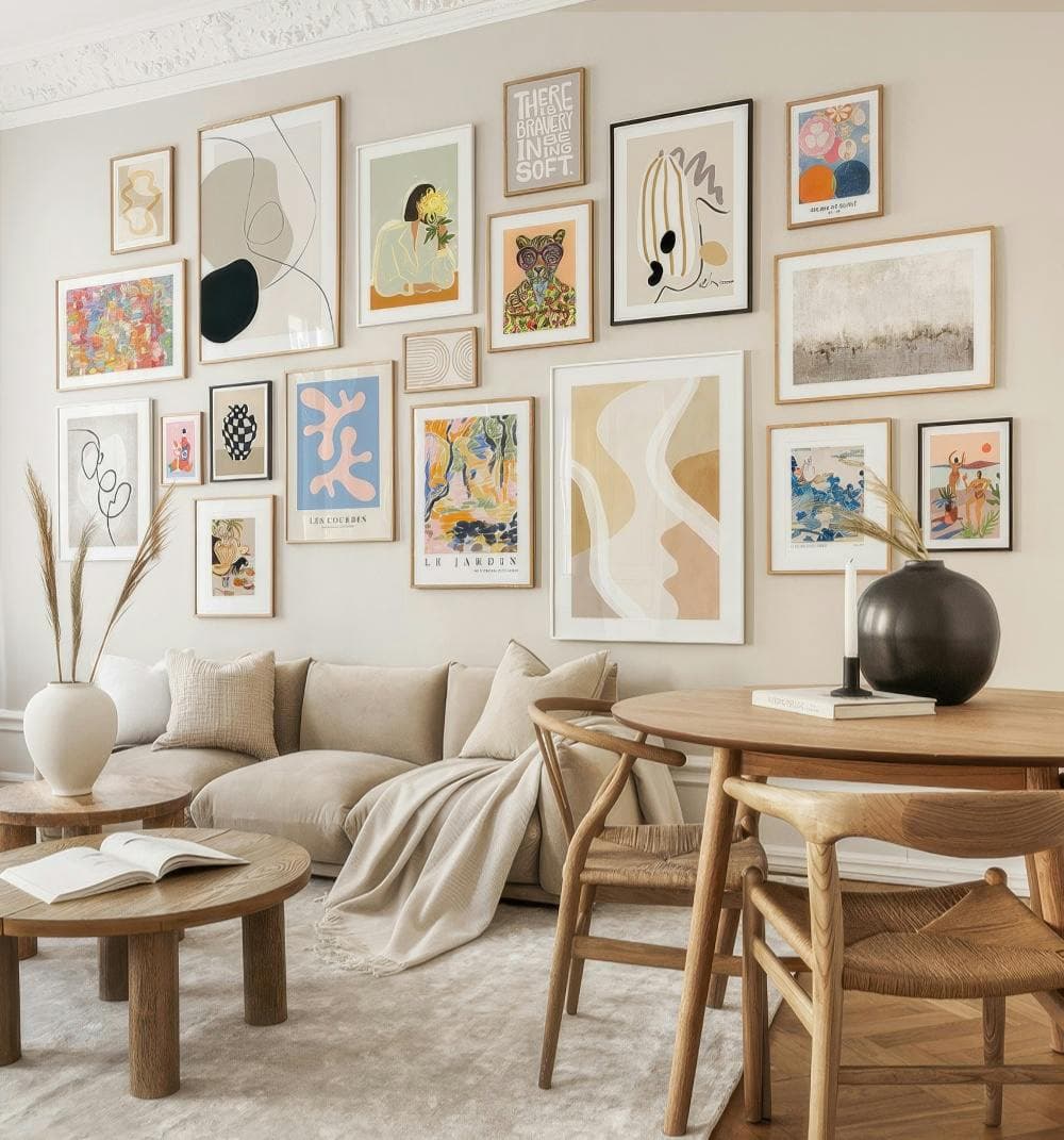
Even if each individual mockup is decent, inconsistency across your shop creates a different problem. One listing has a bright white Scandinavian interior mockup. The next has a dark moody library background. The next is a flat PNG. The next is a bedroom scene from a completely different aesthetic.
Buyers who browse your shop page see all of these together as a grid. That grid is your brand. If it looks chaotic and mismatched, the buyer does not perceive it as variety. They perceive it as a shop without a point of view, without professionalism, and without confidence in its own aesthetic.
Actionable takeaway: Audit your shop grid on both desktop and mobile. Look for the three most visually inconsistent listings and prioritize those for a mockup refresh.
What a High-Quality Mockup Actually Communicates
Now let us flip it. A well-made mockup does not just avoid negative signals. It actively builds a case for buying.
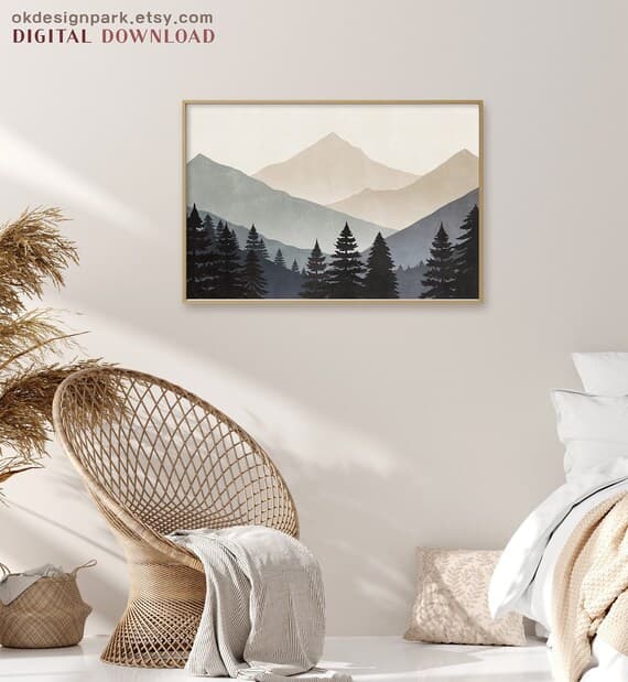
Context Creates Desire
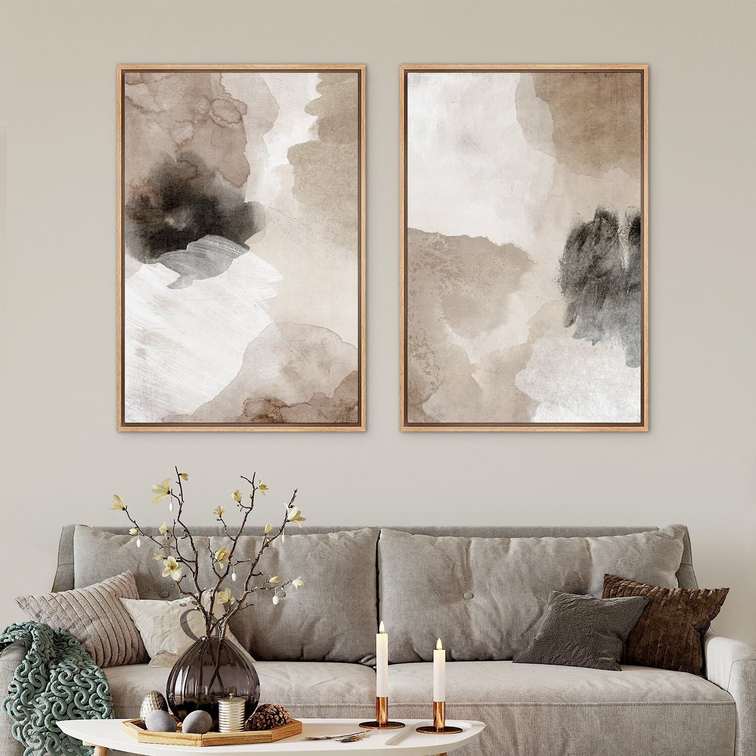
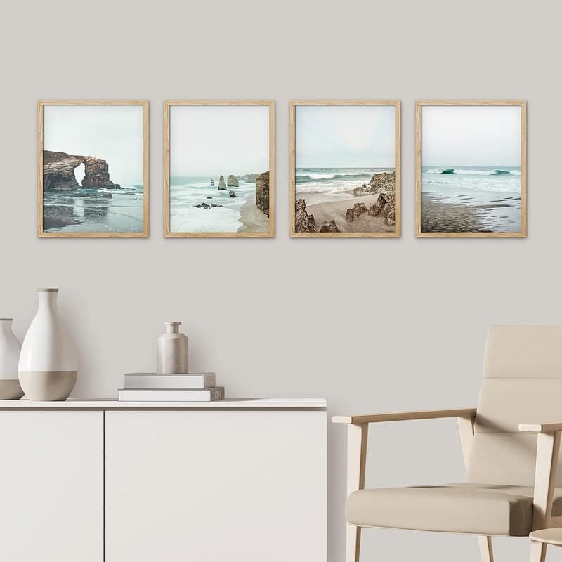
The strongest thing a lifestyle mockup does is place your product inside the buyer's aspirational life. A print hung above a linen sofa in a calm, sun-lit room is not just showing the artwork. It is showing the lifestyle that comes with the artwork. The buyer is not buying the print. They are buying that feeling of a calm, beautiful home.
This is the fundamental power of a well-staged lifestyle mockup and it is why the best Etsy shops invest so heavily in product presentation. The mockup is not documentation of the product. It is a door into a feeling the buyer already wants to walk through.
For print-on-demand sellers who are producing dozens or hundreds of designs, this means your mockup environments need to do consistent emotional work. The room scenes, the lighting, the frame styles, the surrounding objects should all reinforce a single cohesive feeling that matches the aesthetic of your designs.
Quality Signals Justify Higher Prices
There is a pricing dynamic at play in every Etsy shop that most sellers do not consciously understand. Buyers arrive with an internal sense of what a product should cost based on how it looks, not on its objective value. This means two identical prints, one in a flat PNG and one in a beautiful lifestyle mockup, will feel like they should cost different amounts, even if they are actually the same file.
If you are pricing your digital prints at 4 dollars or 5 dollars and struggling to make sales despite decent reviews, one of the first things to examine is whether your mockups are communicating a 4 dollar value or a 15 dollar value. The mockup sets the price anchor before the buyer even sees the price.
Sellers who upgrade their mockup quality frequently find that they can raise prices and see their conversion rate hold steady or improve. Not because the product changed, but because the perceived value changed.
Trust Signals Through Consistency and Craft
When a buyer sees a shop where every listing uses the same clean, professional mockup style, with consistent lighting, consistent framing, and consistent quality, they conclude that the seller is serious and established. Even if the shop has 20 listings instead of 200, that consistency reads as professionalism.
This matters especially for newer shops that have not yet built up a review base. Reviews are trust signals, but so is a well-curated shop aesthetic. A thoughtfully presented shop with 50 reviews will often outperform a carelessly presented shop with 200 reviews, because the presentation is doing credibility-building work at every stage of the buyer journey.
Actionable takeaway: Pick one mockup style, whether a room scene, a frame on a clean white wall, or a styled flat lay, and apply it consistently across an entire collection. See whether your click-through rate improves within two weeks.
How the First Mockup Affects Behavior Beyond the Click
The influence of your first mockup does not stop at whether someone clicks. It shapes behavior throughout the entire purchase journey in ways that are easy to miss.
Shop Browsing Depth
When a buyer lands on a listing that impresses them visually, they are far more likely to click through to the shop and browse other listings. They are in a positive emotional state about the brand. They are curious. They are primed to buy more than one thing, or to save the shop for later.
When a buyer lands on a listing with a weak mockup and clicks through anyway, maybe because the price caught their eye, they are browsing with skepticism. They are looking for reasons to justify buying or reasons to leave. In this mode, small things that would otherwise not matter, a typo in a description, a slightly off-center placement in another listing, become amplified reasons to exit.
The first mockup determines which mode the buyer is in before they see anything else.
Favoriting and Return Behavior
Etsy's favoriting feature is one of the platform's most underappreciated sales mechanisms. A favorited listing brings buyers back to your shop repeatedly, and Etsy sends them notifications when you run sales or when the item becomes more popular. Building a large favorite count also improves your search ranking.
Buyers are dramatically more likely to favorite a listing that stopped them mid-scroll than one they visited with mild curiosity. And what stops someone mid-scroll on Etsy search results is almost always a visually striking mockup thumbnail. Your first image, the thumbnail that appears in search, is your primary favorite-building asset. Treating it as an afterthought is leaving your entire remarketing potential on the table.
Review Quality and Satisfaction
Here is something that surprises most sellers. The quality of your mockups affects the quality of the reviews you receive, even though buyers are reviewing the digital file, not the mockup itself.
When a buyer purchases from a shop that presented beautifully, they arrive with high expectations and a positive emotional association with the brand. When they download the file and it matches those expectations, they feel satisfied. That satisfaction translates to a five-star review and often a warm, specific written review rather than just a star rating.
When a buyer purchases from a shop with weak presentation, they arrive with low expectations or mild skepticism. Even if the file is identical in quality, the emotional context of the purchase is different. Satisfaction is relative to expectation.
Actionable takeaway: Look at your most recent five reviews. Are they specific and warm, or generic and minimal? If generic, consider whether your product presentation is building enough emotional investment before the purchase.
The Practical Problem Most Sellers Face
Everything above makes sense in theory. The problem is time and resources. Most Etsy print-on-demand sellers are not running a team. They are one person designing, listing, optimizing, handling customer service, managing pricing, and trying to produce new designs consistently. The idea of creating individual high-quality lifestyle mockups for every single listing is genuinely overwhelming.
This is the exact gap that tools like Mockupanda were built to fill. When I built Mockupanda, I was dealing with this problem personally as a product designer selling digital prints. I was spending hours in Photoshop creating mockups one at a time, and the volume required for a competitive print-on-demand shop made that approach completely unsustainable.
Bulk Generation Changes the Math
The reason most sellers default to flat PNGs or inconsistent mockups is not that they do not understand the value of good presentation. It is that good presentation used to require either significant time or significant money, neither of which small shop operators have in abundance.
Bulk mockup generation changes the math entirely. Instead of spending 20 minutes per listing creating a mockup, you can process an entire collection in the time it used to take to do one or two listings. That makes the high-quality, consistent shop aesthetic that was previously only achievable by well-resourced sellers accessible to anyone.
Consistency at Scale
The other thing bulk generation solves is the consistency problem described earlier. When you create mockups one at a time across weeks or months, you naturally drift between styles, environments, and quality levels as your taste and tools evolve. When you batch an entire collection through the same template set, you get the visual coherence that signals professionalism without having to consciously maintain it listing by listing.
For shops relaunching their brand or refreshing stale listings, this is particularly powerful. You can go from a mismatched, low-quality grid to a cohesive professional presentation in a single afternoon rather than re-doing listings gradually over months.
Actionable takeaway: Calculate how long it currently takes you to create one polished mockup. Multiply that by the number of active listings you have. That number is the time cost of your current approach. Then ask whether that time could be better spent on design, marketing, or creating new products.
Building a Mockup Strategy, Not Just a Collection of Images
The final shift in thinking that separates successful Etsy shops from struggling ones is treating mockups as strategy rather than a checklist item. A mockup strategy means making deliberate decisions about what emotional work your images need to do and then executing that consistently.
Matching Mockup Environment to Design Aesthetic
Your mockup environments should reinforce the emotional tone of your designs, not contradict them. If you sell minimalist black and white prints, your room scenes should be clean and spare, not cluttered and rustic. If you sell bold, maximalist illustration work, your environments should have energy and color, not muted Scandinavian calm.
This sounds obvious, but a large number of Etsy shops use whatever mockup backgrounds they can find regardless of aesthetic fit. The result is designs that feel incongruous in their own presentation, which confuses buyers about who the product is for and what it would feel like to own it.
Thinking About Thumbnail Composition Specifically
Your first image does double duty. It appears in search results as a thumbnail, often at quite small sizes, especially on mobile. And it appears as the main image when someone clicks into your listing. These two use cases have different requirements.
For thumbnail performance, your product needs to be clearly visible, taking up a substantial portion of the frame, with enough contrast to read at 200 pixels wide. Many beautiful lifestyle mockups fail as thumbnails because the print is too small relative to the room, or the background is so busy that the product disappears.
Test your thumbnails at actual search result size before committing to a template. What looks gorgeous at full resolution sometimes becomes an unreadable smear at thumbnail scale.
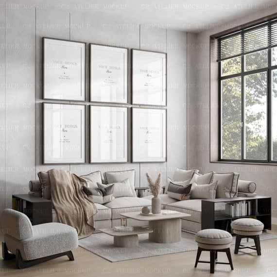
Planning Your Shop Grid Before Individual Listings
The most strategic approach is to plan your shop grid as a designed object before you create individual listing images. Decide on your two or three mockup environments for each collection. Decide whether you want a repeating pattern in the grid, such as alternating room scene and detail shot, or a unified single-environment approach. Then execute every listing within that plan.
This is the approach that luxury print brands and high-converting digital download shops use. The grid is not an accident of individual listing decisions. It is a designed experience that communicates brand coherence at a glance.
When buyers land on a shop whose grid looks like it was curated and considered, they feel they have found something special. That feeling is worth more than any discount or promotional strategy you could deploy. It is the difference between a buyer who checks your price and a buyer who checks out.
Actionable takeaway: Before your next product launch, sketch out what the shop grid will look like with the new listings included. If it creates visual disruption, adjust the mockup style before going live rather than after.
---
Your mockups are not just product images. They are the first, loudest, and most persuasive thing you say to every potential buyer. Make sure what they are saying is worth hearing.
Keep reading
How to Create a Cohesive Etsy Shop Front Using Mockups With a Consistent Color Palette Across All Listings
How to List a Diptych or Triptych Poster Set on Etsy Using a Single Gallery Wall Mockup That Shows the Full Set Together