The Case for Showing the Same Print in Multiple Room Styles: How Interior Aesthetic Mockups Target Different Buyer Personas on Etsy
Why One Mockup Is Leaving Money on the Table
There is a moment every Etsy seller knows well. You finish a print you are genuinely proud of, you upload it with a single lifestyle mockup, and then you wait. The listing gets views, maybe even some favorites, but the conversion rate sits stubbornly low. You tweak the title, adjust the tags, maybe drop the price a little. Nothing moves the needle.
What you might not have considered is that the problem is not the print. It is not the price either. The problem is that your single mockup is only speaking to one type of buyer, and everyone else is clicking away because they cannot picture your art in their home.
Etsy is a visual platform where the decision to buy happens in seconds. When a shopper lands on your listing, they are not just evaluating whether they like the image. They are asking themselves a very specific question: will this look right in my space? If your mockup shows a print in a bright, white Scandinavian living room and the buyer has a cozy, dark, bohemian apartment, the answer is probably no, even if the print itself is exactly the kind of thing they love.
Showing the same print across multiple room styles is not about padding your listing with filler images. It is a deliberate strategy for making your product feel relevant to more people. And relevance, on Etsy, is what converts.
Actionable takeaway: Before your next upload, ask yourself how many distinct interior aesthetics your single mockup actually speaks to. If the honest answer is one, you are already narrowing your audience before a buyer even reads your title.
Understanding Interior Aesthetics as Buyer Personas
Marketing professionals spend a lot of time building buyer personas, detailed profiles of who a customer is, what they care about, and what motivates them to buy. As an Etsy seller, you probably do not have the budget for focus groups and consumer research. But you do have something just as useful: interior aesthetics.
The way someone decorates their home is one of the most reliable signals of their values, taste, and purchasing behaviour. A person who curates a modern minimalist apartment is making very different visual and emotional decisions from someone who layers textiles and plants into a maximalist boho retreat. These are not just aesthetic differences. They reflect different buyer psychologies.
The Most Common Interior Aesthetics on Etsy
Think of these less as decorating styles and more as communities of buyers with shared visual preferences.
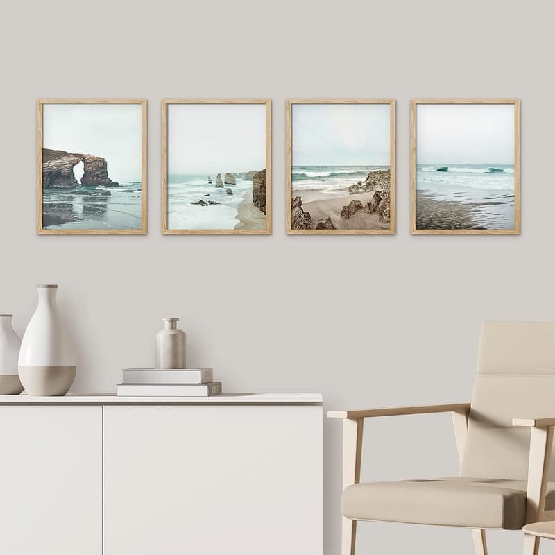
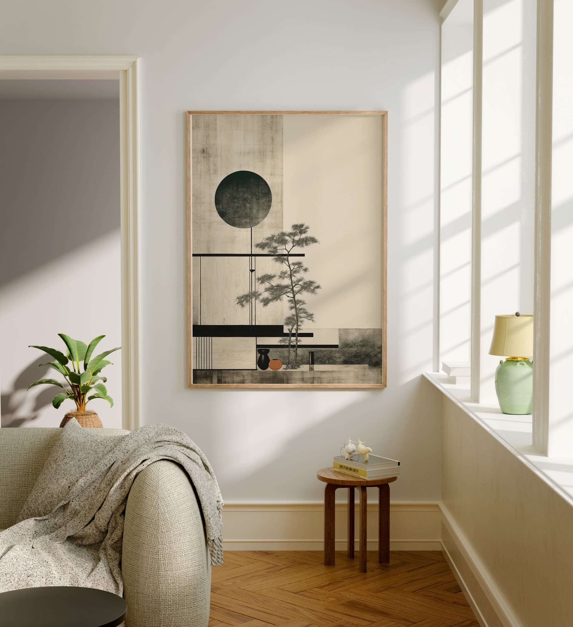
Scandinavian minimalism is clean, neutral, and deliberate. Buyers in this category respond to white walls, natural wood, limited colour palettes, and the sense that every object in the room has earned its place. They are often drawn to typography prints, abstract line art, and anything that feels calm and intentional.
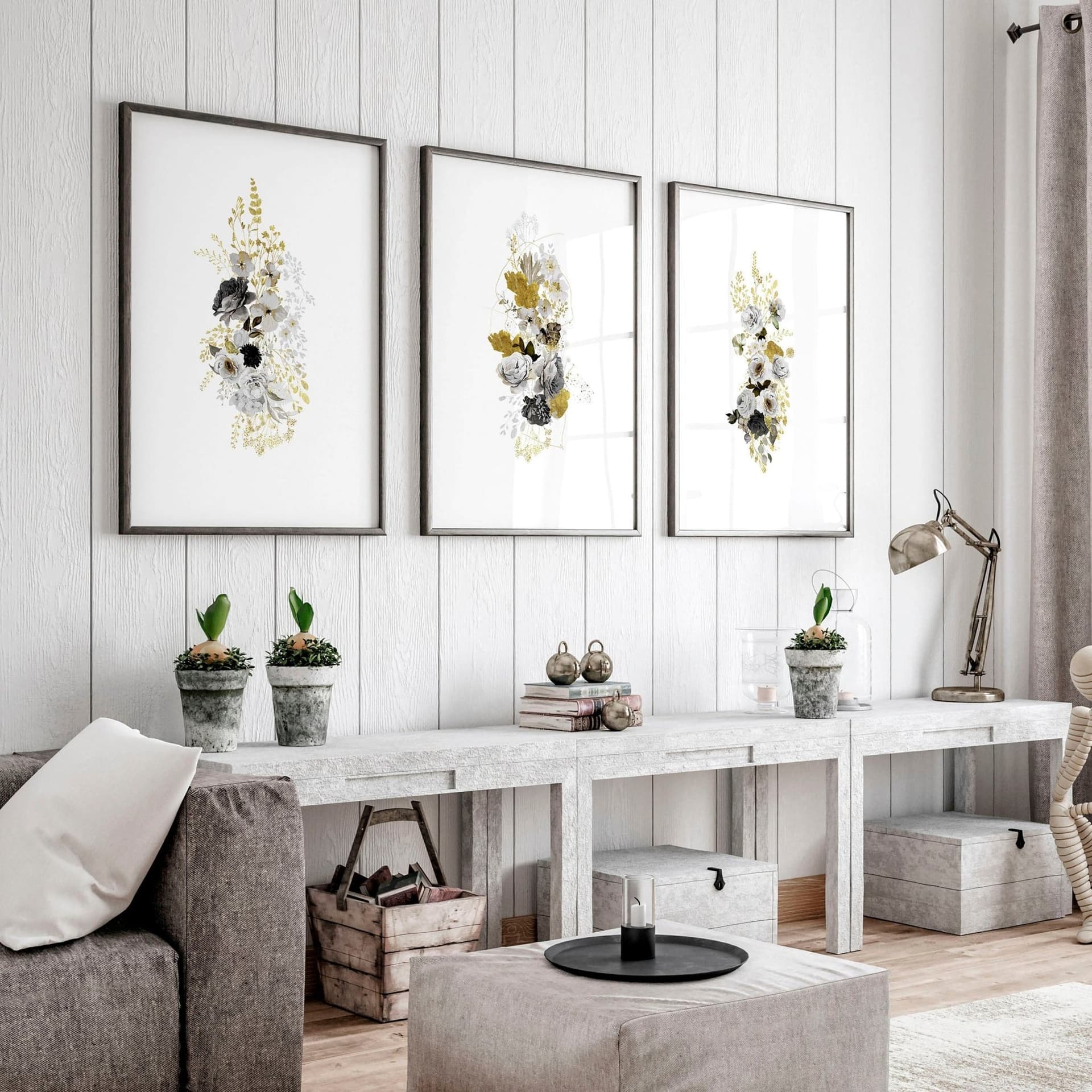
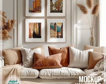
Warm boho or eclectic is layered, textured, and personal. Think terracotta walls, rattan furniture, mixed patterns, and trailing plants. Buyers here want art that feels collected rather than curated. They like botanicals, earthy palettes, abstract forms, and anything with a handmade or organic quality.
Modern farmhouse blends rustic with clean lines. Shiplap walls, neutral linens, black metal fixtures, and vintage-inspired pieces. This buyer is drawn to simple script prints, farmhouse quotes, simple floral illustrations, and anything that feels both comfortable and considered.
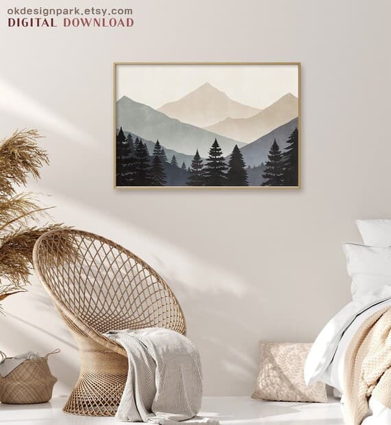
Coastal or Hamptons uses a palette of navy, white, and sand. Natural textures like linen and jute. This buyer wants prints that evoke calm, the sea, and a certain aspirational ease. Abstract watercolour ocean scenes, botanical coastal illustrations, and simple typographic prints work especially well here.
Dark and moody maximalism is growing fast, especially among younger buyers. Deep jewel tones, gallery walls, dark paint colours, and layered lighting. This buyer is bold and wants art that makes a statement. Dramatic florals, dark abstract work, and richly coloured illustrations resonate here.
Why the Same Print Can Belong in All of Them
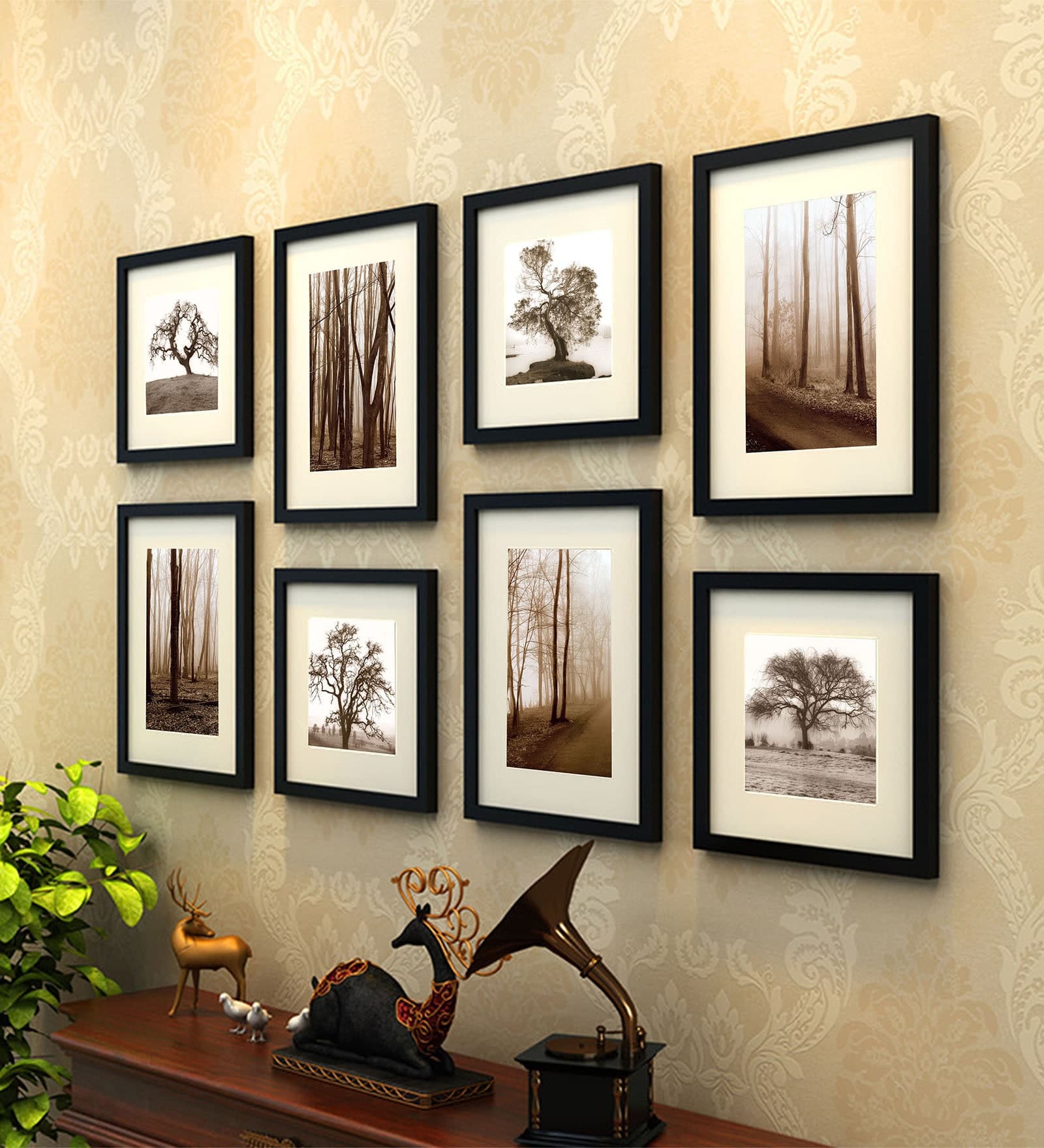
This is where the strategy becomes genuinely powerful. A botanical print with a clean white border can look at home in a Scandi apartment, a boho living room, a farmhouse kitchen, and a coastal bedroom. The print does not change. What changes is the context you show it in.
When you show your botanical print in a minimal white frame against a white wall with a wooden sideboard, you are saying: this belongs in your calm, thoughtful home. When you show the exact same print in a warm-toned room with linen textiles and woven baskets, you are saying: this belongs in your cozy, lived-in space. Both statements are true. You just have to make them explicitly.
Actionable takeaway: List the top three interior aesthetics your print could realistically fit into, then make sure you have at least one mockup representing each. You are not stretching the truth. You are expanding the conversation.
The Conversion Logic Behind Multiple Mockup Styles
It is worth understanding why this works from a psychological standpoint, because it will help you make smarter decisions about which mockups to prioritize.
Visualization Reduces Purchase Anxiety
For digital prints especially, the purchase is abstract. The buyer is paying for a file they will then print and frame themselves. There is more mental work involved than buying a physical object. Every extra step between desire and decision is an opportunity for doubt to creep in.
When you show a print already framed and styled in a room that looks like the buyer's home, you are doing some of that mental work for them. You are collapsing the distance between seeing and owning. This is not a new idea: it is why furniture retailers build fully styled room displays and why IKEA built an entire empire on showing people how their products fit into a life.
For Etsy sellers, multiple room-style mockups are the closest thing you have to that full room experience. Each additional relevant context you show reduces the purchase anxiety for a different segment of buyers.
The Scroll-Stop Effect in Search Results
Etsy's search results are a grid of thumbnails. Buyers are scanning rapidly, and the thumbnail is almost always a mockup, not the raw design. This means your first image is competing with dozens of similar prints for a moment of recognition.
When you A/B test thumbnail images (or simply rotate your primary mockup and watch what happens to click-through rates), you will often find that different room styles perform better in different seasons or for different search terms. A moody, dark-toned mockup might outperform a bright minimal one in autumn and winter. A light, airy coastal scene might win in spring and summer.
By having multiple room style mockups ready, you can rotate your primary listing image strategically, without having to create new mockups from scratch every few months.
Repeat Buyers and Collection Coherence
When buyers return to your shop after a first purchase, they are already fans. What they are looking for next is more things that will work in the same space. If your previous mockups showed your prints in a warm, earthy interior, returning buyers immediately understand that your new prints will work in their home too.
Multiple room styles also help buyers who are purchasing for different rooms. A customer might buy a botanical print for their bedroom shown in a calm, minimal style, and then return for a kitchen print shown in a farmhouse aesthetic. You are not confusing them by showing range. You are telling them that your shop can serve multiple rooms in their home.
Actionable takeaway: Test rotating your primary listing image between a lighter and a darker room aesthetic. Give each version two weeks and compare click-through rates in your Etsy stats. Let the data tell you which visual language your current buyers respond to most.
How to Build a Multi-Persona Mockup Set Without Spending Hours on It
The obvious objection to this strategy is time. You are already stretched. Creating three or four high-quality mockups per print, across multiple aesthetics, sounds like a full-time job on top of your actual creative work.
The good news is that with the right workflow, it does not have to be. The key is to stop thinking about mockups as something you create one at a time for each print, and start thinking about them as a system.
Build Aesthetic Templates, Not One-Off Mockups
The smartest way to approach this is to build a small library of interior room templates across your target aesthetics. A minimal white wall scene. A warm boho setting. A dark moody gallery wall. A coastal light-filled corner. Once you have these templates in place, every new print you create gets dropped into each template automatically.
You are not creating four unique mockups per print. You are creating one mockup system that generates four variations with minimal extra work. This is exactly the kind of workflow that tools like Mockupanda are built around. Rather than opening Photoshop for every new print and manually placing it into a room scene, you can generate multiple styled mockups in bulk, across different aesthetic settings, in a fraction of the time.
For high-volume shops selling dozens or hundreds of prints, this difference is enormous. The alternative is either a significant time investment per listing or the compromise of a single generic mockup that speaks to nobody in particular.
Choosing Mockup Styles That Match Your Niche
Not every aesthetic is relevant to every print type, and you do not need to cover all of them. Your job is to identify the two or three aesthetics that represent the widest spread of buyers for your specific niche, and build your template library around those.
If you sell minimalist typography prints, Scandinavian, modern farmhouse, and coastal are likely your three most relevant aesthetics. If you sell rich botanical illustrations, boho, maximalist, and farmhouse might serve you better. Think about where your existing buyers are coming from and what their shops are likely to look like.
You can get useful clues by looking at who favorites your listings. If you can see a buyer's public profile, check whether they have favorited other items. The patterns in what they save will tell you a lot about their interior aesthetic preferences.
Seasonal and Trend Adjustments
Room aesthetics shift with design trends, and Etsy's audience is often closely aligned with what is appearing in interior design media. The dark, moody maximalist aesthetic that is popular right now might give way to something softer in two years. Keeping your mockup library relatively small and refreshing it annually is a more sustainable approach than trying to cover every possible trend.
Set a reminder each January to review your mockup templates. Look at what interior aesthetics are trending on Pinterest and Instagram, check what new Etsy sellers in your category are using, and update one or two templates to reflect what feels current. This keeps your listings feeling fresh without requiring a complete overhaul.
Actionable takeaway: Choose two or three interior aesthetic templates that cover the widest range of your actual buyer base. Build those templates once, either in your mockup tool of choice or using a platform like Mockupanda, and then use them systematically for every new print you add to your shop.
What to Put Where: The Listing Image Strategy
Having multiple room-style mockups is only half the job. Knowing how to sequence them in your listing is what actually converts browsers into buyers.
Image Order and the Buyer Journey
Etsy allows up to ten listing images. Most sellers use three or four. The sequence matters because it mirrors a buyer's decision-making process.
Your first image is your thumbnail and it needs to do one job: stop the scroll and earn the click. Use your highest-performing room aesthetic here, or the one that best matches the search intent behind your primary keyword.
Your second and third images are where you show range. This is where you place your alternative room styles. At this point, the buyer has already clicked because they liked the first image. Now you are showing them that this print can work in multiple contexts. You are expanding their sense of possibility and deepening their confidence in the purchase.
Your fourth image is a good place for a close-up of the print itself, showing the detail and quality of the design without any room context. This is especially useful for buyers who have already decided they like the print and now want to examine the craft more carefully.
Any remaining images can show different frame options, size comparisons against a wall or person, or a styled flat lay that emphasizes the product's physical details.
Matching Mockup Aesthetics to Your Keywords
This is a subtle but genuinely useful tactic. If you have multiple listings for the same print in different sizes or frame styles, consider leading with different aesthetic mockups for each listing and targeting slightly different search terms.
For example, your A3 listing might lead with a minimal Scandinavian mockup and target keywords related to minimalist wall art, while your A4 listing leads with a warm boho aesthetic and targets botanical home decor. You are selling the same print in different sizes, but you are opening two separate doors for two different buyer personas.
Actionable takeaway: Review your listing image sequence for your top five products. Check whether the second and third images show meaningfully different interior aesthetics or whether they are all variations on the same visual tone. If it is the latter, this is your next improvement to make.
Making the Strategy Sustainable Over Time
Like any good business strategy, multi-persona mockup creation only delivers results if you actually do it consistently. The sellers who see the biggest impact are not the ones who do it perfectly once and move on. They are the ones who have made it a non-negotiable part of their listing process.
Turning It Into a Workflow, Not a Project
The trap most sellers fall into is treating mockup creation as something to optimize later. They upload the listing with one mockup because they are eager to get the product live, and the additional mockups never get added. Three months later, they wonder why conversions are flat.
The fix is to make multi-aesthetic mockup creation part of your upload checklist, not an optional extra. Before any listing goes live, it needs at least two room-style mockups. Full stop. Treat it the same way you treat filling in your title and tags. It is not done until it has them.
If the time constraint is real, address the root cause rather than the symptom. Bulk mockup generation tools exist specifically for this. The few minutes you spend generating three aesthetic variations of every print will almost certainly return more value than the same time spent tweaking keywords or adjusting your price by a dollar.
Measuring What Works
Etsy gives you stats on views, visits, and conversion rates. They do not tell you directly which mockup image drove the conversion, but you can infer a lot by tracking changes over time.
When you add a second or third room-style mockup to a listing that previously had only one, note the date and monitor the conversion rate over the following four to six weeks. If it rises, you have evidence. If it stays flat, look at whether the new mockups are actually representing a different aesthetic, or whether they are just visual repetition.
Over time, patterns will emerge. You will notice that certain aesthetic types consistently outperform others for your specific audience. That information is worth more than any general advice you will ever read, because it is your buyers telling you exactly what helps them decide to purchase.
Actionable takeaway: Add a multi-aesthetic mockup check to your listing upload process today. Even just committing to a minimum of two room styles per listing will immediately set your shop apart from the majority of sellers who are relying on a single generic image to do all the work.
The Bigger Picture: Mockups as Marketing, Not Just Presentation
It is easy to think of mockups as a finishing step, the thing you do after the real work of creating the print is done. But if you have followed this post to here, you can see that mockups are actually one of your primary marketing tools on Etsy.
They communicate which buyers your product is for. They reduce purchase anxiety by showing the print in context. They give you a way to reach different personas without creating different products. They can be rotated seasonally to stay relevant. And they give returning buyers a sense of your shop's range and versatility.
The sellers who understand this treat mockup creation as a strategic investment, not a chore. They build systems around it so it does not eat up their creative time. And they use tools, whether that is Mockupanda for bulk generation and text overlays, or a library of styled templates they have built over time, that let them execute the strategy efficiently rather than manually.
Showing your print in a minimal white Scandinavian room, a warm boho setting, and a modern coastal interior is not about having nice photos. It is about telling three different buyers, at the same time, that your art belongs in their home. When you get that right, conversion is not a mystery. It is just the natural result of people seeing themselves in what you have created.
Keep reading
How to Create a Cohesive Etsy Shop Front Using Mockups With a Consistent Color Palette Across All Listings
How to Showcase Poster Sets on Etsy Using Gallery Wall Mockup Templates