How to Use Mockup Images in Shopify Email Marketing to Recover Abandoned Carts for Print-on-Demand Products
You spent time creating your digital print. You uploaded it, wrote the description, set up your Shopify store, and waited. A shopper found your product, added it to their cart, and then... nothing. They left.
Abandoned cart rates for e-commerce stores hover around 70 percent. That means roughly seven out of every ten shoppers who show genuine interest in your product walk away without buying. For print-on-demand sellers, that number stings even more because your margins are already thin and every lost sale feels personal.
Here is the good news: abandoned cart emails are one of the highest-converting marketing channels available to you as a Shopify seller. Average recovery rates range from 5 to 15 percent, and some well-optimized sequences push even higher. The difference between a recovery email that gets ignored and one that actually brings a shopper back often comes down to one thing: the image you use.
This guide is specifically about using mockup images strategically inside your Shopify abandoned cart email sequences. Not stock photos. Not blurry product thumbnails. Proper, lifestyle-style mockup images that make your print-on-demand products look like something worth coming back for.
Why Most Abandoned Cart Emails Fail for Print-on-Demand Products
Before we talk about what works, it helps to understand what most sellers get wrong. If you have set up a basic abandoned cart flow in Shopify or Klaviyo, chances are your emails are automatically pulling the product image from your listing. That sounds fine in theory, but in practice it creates a problem.
The Default Product Image Problem
Most print-on-demand sellers use the same image for their listing that gets pulled into cart recovery emails. That image is often a simple flat file preview, a basic mockup from a supplier like Printful or Printify, or something you threw together quickly just to get the listing live.
When a shopper sees that image again in their inbox, it does not remind them why they wanted the product. It just shows them a flat, uninspiring version of something they already chose to leave behind. There is no emotional pull. There is no lifestyle context. There is nothing that says "this belongs in your home" or "this is the piece you were looking for."
The image in your email is not just decoration. It is doing sales work. And if the image is weak, the email is weak, no matter how good your copy is.
The Emotional Gap in Cart Recovery
Shopping is an emotional decision, especially for wall art, digital prints, and decorative products. When someone adds your art print to their cart, they are imagining it on their wall. They are picturing how it will look in their living room, above their desk, in their kid's bedroom.
Then life interrupts. They get a phone call, the baby wakes up, or they just want to think about it for a day. By the time your cart recovery email lands in their inbox, that emotional moment has faded. Your job with the recovery email is to recreate that emotional spark.
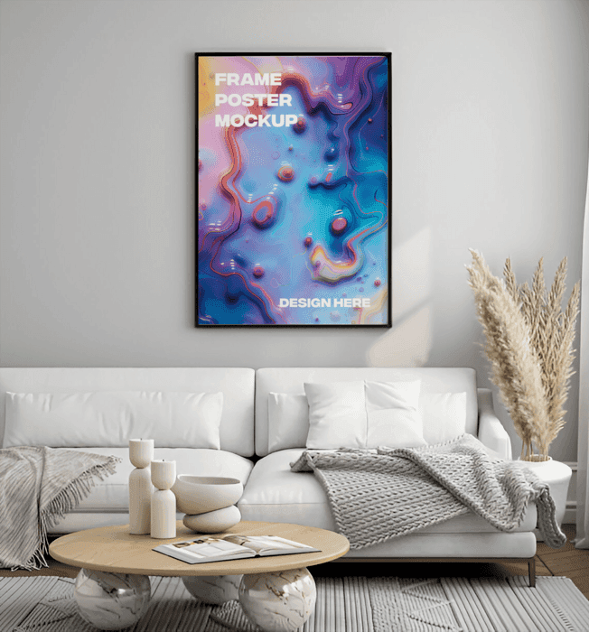
A high-quality lifestyle mockup image does that in a way that flat product images simply cannot. A print hanging on a real-looking wall, styled with furniture and plants and natural light, tells a visual story that pulls the shopper back into that original feeling of wanting it.
Actionable takeaway: Audit your existing cart recovery emails right now. Open the email that goes out automatically and look at the product image it uses. If it is a flat file or a basic supplier mockup, that is your first thing to fix.
The Types of Mockup Images That Work Best in Abandoned Cart Emails
Not all mockups are created equal when it comes to email marketing. The images that perform best in cart recovery sequences share a few specific characteristics.
Lifestyle Mockups Over White Background Shots
For digital prints and wall art, lifestyle mockups consistently outperform clean studio shots in email contexts. A lifestyle mockup shows your print in a real-seeming environment: a Scandinavian-style living room, a cozy reading nook, a bright home office. It places your product in context and helps the shopper visualize ownership.
White background shots have their place on product listing pages where shoppers want to see clean detail. But in an email, you are competing with dozens of other messages in someone's inbox. You need an image that stops the scroll and creates a feeling, not just a visual reference.
When you are creating mockups for your email sequences, think about the room or environment that best matches your ideal customer's aesthetic. If you sell minimalist botanical prints, you want a mockup in a clean, light-filled space with neutral tones. If you sell bold maximalist art, lean into a richer, more layered environment.
Showing Scale and Context Together
One of the biggest reasons shoppers abandon carts for wall art is uncertainty about size. They liked the print, but they were not sure if it would look right on their specific wall. Your cart recovery email can address this objection directly with the right mockup image.
Choose mockups that clearly show the print in proportion to recognizable room elements: a sofa, a door frame, a bedside table. When a shopper can see that your 18x24 print fills a wall beautifully above a couch, their size anxiety drops significantly.
If you sell multiple sizes of the same print, consider using different mockups for different size variants. The shopper who abandoned a large format print should see a large format mockup in their recovery email, not a small framed version that undersells the impact.
Matching the Mockup Style to Your Brand Aesthetic
Consistency matters in email marketing just as much as it does on your storefront. The mockup images you use in your recovery emails should feel like a natural extension of your shop's visual identity.
If your shop has a warm, earthy aesthetic and you send a recovery email with a cold, grey, ultra-modern interior mockup, there is a visual disconnect that subtly undermines trust. The shopper's subconscious registers that something feels off, even if they cannot articulate why.
This is one reason it is worth investing time upfront to create a small library of mockup images that are all stylistically consistent with your brand. Then you can pull from that library for emails, social media, and ads without starting from scratch every time.
Actionable takeaway: Create at least three lifestyle mockup variations for your top-selling products specifically for use in email sequences. Make sure they show scale, use a consistent aesthetic, and feature real-seeming interior environments rather than plain backgrounds.
Setting Up Your Abandoned Cart Email Sequence in Shopify
Shopify has built-in abandoned cart recovery through its native email tool, but most serious print-on-demand sellers will get better results using a dedicated email platform like Klaviyo, Omnisend, or Mailchimp. Here is how to structure a sequence that uses your mockup images effectively.
The Three-Email Framework
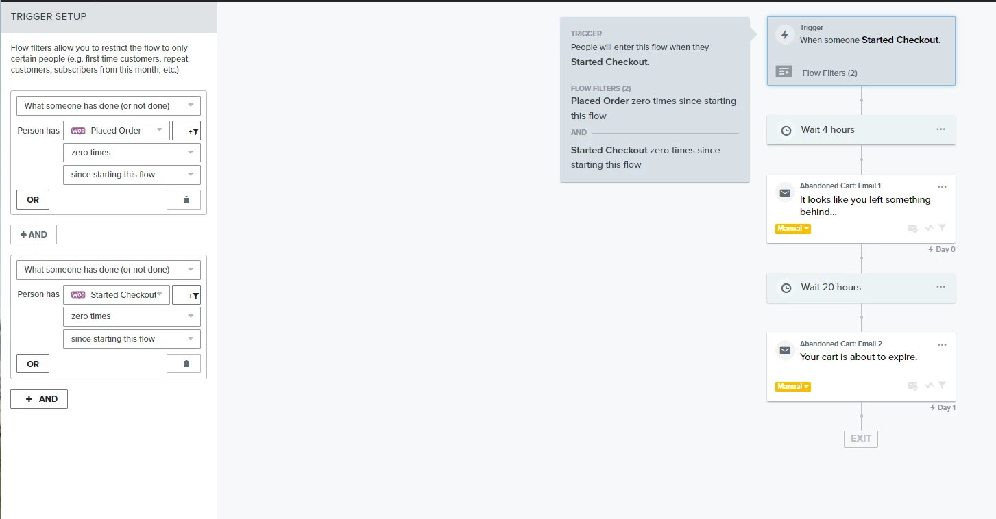
A three-email abandoned cart sequence is the standard that most e-commerce marketers recommend, and it works well for print-on-demand products specifically because it gives you space to address different objections at different points in the buying journey.
Email one goes out one to two hours after abandonment. This is the reminder email, and it should be simple and direct. Lead with your best lifestyle mockup image, a short subject line, and a clear call to action to return to the cart. Do not oversell. The shopper just left. They probably just got distracted. Show them what they left behind in the most compelling visual way possible and give them an easy path back.
Email two goes out 24 hours later. By this point, the shopper has had a chance to comparison shop or simply forget. This email needs to do more work. Use a different mockup image from your library, one that shows the product in a different context or from a different angle. This is also where you address the most common objections: sizing uncertainty, shipping times, or print quality. A before and after showing your design as a flat file versus a beautifully framed print on a wall can be powerful here.
Email three goes out 48 to 72 hours after abandonment. This is your final nudge, and it is where a time-limited incentive makes sense if your margins allow it. A 10 to 15 percent discount or free shipping offer, paired with a high-impact mockup image and urgency-driven copy, gives hesitant buyers the final push they need.
Customizing the Product Image Block
In most email platforms, the abandoned cart template will automatically pull the product image from your Shopify store. This is convenient but limiting. To use your custom mockup images instead, you need to either manually customize the email template or use a dynamic image block that you can control.
In Klaviyo, for example, you can edit the abandoned cart flow template and replace the default product image block with a custom image block. You upload your lifestyle mockup directly into the email template for that specific product or product category. This takes a bit more setup time upfront but gives you complete control over the visual experience.
For sellers with large catalogs, another approach is to group your products into visual categories and create one strong lifestyle mockup per category. Then in your email template, you can conditionally show different images based on which product category was abandoned. This is a more advanced setup but scales well for high-volume shops.
Writing Copy That Works With the Image, Not Against It
Your mockup image and your email copy need to work together. The most common mistake sellers make is writing copy that just repeats what the image already shows. If your mockup image of a botanical print in a sunlit living room is doing the job of creating desire, your copy should be addressing something the image cannot: the practical decision-making factors.
Use your copy to handle objections. Mention your print quality, your return policy, your fast dispatch time. Remind the shopper that this is a unique design they will not find anywhere else. If you are a solo creator, this is also where the personal story element of your brand can shine. Something like "I designed this print to bring a little calm into busy homes" does something a product image cannot: it connects the shopper to the person behind the product.
Actionable takeaway: Map out your three-email sequence and identify the specific mockup image you will use for each email. Make sure each image serves a different visual purpose: desire in email one, context and scale in email two, and final conviction in email three.
Creating the Right Mockup Images Without Wasting Hours
Here is where many print-on-demand sellers get stuck. They understand that better mockup images will improve their email performance, but the process of creating those images feels overwhelming, expensive, or time-consuming.
Bulk Mockup Generation for Product Collections
If you sell a collection of prints with a consistent aesthetic, you do not need to create individual mockups one by one for every single product. Bulk mockup generation tools let you upload multiple designs and generate a set of consistent, professional mockups in a fraction of the time.
This matters for email marketing specifically because you want a library of images to draw from. The more mockup variations you have for each product, the more flexibility you have when customizing your email sequences. You can use a different image in each of your three recovery emails without repeating yourself, which keeps the visual experience fresh and continues to build desire rather than just repeating the same prompt to buy.
Mockupanda was built specifically for this kind of workflow. As a print-on-demand seller myself, I built it because I was spending way too much time dragging and dropping designs into mockup templates one at a time. The bulk generation feature means you can drop in your entire collection and walk away with a folder of professional lifestyle mockups ready to use across your email sequences, your listings, and your ads.
Choosing the Right Scenes for Email Contexts
Not all mockup scenes work equally well in email format. Emails are often viewed on mobile, which means your image will be displayed at a relatively small size in a vertical layout. Mockup scenes that work best in this format are ones where your print is the clear focal point and the surrounding room elements support rather than compete with it.
Avoid overly complex or busy room scenes for email use. A mockup with seventeen props, three plants, a stack of books, and a dog in the corner might look beautiful on a large monitor but becomes chaotic and hard to read on a phone screen. Simpler, cleaner compositions with clear negative space around the print perform better in email contexts.
Horizontal landscape mockups can also cause problems in email templates, which typically use a vertical column layout. Whenever possible, choose portrait-oriented or square mockup scenes for email use, as they resize more cleanly and maintain visual impact at smaller sizes.
Testing Different Mockups to Find What Converts
Once you have your mockup library and your email sequence set up, the real optimization work begins with testing. Most email platforms let you run A/B tests on individual emails within a flow, including testing different images.
Set up a simple test where half your abandoned cart emails show one lifestyle mockup and the other half show a different scene or composition. Run the test long enough to get statistically meaningful results, which usually means at least a few hundred sends per variation. Then take the winning image and apply it as your default, and set up the next test.
Over time, this kind of systematic testing builds you a genuinely optimized email sequence based on real data from your actual customers, not guesswork. It is one of the highest-leverage things you can do to improve your recovery rate without spending more on ads or traffic.
Actionable takeaway: Use a bulk mockup generator to create at least two to three lifestyle mockup variations per product before building your email sequence. Aim for portrait or square compositions with clean focal points that will render well on mobile screens.
Measuring Whether Your Mockup Strategy Is Working
Improving your mockup images is only worthwhile if you are tracking whether the change actually improves your results. Here is how to measure the impact without getting lost in data.
The Metrics That Matter for Cart Recovery Emails
For abandoned cart emails, the three numbers you care most about are open rate, click rate, and recovered revenue. Open rate tells you whether your subject line is working. Click rate tells you whether your email content, including your mockup image, is compelling enough to get the shopper back to your store. Recovered revenue tells you the actual business impact.
For print-on-demand sellers, a healthy abandoned cart open rate is typically between 40 and 50 percent for the first email. Click rates of 8 to 15 percent are realistic for a well-optimized sequence. If your click rates are below 5 percent, your images and copy are not creating enough desire to get the shopper back to the cart page. That is your signal to test different mockup images.
Connecting Mockup Quality to Conversion Rate
One of the most telling experiments you can run is comparing your cart recovery conversion rate before and after upgrading your mockup images. Pull your recovery rate data for the 30 days before you make the change, then compare it to the 30 days after. If your recovery rate improves without any other changes, you have your answer about whether better images are doing their job.
Keep in mind that recovery rate improvement compounds over time. A 2 percentage point improvement in recovery rate might sound small, but across hundreds of abandoned carts per month, that translates into meaningful additional revenue with zero additional ad spend.
Actionable takeaway: Set a baseline for your current abandoned cart recovery rate before making any changes. Then, after implementing new mockup images across your sequence, track for 30 days and compare. That data will show you exactly what your mockup investment is returning.
Putting It All Together for Your Print-on-Demand Shop
Recovering abandoned carts is one of the most direct ways to increase revenue from the traffic you already have. For print-on-demand sellers, the visual quality of your recovery emails is often the single biggest lever you have to pull, because your products are inherently visual and buying decisions are driven by desire and imagination.
The framework is straightforward. Create a library of high-quality lifestyle mockup images that show your prints in real environments, with clear scale and consistent brand aesthetic. Set up a three-email recovery sequence where each email uses a different mockup to rebuild desire and address specific objections. Customize your email templates to use these mockups instead of default product images. Then test, measure, and keep improving.
The sellers who consistently recover the most abandoned carts are not necessarily the ones with the best discounts or the cleverest copy. They are the ones who make it visually irresistible to come back and finish the purchase. That starts with a great mockup image and a recovery email that treats the shopper like someone who already wanted the product, because they did.
If creating those mockup images feels like the bottleneck right now, Mockupanda is built to remove exactly that friction. Upload your designs, generate professional lifestyle mockups in bulk, and have a full email-ready image library ready to go without spending hours in design software. It is the part of the workflow that should be the easiest, so you can focus on the strategy work that actually grows your shop.
Keep reading
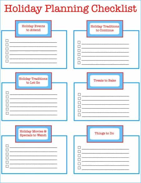
The Batch Mockup Checklist Every Print-on-Demand Seller Needs Before a Holiday Sales Season
How to Use Batch Mockup Generation to Stay Consistent When You Have Multiple Designers Uploading New Artwork to Your Shop