The Best Shopify Product Page Layout for Selling Digital Prints: How Many Mockups, What Order, and Why
You have about three seconds to convince someone your digital print is worth buying.
That is not a dramatic exaggeration. It is closer to the reality of how quickly shoppers make a gut decision about whether to keep scrolling or actually stop and read. On Shopify, your product page is doing a lot of heavy lifting, and most of that work happens through your images, not your words.
If you are selling digital prints, wall art, or printable downloads, you are working with a unique challenge. Your customer cannot hold the product. They cannot see it on their wall before purchasing. They are buying a vision, and it is your job to make that vision feel real and desirable before they even reach for their wallet.
That is exactly why your product page layout matters so much, and specifically why the number of mockups you use, the order you place them in, and the types of images you choose can directly determine whether someone converts or clicks away.
This post is going to walk you through the exact structure that works for digital print product pages on Shopify, broken down into the logic behind each decision so you can apply it to your whole shop, not just copy a formula blindly.
Why Your Image Sequence Is a Sales Funnel
Most sellers think about product images as a gallery. You pick a few nice photos, upload them, and move on. But the most effective product pages treat the image sequence like a mini sales funnel, where each image serves a specific purpose and moves the buyer one step closer to adding the product to their cart.
Shopify displays your images in a left-to-right or top-to-bottom scroll on mobile, and in a thumbnail stack on desktop. Customers do not always view every image. Many make a decision after seeing two or three. That means your first images need to do the most work, and every image that follows should be adding new information, not repeating what they already saw.
The Three Jobs Your Images Need to Do
Before you think about how many mockups to include or what order to put them in, it helps to understand what your images are collectively trying to accomplish.
First, they need to establish desire. The customer needs to see the print in a context that makes them want it, ideally in a room that looks like a space they aspire to have. A well-styled lifestyle mockup showing your botanical print in a cozy living room does this immediately.
Second, they need to build trust. Your customer is buying a digital file, not a physical product. They need to believe that what they download will actually look the way it does in your mockups. Close-up images, detail shots, and previews of the actual file help with this.
Third, they need to answer objections. Common objections for digital prints include questions about size, color accuracy, file format, and print quality. Your images should preemptively answer those questions so the customer does not have to go looking for the information and risk losing interest.
Every image you choose should serve at least one of these three jobs. If it does not, it probably does not belong on the page.
What Happens When Image Order Is Wrong
Imagine you land on a product page and the first image you see is a flat, white-background PNG of a digital file. No room context, no scale reference, no styling. You might click through to the next image, but there is a real chance you already formed a negative impression, or simply moved on.
Now imagine the first image shows that same print hanging in a warm, beautifully lit bedroom above a linen bed with a trailing plant nearby. Suddenly you are not looking at a file. You are imagining waking up in that room.
The second experience creates emotion first, then gives you the details. That is the sequence that sells.
When the order is reversed, or when images are placed randomly without intention, you are leaving conversion rates on the table. And on a platform as competitive as Shopify, especially if you are also running ads that drive traffic directly to product pages, that matters enormously.
Takeaway: Map your current product images against those three jobs: desire, trust, and objection-handling. If any image does not serve one of those purposes, consider replacing it with one that does.
The Ideal Number of Mockups for a Digital Print Product Page
There is no single magic number, but there is a range that tends to work well for digital print sellers, and there is a clear reasoning behind it.
For most digital print listings on Shopify, between five and eight images is the sweet spot. Here is why that range works.
Fewer than five images usually means you are not giving customers enough context. You might have one lifestyle shot and one flat preview and call it done. That leaves a lot of trust-building and objection-handling on the table.
More than eight or nine images can actually hurt conversions. When you have too many images that look similar or serve the same purpose, customers start to skim or disengage. If your eighth and ninth images are just the same mockup with slightly different plants in the background, you are adding noise, not value.
The Core Five: What Every Product Page Needs
If you are going to build a product page with a minimum viable image set, here is what those five images should be.
Image one is your hero lifestyle mockup. This is the most important image on the page. It should show the print in a beautifully styled room setting, at a realistic scale, in the best possible light. This is the image your customer sees in search results and on collection pages, so it needs to stop the scroll immediately.
Image two is a second lifestyle angle or a different room context. If your first image showed the print in a living room, the second might show it in a bedroom or home office. This helps customers with different home aesthetics see themselves owning the piece.
Image three is a close-up detail shot. Show the texture, the typography if it is a quote print, or the fine detail of the illustration. This builds trust by proving the quality of the artwork itself.
Image four is the flat file preview or a clean mockup showing exactly what the customer will receive when they download. This is where you manage expectations and reduce post-purchase anxiety.
Image five is an informational image, a size guide, a color swatch comparison, or a graphic that explains what is included in the download. This image handles the objections.
When to Go Beyond Five Images
Adding more images makes sense when you are selling a print in multiple sizes, when the print comes in multiple colorways, or when you want to show it styled in several different types of rooms to broaden its appeal.
For example, if you sell a minimalist line art print that works in both a contemporary loft and a farmhouse-style kitchen, showing both contexts with a dedicated mockup for each is worth the extra image slot. You are essentially doubling the number of customers who can picture themselves buying it.
You can also use an additional image to show the print as part of a gallery wall, which is a common way customers display wall art. This opens up the possibility of upselling companion prints or sets.
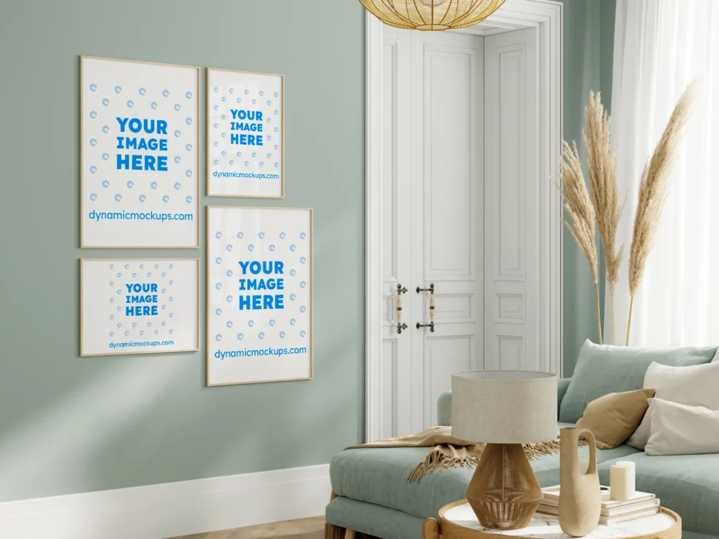
Takeaway: Audit your existing listings and make sure you have at least five images per product, each serving a distinct purpose. If you have fewer, prioritize adding the lifestyle hero shot and the informational size guide image first.
The Right Order: How to Sequence Your Mockups for Maximum Conversion
Now that you know what images to include, the order they go in is where the real strategy lives. The sequencing should mirror the mental journey your customer takes from first impression to purchase decision.
Emotion First, Logic Second
Human purchasing decisions are driven by emotion and justified by logic. Your image sequence should follow the same pattern.
Start with the most emotionally compelling image you have. This is almost always a lifestyle mockup, styled to match the aspirational home your target customer wants to have. Do not start with a flat file preview. Do not start with a size chart. Start with the image that makes someone feel something.
From there, you can move into the second lifestyle shot to keep the emotional momentum going. Two strong lifestyle images back to back reinforce the desire before you start asking the customer to process more rational information.
Once you have established emotional interest, you can bring in the trust-building images. The close-up detail shot, the clean file preview, the gallery wall context. These images are for customers who are already interested and now need reassurance.
Finally, end with your informational or objection-handling image. By the time a customer reaches this image, they are deep into evaluating the product. They want to know the specifics. A clean size guide or a graphic showing exactly what file formats are included is exactly what they need at this stage.
Adapting the Sequence for Different Print Types
Not every digital print product page works exactly the same way. A typography quote print is different from a watercolor botanical, which is different from a kids' room print with a character illustration.
For quote prints, the readability of the text is a key purchase driver. Your close-up detail shot should come earlier in the sequence, possibly at position two or three, because customers want to read the full text clearly before committing.
For illustrative or detailed artwork, the lifestyle shot carries more weight because the overall composition and feel matter more than any single element. Keep the lifestyle images at the front.
For children's room prints, showing the product in an actual nursery or kids' room is especially powerful because parents are trying to visualize the room they are designing. A children's room styled mockup can do a lot of heavy lifting.
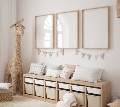
Takeaway: Reorder your current product images so that emotion comes first. If your hero image is anything other than a well-styled lifestyle mockup, swap it out and test whether your engagement metrics improve.
How to Create Consistent, Professional Mockups Without Spending All Day on It
Knowing the right layout is one thing. Actually producing the images efficiently is another challenge entirely, especially when you have dozens or hundreds of products to list.
Many digital print sellers hit a wall here. They know they need professional lifestyle mockups. They know their white-background screenshots are not cutting it. But they also do not have the budget for a professional photographer or the skills to use Photoshop comfortably.
This is exactly the problem Mockupanda was built to solve. As a product designer who sold digital prints myself, I ran into this frustration constantly. I needed a way to create professional, on-brand lifestyle mockups in bulk, without spending hours on each one or paying for a tool that was designed for apparel brands rather than wall art sellers.
Bulk Generation for High-Volume Shops
If you sell ten prints, manually creating five mockup variations for each one is manageable, maybe. If you sell a hundred prints across multiple size options and colorways, doing that manually is simply not sustainable.
Bulk mockup generation is the practical answer. With Mockupanda, you can upload a batch of your print files and generate multiple mockup variations across different templates in one workflow. The result is a consistent set of images for every product without the per-image time cost.
This also solves a consistency problem that many Shopify shops have. When you create mockups manually over time, you end up with a mix of styles, lighting conditions, and quality levels across your shop. A buyer browsing your collection page notices this inconsistency even if they cannot articulate why. Bulk generation keeps everything visually cohesive.
Choosing the Right Mockup Templates
Not every mockup template is right for every print. The template you choose should match the aesthetic of the print itself and the target customer you are trying to reach.
A moody, dark-toned art print belongs in a similarly styled interior, perhaps with darker walls, dramatic lighting, and minimal decor. A bright, airy botanical print belongs in a light-filled Scandinavian-style room with white walls and natural textures.
When your mockup environment clashes with the feeling of the print, the result looks off even to customers who could not explain why. When the environment complements the print, the whole image feels intentional and aspirational.
Mockupanda offers templates specifically curated for wall art and digital print sellers, which means you are not scrolling through hundreds of t-shirt or phone case mockups trying to find something relevant. The templates are already filtered to the use case.
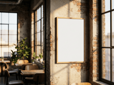
Takeaway: If you are manually creating mockups one by one for every product, calculate how much time you are spending per listing and multiply that by your total product count. If that number feels unsustainable, bulk mockup generation is worth testing immediately.
Optimizing Beyond the Images: What Else Supports Your Product Page Layout
Your mockup strategy does not exist in isolation. The images work together with the rest of your product page to create a complete buying experience. A few other elements are worth considering alongside your image layout.
Product Description That Reinforces What the Images Show
Your product description should start by confirming what the customer just saw in the images. If they saw a linen-textured bedroom with your print centered above the bed, your opening line should anchor that same feeling with words.
Avoid starting with purely technical information. Lead with the feeling or the use case, then follow with the practical details like file formats, sizes included, and delivery method. This mirrors the emotion-first, logic-second structure of your image sequence.
Also make sure your description explicitly answers the questions your images left open. If your size guide image shows five size options, your description should spell out exactly what is included in the download for each size.
Variants, Thumbnails, and How They Affect Perception
If you sell your print in multiple sizes or colorways, Shopify lets you add variant images that change the main display image when a customer selects a different option. Use this feature deliberately.
For example, if you offer a print in three colorways, each variant should have its own hero lifestyle image that matches that colorway's aesthetic. A customer selecting the sage green version should see the sage green print styled in a room that complements that color, not the mustard yellow version they already saw.
This requires more mockup images overall, but it significantly improves the experience for customers who are choosing between options. It also reduces the confusion that leads to abandoned carts.
Takeaway: Review your product descriptions to make sure they follow an emotion-first structure and explicitly confirm what customers see in the images. Check your variant images to make sure each option has its own relevant lifestyle mockup.
Measuring Whether Your Product Page Layout Is Actually Working
Once you have restructured your product pages with intentional image sequencing, the right number of mockups, and a clear hero image strategy, you need a way to know if it is working.
Metrics to Watch in Shopify Analytics
Shopify gives you access to a few key metrics that can tell you a lot about product page performance. Session-to-conversion rate is the most direct signal. If you update a product page and the conversion rate increases over the following two to four weeks, the changes are working.
Add-to-cart rate is another useful signal. If more people are adding the product to their cart but not completing checkout, the issue might be downstream in your checkout flow rather than on the product page itself.
You can also look at which products in your shop have the highest conversion rates and study what their product pages have in common. Often the best-performing listings share a strong hero image, a clear image sequence, and a higher total image count than your underperformers.
A Simple Testing Approach
You do not need sophisticated A/B testing tools to improve your product pages. A simple approach is to identify your five to ten lowest-converting products, rebuild their product pages using the image structure outlined in this post, and then compare their conversion rates over the next month against products you did not change.
This is not a perfect controlled experiment, but it gives you directional data. If the updated pages consistently outperform the unchanged ones, you have good reason to roll out the same approach across the rest of your shop.
Takeaway: Set a reminder to check the conversion rate on any product page you update about four weeks after making changes. Use that data to decide whether to apply the same structure across your other listings.
Putting It All Together
Building the best Shopify product page layout for digital prints comes down to one core principle: every image needs to earn its place by moving the customer one step closer to buying.
Start with a lifestyle hero shot that creates immediate desire. Follow it with a second lifestyle context to broaden appeal. Use a detail shot to build trust in the artwork quality. Include a flat file preview to set accurate expectations. End with an informational image that handles size and format questions before the customer has to ask.
Keep your total image count between five and eight for most products, and scale up only when you have genuinely different contexts or colorways to show. Order your images so emotion comes before logic, matching how purchasing decisions are actually made.
And when it comes to actually producing those images efficiently across a large catalog, a tool like Mockupanda takes the manual labor out of the equation so you can focus on what actually drives your business forward, which is getting more products listed and in front of more customers.
Your product page is your best salesperson. Build it like one.
Keep reading
The Batch Mockup Checklist Every Print-on-Demand Seller Needs Before a Holiday Sales Season
How to Use Batch Mockup Generation to Stay Consistent When You Have Multiple Designers Uploading New Artwork to Your Shop