Why Shopify Product Images for Print-on-Demand Wall Art Need Different Mockup Specs Than Etsy
If you sell print-on-demand wall art on both Shopify and Etsy, you've probably done what most sellers do: create one set of mockups and upload them everywhere. It feels efficient. It feels smart. But the reality is that this approach is leaving money on the table on at least one of those platforms, and often both.
Etsy and Shopify are not the same selling environment. They have different image requirements, different browsing patterns, different buyer psychology, and different competitive dynamics. What works beautifully on one platform can look underwhelming or even unprofessional on the other.
I built Mockupanda after running into exactly this problem myself. As a product designer, I knew what good visual presentation looked like, but I kept watching sellers waste hours creating the wrong mockups for the wrong platforms. So let's fix that. Here's exactly why your Shopify and Etsy mockup specs need to be different, and what to do about it.
The Technical Reality: Image Specs Are Not the Same
Let's start with the basics, because the technical differences alone are enough to justify maintaining separate mockup sets for each platform.
Etsy's Image Requirements and How the Platform Actually Displays Them
Etsy recommends images that are at least 2000 pixels on the shortest side, with a preferred aspect ratio of 4:3 (landscape). The platform displays listing thumbnails as squares in search results, which means Etsy crops your image automatically when shoppers are browsing. Whatever you put in the center of your image is what survives that crop.
This has real consequences for wall art mockups. If you create a beautiful wide lifestyle shot of a print hanging in a living room, and the composition centers the art with lots of contextual room on either side, Etsy's square crop is going to eliminate a lot of that context. The print might still be visible, but the careful staging you did could be partially lost.
The best performing Etsy mockups for wall art tend to use tighter compositions that center the product prominently, with lifestyle context framing it rather than competing with it. The image needs to read well at thumbnail size, because that is literally what drives the click.
Shopify's Image Display and What Your Store Theme Actually Does
Shopify does not have a single universal image spec because it depends entirely on your theme. Most modern Shopify themes display product images in a 1:1 square format or in portrait-oriented gallery layouts, but some themes use landscape or even custom aspect ratios. The platform itself recommends 2048 x 2048 pixels for square images and suggests keeping images consistent in ratio across your store.
Here is the critical difference: on Shopify, shoppers are already on your store. They came there intentionally, often through an ad or a Google search. They are not scrolling through a competitive marketplace grid where your thumbnail has to beat out hundreds of other listings. They are in your environment, evaluating your brand.
This means Shopify mockups can and should do more heavy lifting for your brand story. You have more real estate, more context, and a more captive audience. A wider aspect ratio, more editorial lifestyle photography, and brand-consistent styling all perform better here than they do on Etsy, where the thumbnail is the battlefield.
Actionable takeaway: Before creating any mockups, check your Shopify theme's product image ratio and create a template at that exact ratio. For Etsy, always design with the center-crop in mind and keep your primary product clearly visible within a 1:1 square centered on your image.
Buyer Psychology Is Different on Each Platform
Beyond the technical specs, the people browsing these platforms are in a different headspace when they land on your listing. Understanding that changes everything about what your mockups should communicate.
The Etsy Shopper: Discovery Mode and Competitive Scanning
Etsy is a marketplace. Shoppers are almost always in discovery mode, scrolling through search results and comparing dozens of options in a single session. They are evaluating your product against competitors in real time, often without clicking through to your listing at all.
In this environment, your mockup has one job: stop the scroll and earn the click. It needs to communicate product quality, style fit, and some emotional resonance in under two seconds at thumbnail scale. This means:
The print itself needs to be clearly visible and readable. Lifestyle context should feel aspirational but not overwhelming. Text overlays (if you use them, and sometimes they perform very well on Etsy) need to be legible at small sizes. Colors need to pop against Etsy's white background.
Social proof signals matter enormously on Etsy. Showing the print in a styled, realistic room setting helps buyers visualize it in their own homes, which reduces purchase anxiety. But the room cannot be so elaborate or dark that it obscures the art.
The Shopify Shopper: Evaluation Mode and Brand Immersion
Someone browsing your Shopify store has already found your brand. Maybe they came through an Instagram ad, a Pinterest pin, or a Google search for a specific type of wall art. They are in evaluation mode, not discovery mode. They want to know if your brand is the right fit for them and if the quality justifies the price.
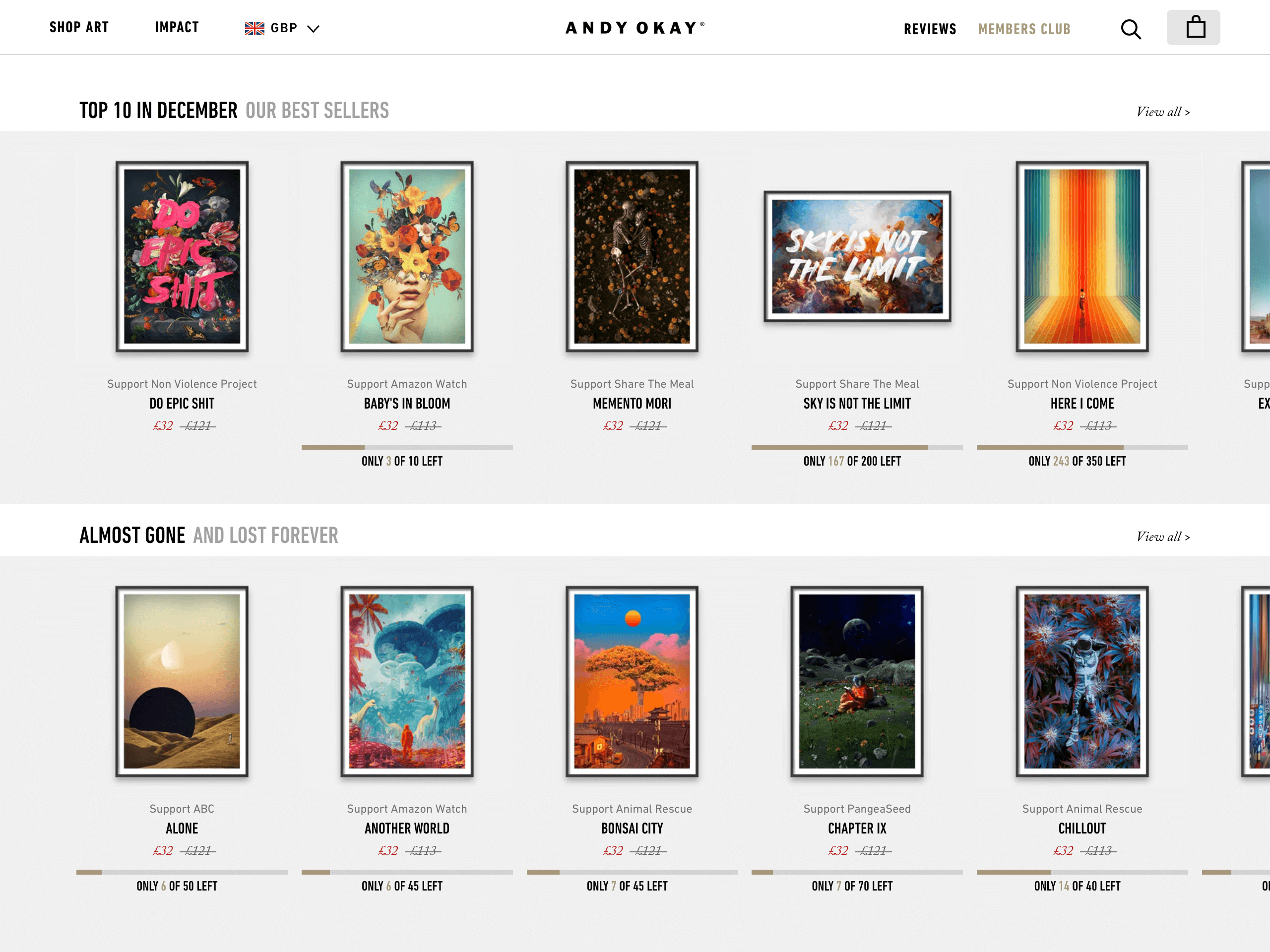
This is where more editorial, brand-forward mockups shine. You can use slightly moodier lighting, more intentional styling, and images that tell a story about the lifestyle your art belongs to. You can show the print in multiple room contexts across your image gallery because buyers will click through to see all images. You have space to show size context, framing options, and collection pairings.
Shopify buyers are often also willing to spend more per order, especially if your store communicates premium quality. Your mockups are part of that premium signal.
Actionable takeaway: For Etsy, prioritize clarity and immediate product visibility in your mockup. For Shopify, prioritize brand atmosphere and lifestyle storytelling across your full image gallery. Ask yourself: does this mockup earn a click in two seconds (Etsy), or does it build trust over a full product page scroll (Shopify)?
File Format, Resolution, and Loading Speed Matter More Than You Think
This section does not get talked about enough in the print-on-demand community, but file optimization is a meaningful part of mockup strategy, and it differs by platform.
Why Resolution and File Size Affect Your Etsy Ranking
Etsy's algorithm factors in listing quality, and while image file size is not a direct ranking signal, page load speed and user experience are. Etsy hosts your images on their CDN and compresses them, but starting with a bloated file can create issues during upload and can result in visual compression artifacts.
For Etsy, you want images that are sharp and well-optimized. JPEG at high quality (around 90 percent) for lifestyle mockups is the standard. PNG can work for flat mockups with clean backgrounds, but the file sizes get large fast. Aim for under 2MB per image while maintaining visual crispness.
For your Etsy main listing image, the 4:3 ratio at 3000 x 2250 pixels gives you solid resolution with room for the platform's compression while keeping that square-crop-safe center composition.
Shopify, Page Speed, and Your Conversion Rate
Shopify connects your page speed directly to your conversion rate, and their own data shows that slower stores convert worse. Unlike Etsy where images are platform-hosted and compressed uniformly, your Shopify store's performance depends on how well your images are optimized before upload.
For Shopify, use WebP format if your theme supports it (most modern ones do). It provides the best balance of quality and file size. Keep individual product images under 1MB, and ideally under 500KB for most lifestyle shots. If your theme uses a 1:1 ratio, create your mockups at exactly 2000 x 2000 pixels rather than uploading a larger image and letting the theme crop it.
Also worth noting: Shopify stores often pull product images into collection pages, featured product sections, and even email marketing. Your mockups need to be versatile enough to look good across all of these contexts, not just the product page.
Actionable takeaway: Export your Etsy mockups as high-quality JPEGs under 2MB at 3000 x 2250 pixels. Export your Shopify mockups in your theme's exact ratio, in WebP if possible, keeping file sizes lean. This small step has a real impact on both performance and professionalism.
Mockup Style and Staging: What Converts on Each Platform
Now let's talk about the visual direction of the mockups themselves, because the style that works on Etsy is genuinely different from what works on Shopify.
Etsy: Warm, Cozy, and High-Clarity
Etsy has a particular aesthetic that its buyer base is drawn to: warm neutrals, natural light, cozy domestic settings, and an overall sense of warmth and approachability. This is not a universal rule, but it is a strong trend across the categories that print-on-demand wall art sits in.
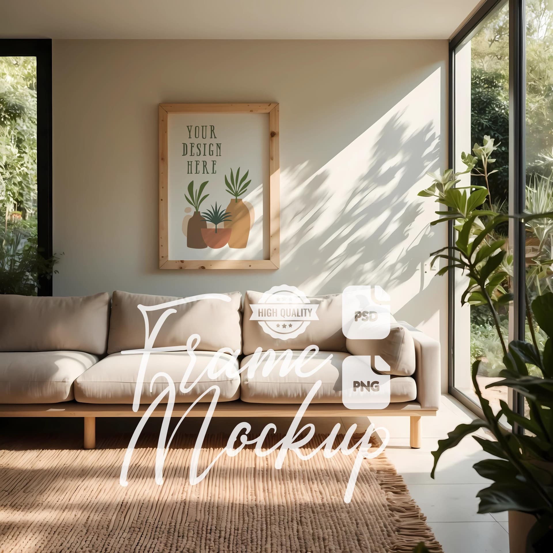
For Etsy mockups, lean into light-filled rooms with warm tones. Show the print framed (if your product comes framed) or use a realistic white or natural wood frame mockup even for unframed prints, because it helps buyers visualize the end result. Keep the composition simple, the background uncluttered, and the print the clear star of the image.
Bright white backgrounds also perform well on Etsy for certain product types, especially if you are selling in a category where shoppers are doing side-by-side comparisons. A clean white background mockup as your secondary or tertiary image gives buyers a clear look at the art itself.
Shopify: Brand-Consistent, Editorial, and Aspirational
On your own Shopify store, you are not competing in a crowded marketplace feed. You are curating an experience. This is your chance to build a world around your art.
If your brand is minimal and modern, your mockups should reflect that with cool whites, clean lines, and architectural spaces. If your brand is bohemian and layered, your staging should reflect that. The goal is that a customer looking at your product images should feel like they are already inside the aesthetic universe your shop inhabits.
On Shopify, you can also use your product image gallery more strategically. Use your first image for maximum visual impact and product clarity. Use images two through five to show the art in different room contexts, at different scales, or styled in different ways. This kind of depth is expected on a branded Shopify store and builds purchase confidence.
Text overlays are another tool worth considering for Shopify product images or ad creative. A subtle overlay that says "Available in 5 sizes" or "Ships in 3 to 5 days" embedded directly in an image can answer objections before buyers have to hunt for that information. Mockupanda supports text overlays natively, which makes this kind of tactical image creation much faster than doing it manually in design software.
Actionable takeaway: Define your Shopify brand aesthetic clearly before creating mockups for your store. Choose two to three room settings that represent your brand world and create consistent mockups across your entire catalog using those settings. On Etsy, prioritize warmth, clarity, and immediate visual impact over editorial sophistication.
Building a Dual-Platform Workflow That Does Not Eat Your Life
At this point you might be thinking: this sounds like twice as much work. It does not have to be, if you build the right workflow.
Start With Your Shopify Mockup and Adapt It
Here is the most efficient approach: create your higher-production Shopify mockup first, because it requires more intentional styling and brand thinking. Then adapt it for Etsy by adjusting the crop and composition rather than starting from scratch.
In practical terms, this means designing your Shopify lifestyle mockup with a composition that has a safe center zone for the product. When you crop that image to Etsy's preferred 4:3 or square-safe format, the core product and enough lifestyle context remain visible. You are not creating two completely different images. You are creating one well-designed image that you optimize for two different display contexts.
For bulk catalogs with dozens of prints, this workflow becomes essential. Doing it manually for every product is not sustainable. This is exactly the kind of use case Mockupanda was built for: you can generate mockups in bulk across your entire catalog, apply consistent styling, and produce platform-appropriate outputs without sitting in Photoshop for hours.
Using Consistent Templates to Scale Across Your Catalog
Consistency is a competitive advantage that most Etsy and Shopify sellers underestimate. When your entire shop looks visually cohesive, customers trust you more. It signals professionalism, intentionality, and quality. Buyers may not consciously notice that every listing uses the same styled scene, but they absolutely notice when a shop looks scattered and inconsistent.
Building a small set of mockup templates, perhaps two to three Etsy templates and two to three Shopify templates, and applying them consistently across your catalog accomplishes two things. First, it makes your shop look professional and brand-coherent. Second, it dramatically speeds up the process of adding new products because you are not making design decisions from scratch every time.
With a tool like Mockupanda, you can set up these templates once and then generate new product mockups in bulk as you add designs. The time investment shifts from execution to strategy, which is where your energy should be going.
Actionable takeaway: Build your Shopify mockup templates first with brand and lifestyle in mind. Crop and optimize them for Etsy second. Create no more than three templates per platform and use them consistently across your full catalog. The goal is speed, consistency, and platform-appropriate presentation, all at the same time.
Pricing Strategy and How Your Mockups Support It
There is one more dimension to this conversation that rarely gets discussed: the relationship between mockup quality and price positioning.
Why Your Mockups Are Part of Your Pricing Strategy
If you are selling an $18 print with a low-resolution, generic mockup, the mockup is actively undermining your ability to charge even that. Buyers calibrate their willingness to pay based on every visual cue they encounter. A product that looks polished commands a price that reflects that polish.
On Etsy, professional mockups help you stand out in a marketplace where many sellers are still using flat, unstyled product images or generic mockups that look like every other shop. The visual quality differential between a well-executed lifestyle mockup and a basic flat image can justify a meaningful price premium.
On Shopify, where you control the entire customer experience, the stakes are even higher. Every product image is either building or eroding trust in your brand. If you are running paid traffic to your store, which many Shopify sellers do, every mockup that fails to convert represents real ad spend lost.
The ROI Calculation for Better Mockups
Spend a moment on this math. If improving your mockup quality increases your Etsy conversion rate from 1.5 percent to 2.5 percent, that is a 67 percent increase in sales from the same traffic. On a store doing 1000 visits per month at an average order value of $25, that is an extra $250 per month, every month, from one change.
The cost of creating better mockups, especially with a tool designed for volume production, is a fraction of that return. This is not a luxury investment. It is one of the highest-leverage things you can do for a print-on-demand business where the product itself is largely the same regardless of how many you sell.
Actionable takeaway: Treat your mockup investment as a pricing and conversion decision, not a design decision. Calculate what even a one percent conversion rate improvement would be worth on each platform, then evaluate your mockup quality against that standard.
Final Thoughts
Selling print-on-demand wall art on both Shopify and Etsy is a smart business strategy. But treating both platforms as interchangeable when it comes to product imagery is a mistake that costs you sales quietly, over time, in ways that are hard to attribute to a single cause.
The fix is not complicated. It is a matter of understanding that Etsy demands thumbnail-optimized, warm, high-clarity imagery that earns a click in a competitive feed. Shopify rewards brand-consistent, editorial, lifestyle-forward imagery that builds trust across a full product page.
Different specs, different psychology, different styling, same product. Once you internalize that distinction, your mockup strategy gets a lot clearer and a lot more effective.
If you are creating these mockups at any kind of scale, doing it manually is not realistic. Mockupanda was built specifically to help print-on-demand sellers generate professional, consistent mockups in bulk without needing design skills or expensive software. You get the quality your products deserve at a pace that actually works for a real business.
Keep reading
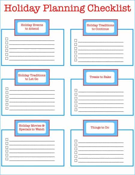
The Batch Mockup Checklist Every Print-on-Demand Seller Needs Before a Holiday Sales Season

How to Use the Mockupanda API to Auto-Generate Mockups Every Time You Upload a New Design to Your Print-on-Demand Store