How to Refresh Your Entire Etsy Shop's Mockup Style in a Weekend Without Redoing Your Designs
There is a moment every Etsy seller eventually hits. You scroll through your own shop, and something feels off. The listings look a little dated. The mockups are inconsistent, some lifestyle photos mixed with plain white backgrounds mixed with that one beige linen flat lay you did eighteen months ago. Your designs are actually good, but your shop does not look like it belongs together.
The frustrating part is that nothing about your actual products has changed. You just need the presentation to catch up.
Here is the good news: you do not need to redo your designs, hire a photographer, or spend weeks on this. With the right process and tools, you can refresh your entire shop's mockup style over a single weekend. This post breaks down exactly how to do it.
Why Your Mockup Style Matters More Than You Think
First Impressions Happen Before Anyone Clicks
When a shopper searches for wall art or digital prints on Etsy, they see a grid of thumbnail images. That grid is doing a lot of work. Your thumbnail is not just showing a product, it is making a promise about your brand. A listing with a beautiful, well-lit lifestyle mockup signals professionalism, quality, and trust before the shopper reads a single word of your description.
A mismatched, outdated, or low-quality mockup does the opposite. It creates doubt. Even if your design is strong, a weak mockup can make a shopper scroll past without a second thought.
The research on first impressions in e-commerce consistently shows that product imagery is the single most influential factor in purchase decisions, ranking above price, reviews, and even product descriptions. You are essentially selling the image before you are selling the product.
Cohesion Builds Brand Recognition
Beyond individual listings, there is the shop-level experience. When a shopper clicks into your store and sees a cohesive visual style across all your listings, something shifts psychologically. The shop feels intentional. It feels like a real brand, not a side project. That perception directly affects whether someone favorites your shop, follows you, or buys multiple items in one visit.
Sellers who go through a mockup refresh often report an increase in repeat visits and favorites even before sales move, because people start treating the shop as a destination rather than a one-off transaction.
Actionable takeaway: Before you start updating anything, go look at your shop as a stranger would. Open your Etsy storefront, take a screenshot of the listings grid, and honestly assess whether the thumbnails tell a consistent story. That screenshot becomes your before photo, and it will motivate you through the weekend.
Day One, Morning: Audit What You Have
Categorize Your Current Mockups
Before you can decide where you are going, you need to understand where you are. Spend the first hour of Saturday morning doing a full audit of your existing listings. You are looking for a few things: what mockup styles you have used so far, how consistent they are, and which listings are underperforming visually.
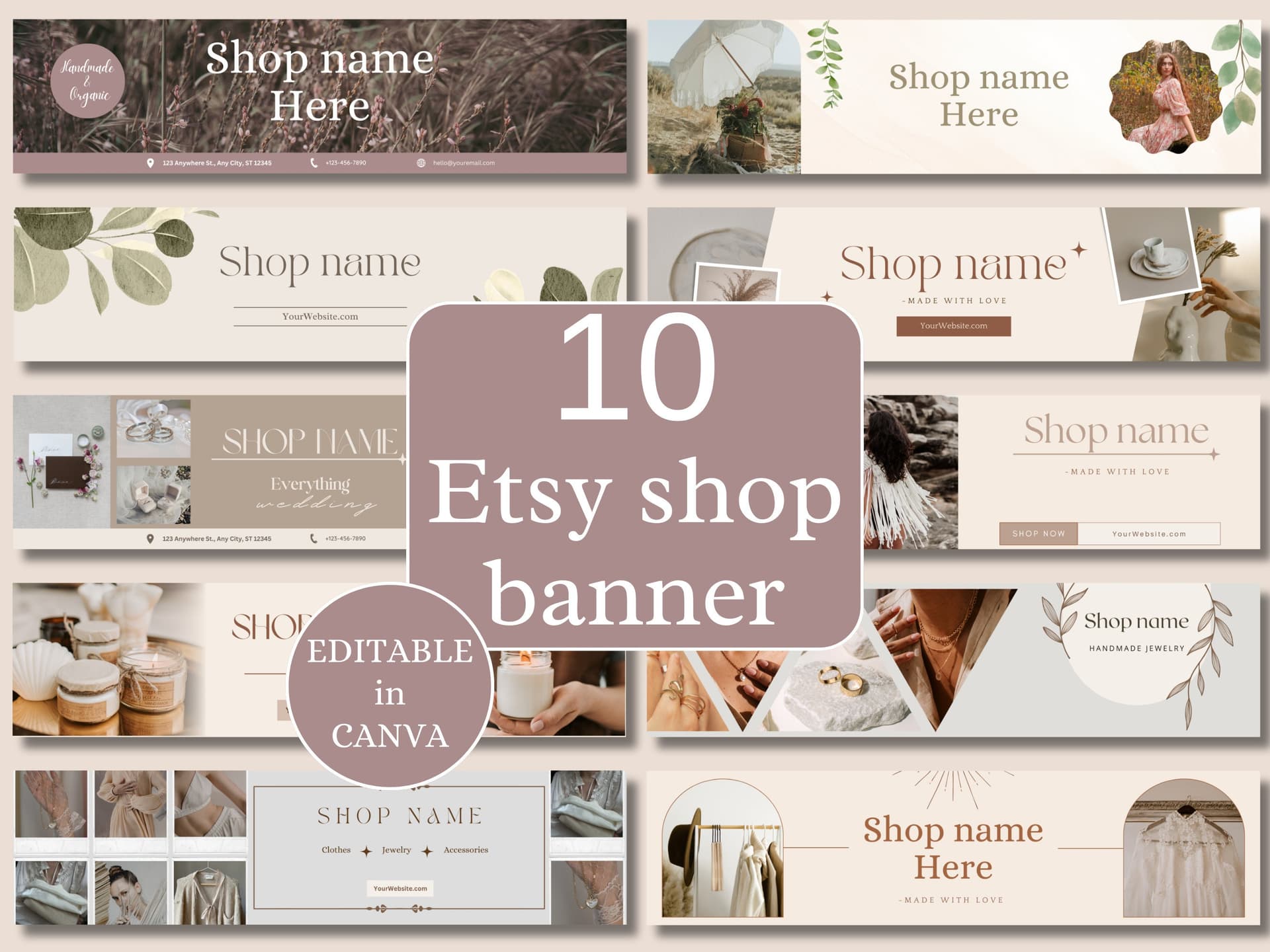
Open a simple spreadsheet or even a notes app. List every listing and tag it with the mockup type it currently uses. Common categories you might find in a digital print shop include plain white background, lifestyle room scene, flat lay on a desk or table, frame mockup with furniture in the background, and phone or device screen mockup for digital files. Once you see your inventory laid out this way, the inconsistency usually becomes obvious fast.
Note which listings have your highest view-to-favorite ratios. That is a signal about which mockup styles your specific audience responds to, and it should influence the direction you choose.
Identify Your Bestsellers First
Not all listings need equal attention this weekend. Your bestsellers should be at the top of your priority list, because improving their thumbnails can have an immediate impact on revenue. If a listing is already converting well with a mediocre mockup, imagine what it could do with a great one.
Make a short list of your top ten listings by sales or revenue. These are the ones you will update first, before anything else. If you run out of time on Sunday afternoon, at least your most important listings will have a fresh look.
Actionable takeaway: By the end of Saturday morning, you should have a spreadsheet with every listing categorized by current mockup type, and a priority list of your top ten. This structure will keep you from wasting time during the actual refresh.
Day One, Afternoon: Choose a Cohesive Visual Direction
Pick One to Two Core Mockup Styles
One of the most common mistakes sellers make during a shop refresh is trying to use too many different mockup styles at once. The goal of a refresh is cohesion, and cohesion requires constraint. You want your shop to feel like it has a point of view.
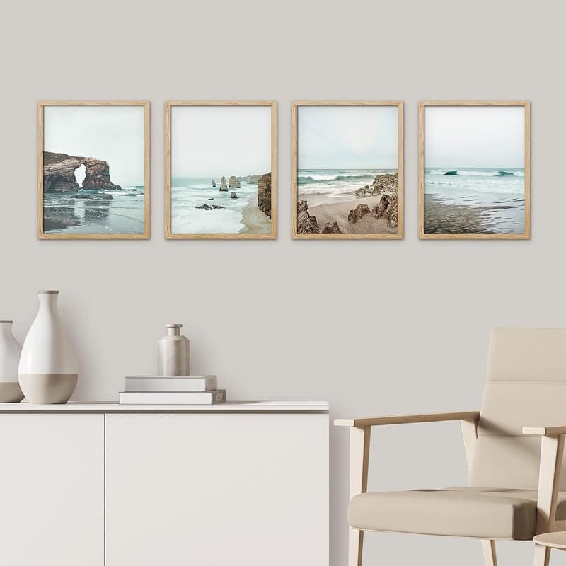
For most digital print and wall art sellers, the sweet spot is one primary style and one secondary style. Your primary style should dominate, appearing in the first thumbnail of almost every listing. Your secondary style can appear in supplementary listing images to give additional context.
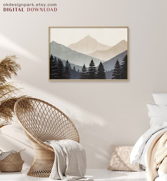
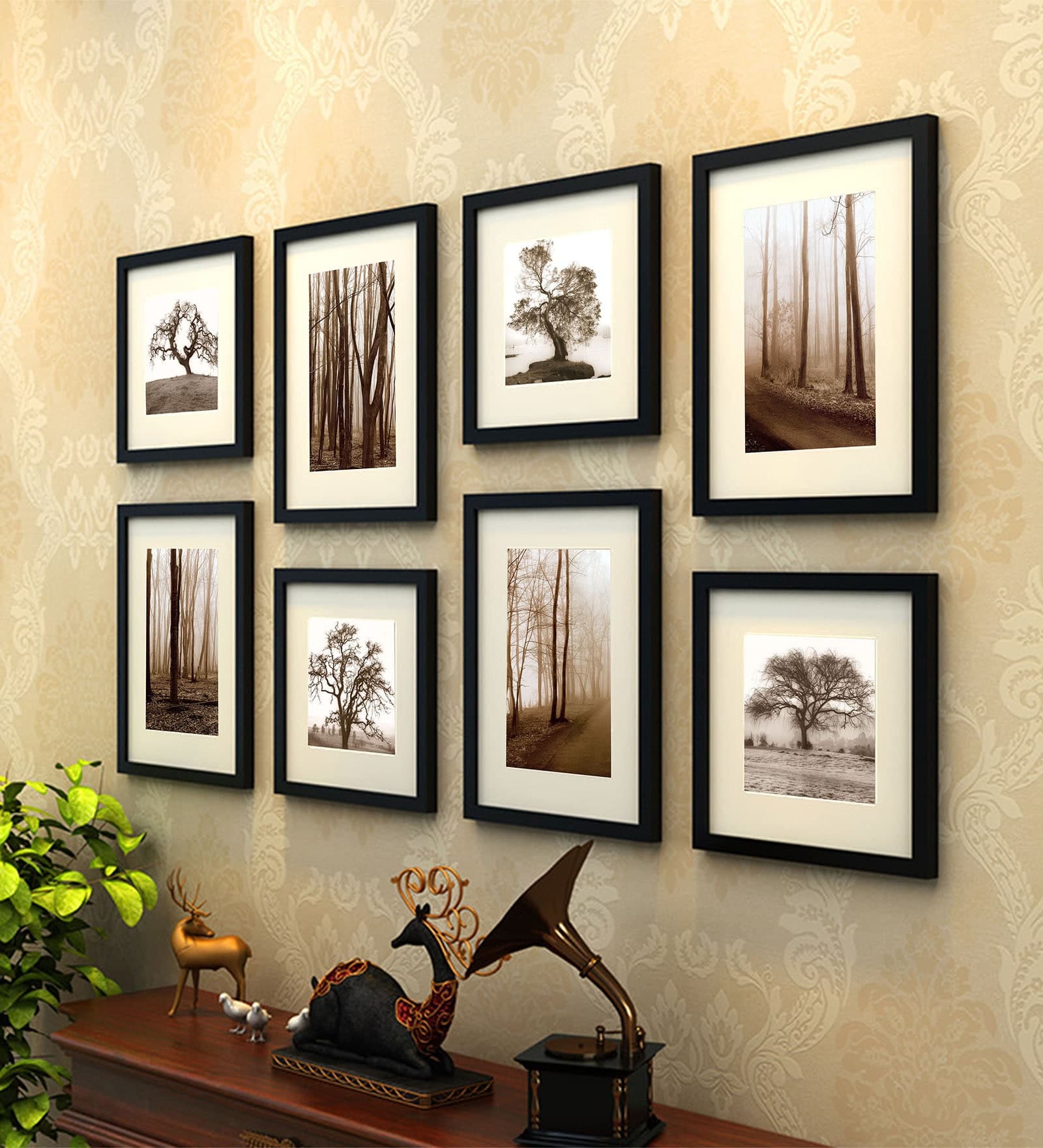
Some examples of combinations that work well together: a warm lifestyle room scene as primary, with a close-up frame mockup as secondary. Or a clean white wall mockup as primary, with a styled desk flat lay as secondary. The key is that both styles share similar lighting, color temperature, and mood. Warm tones with warm tones. Cool, minimal aesthetics with other clean, uncluttered scenes.
Look at Etsy shops you admire in your niche, not to copy them, but to observe how they use visual consistency. Notice whether they stick to a particular color palette in their backgrounds, whether they favor natural light or studio light, and whether their scenes feel lived-in or staged.
Match Your Mockup Style to Your Brand Aesthetic
Your mockup style should feel like a natural extension of your designs. If you sell minimalist black-and-white prints, a cluttered, rustic farmhouse mockup scene creates a jarring disconnect. If you sell colorful, maximalist art, a stark white background might undersell the energy of the piece.
Think about the customer you are trying to attract. What does their home probably look like? What would feel aspirational to them? The mockup is not just showing your product, it is showing them a version of the life they want, with your art in it.
Once you have settled on your one or two styles, write them down clearly so you stay consistent during the production phase. Something as simple as: warm lifestyle frames in neutral living room scenes, secondary close-up in light wood frame on white wall. That sentence becomes your visual brief for the weekend.
Actionable takeaway: Choose your core mockup style and write a one-sentence visual brief before you generate a single new mockup. Decisions made upfront save hours of second-guessing later.
Day One, Evening: Set Up Your Mockup Workflow
Use Bulk Generation to Move Fast
This is where the actual production work begins, and this is also where most sellers get stuck. The traditional approach involves opening a design tool, placing each design into a mockup template one at a time, exporting, renaming, and repeating. If you have fifty listings, that process can take days.
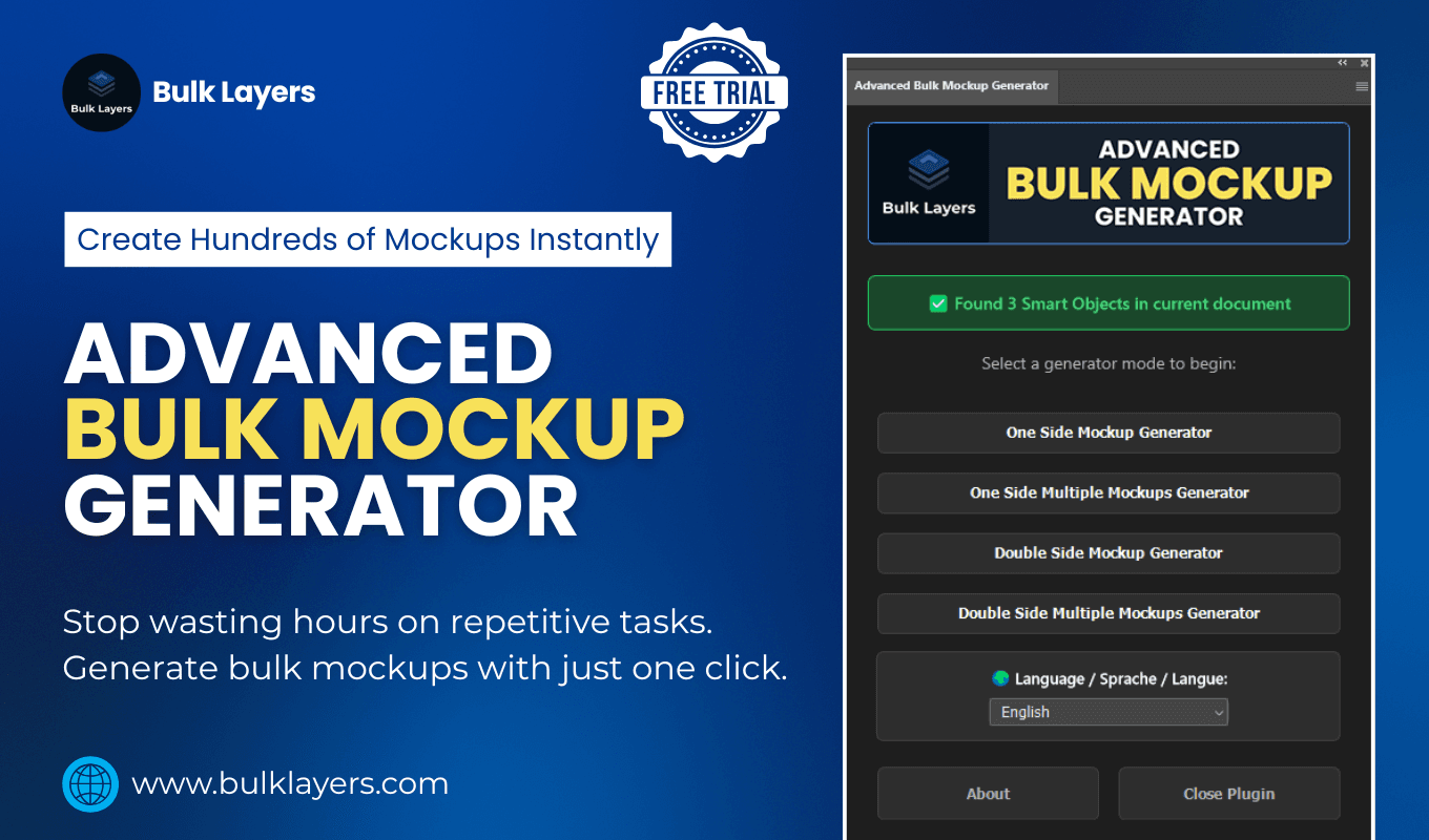
The smarter approach is bulk mockup generation. Tools like Mockupanda are built specifically for this scenario. You upload your design files, select your mockup templates, and generate dozens of finished images at once. What would take you three days of manual work can happen in an afternoon.
For a weekend refresh, the workflow looks like this: collect all your design files into one folder, choose your mockup templates based on the visual direction you set earlier, batch upload and generate, then download the finished images organized by listing. That is it. The tool handles the repetitive part so you can focus on reviewing and uploading.
Organize Your Output for Easy Uploading
Before you start generating, think about how you will name and organize your output files. Etsy listings can have up to ten images each, and if you are refreshing fifty listings, you could be managing hundreds of image files. A little organization upfront saves significant confusion later.
Create a folder structure that mirrors your listing priority list. Your top ten listings get their own folders. Keep the naming simple and consistent: listing name, mockup style, image number. When you sit down to upload on Sunday, you will be able to move through listings quickly instead of hunting through a flat folder of five hundred files.
If you are using Mockupanda, the export options let you organize output in ways that align with this kind of workflow, which makes the Sunday uploading session much smoother.
Actionable takeaway: Spend thirty minutes on Saturday evening setting up your folder structure and file naming convention before you generate anything. This small investment saves hours of confusion during the upload phase.
Day Two: Upload, Update, and Review
Work Through Your Priority List First
Sunday is upload day. Start with your top ten priority listings and work through them methodically. For each listing, replace the main thumbnail first, then add the secondary mockup as the second image, and review the listing description to make sure nothing references the old imagery.
As you update each listing, publish it immediately rather than saving drafts. This keeps your shop active and means your updated listings start getting impressions right away. Etsy's algorithm also tends to give a small visibility bump to recently edited listings, so publishing as you go rather than batch-publishing at the end can work in your favor.
Check each updated listing in both desktop and mobile view before moving on. Thumbnails crop differently on mobile, and a mockup that looks great on desktop can get awkwardly cropped on a phone screen. Make sure the focal point of your mockup, usually the artwork itself, is visible without needing to tap the image.
Adjust Your Shop Banner and Featured Listings
While you are in refresh mode, take an extra thirty minutes to align your shop banner and featured listings with your new mockup aesthetic. These two elements are the first thing visitors see when they land on your storefront, and if they are dramatically different from your freshly updated listings, the cohesion you worked to create gets undermined.
Your shop banner does not need to be elaborate. A clean, simple banner that uses the same color palette and visual style as your new mockups does the job. If your new mockup style is warm and neutral, your banner should feel warm and neutral too.
For featured listings, choose three or four listings that showcase your new mockup style at its best. These should be your bestsellers or your most visually striking pieces, since they are essentially your storefront window display.
Actionable takeaway: Do not finish the weekend with updated listings but an outdated banner. Spend the last thirty minutes of Sunday making sure your storefront-level visuals match the listing-level refresh you just completed.
Sustaining the Refresh: Keeping Your Shop Consistent Going Forward
Create a Simple Template System for New Listings
One of the hidden benefits of doing a full shop refresh is that it forces you to make decisions you should have made earlier, decisions about your visual direction that you can now document and reuse. Before you close your laptop on Sunday, create a simple template file or document that captures your mockup choices.
Write down which mockup templates you used, where they came from, the specific color or style settings you chose, and the order in which you place images in each listing. This document becomes your onboarding guide for future listings. Every new product you add will follow the same system, and your shop will maintain its cohesion automatically rather than drifting back into inconsistency.
If you are using Mockupanda, you can save your preferred templates so that future batches start from the same starting point. That kind of workflow memory means your next refresh, or your next batch of new listings, takes a fraction of the time.
Schedule a Quarterly Mockup Review
Trends in interior design, home decor aesthetics, and product photography shift gradually but steadily. A mockup style that feels fresh today might feel dated in two years. Scheduling a light quarterly review keeps you ahead of this.
A quarterly review does not mean redoing everything again. It means spending thirty minutes looking at your shop with fresh eyes, checking whether your mockup style still feels current, and identifying one or two listings that could benefit from an updated thumbnail. Small, regular maintenance prevents the next big catch-up project from becoming overwhelming.
You can also use this quarterly review moment to check your listing analytics. If a listing's views dropped significantly in the past quarter, a mockup update is often one of the first things to test before changing anything else.
Actionable takeaway: Create your mockup style document on Sunday evening and block thirty minutes in your calendar three months from now for a quick visual review. Systems are what keep a good shop looking good over time.
Wrapping Up
Refreshing your entire Etsy shop's mockup style in a weekend is genuinely achievable, and the impact on your shop's perceived quality is immediate. The key is treating it like a project with a clear process rather than a vague intention to update things at some point.
Audit first, decide on a visual direction before you produce anything, use bulk generation to handle the heavy lifting, and work through your priority listings systematically. By Sunday evening, you can have a shop that looks like you spent months on it, because the designs were already there. You just gave them the presentation they deserved.
Tools like Mockupanda exist precisely for moments like this. When you have dozens of listing images to generate and a weekend to do it, bulk generation is not a luxury, it is the only practical way to move fast without cutting corners on quality. If you have been putting off this kind of refresh because it felt too time-consuming, the tooling has genuinely caught up with the problem.
Keep reading
How to Create a Cohesive Etsy Shop Front Using Mockups With a Consistent Color Palette Across All Listings
How to Showcase Poster Sets on Etsy Using Gallery Wall Mockup Templates